|
This week I am sharing a simple tip that will bring acrylic paint that has become thicker, almost jelly-like to a more normal consistency for painting with. The first paint is Ultramarine Violet, the second paint is a rather old tube of Quinacridone Blue Violet and the last one is Alizarin Crimson Permanent. 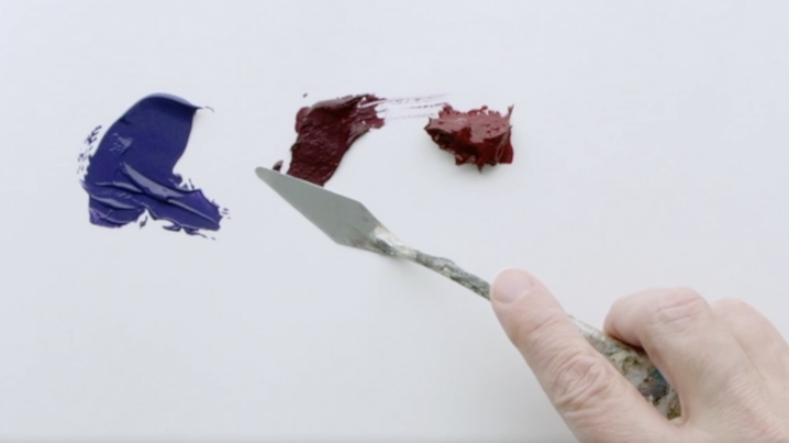
I put a small amount down to incorporate it into the paint and the repeat until the paint looks as smooth as possible. 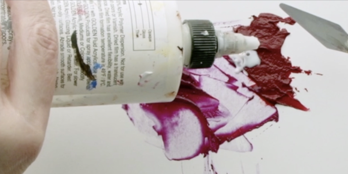 There is friction created by the palette knife which also helps to smooth the paint more. See how much smoother the Alizarin Crimson Permanent is? The Quinacridone Blue Violet is better than it started but I decided to toss that particular tube away...it took far to long to 'save'. 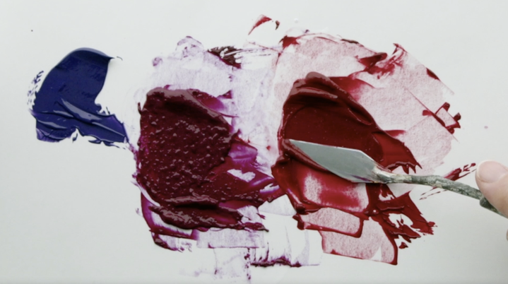
0 Comments
This is the final video for ACRYLIC PAINTING 101: Basics for Beginners. I was asked by SassyCat over on YouTube if I do Complementary mixing or added Black to create darker colours. I don’t generally add Black to change the value of a paint because it is a low chroma Blue. And though Black paint will darken the colour, I find it changes the colour in ways that are not always what I want. There are times that I do use complimentary mixing but generally that is with watercolour, not acrylic. In this lesson we will explore complimentary colours of Cadmium Yellow Light to Dioxazine Purple in the form of a Chroma Chart. 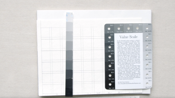 Gather your chart (which you can download HERE), your Value Scale, paper palette, palette knife, a brush, and the paint…let’s get going.  We will begin with placing the Cadmium Yellow Light (Value 9) on the far left and Dioxazine Purple (Value 1) on the far right. 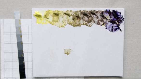 Using the Value Scale begin by adding a very small amount of the Purple to the Cadmium Yellow Light to bring to Value 8, then repeat until the mixture is at a Value 7 and so on until there are 9 paint mixtures. 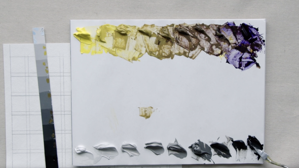 Below add the same values 9 to 1 of the Neutral Grey (from Lesson 8 HERE) on the bottom of the palette. 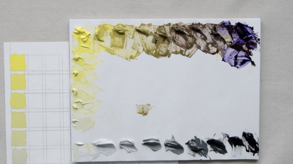 The focus on this chart is to create a Chroma version of the Complimentary Colour Chart. Taking the Neutralized Grey Value 9 and start mixing it into the pure Cadmium Yellow Light as we are not changing the value just the chroma. 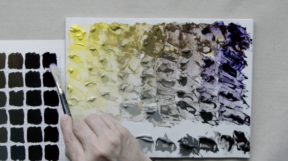 Work all the way across the 9 piles until the chart has been filled. Now it is time to compare the Chroma Chart from this lesson with a Value Chart using the very same two colours - Cadmium Yellow Light and Dioxazine Purple. As always with the Chroma Chart the value is the same from the top to the bottom...all that happens is a Neutral Grey of the same value is added which changes the chroma only. The Value Chart there is white added to lighten each of the colours mixed from Yellow on the left to Purple on the right. 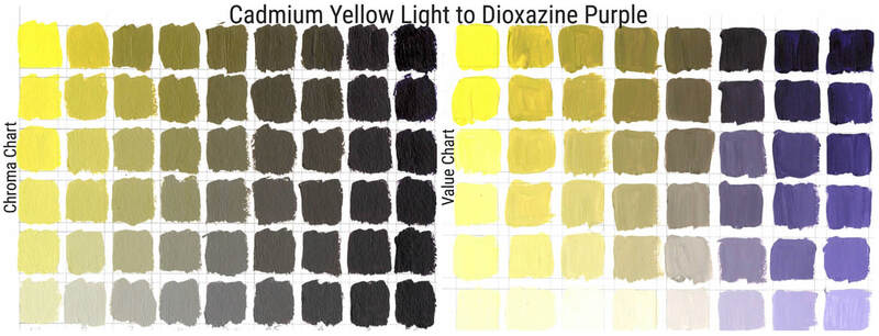 Below is the Chroma Chart and Value Chart for Cadmium Yellow Medium and Dioxazine Purple. 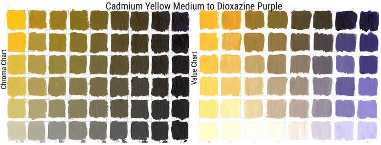 Here is the last Yellow that I played with - Yellow Ochre with both a Chroma Chart and Value Chart 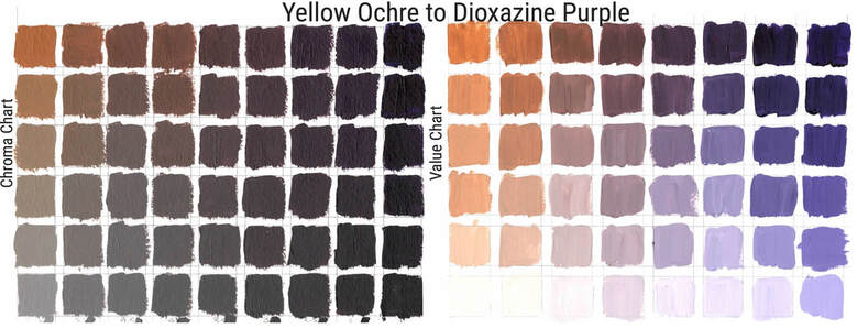 I hope that this lesson was helpful. Below is the link to the chart measurements and the Youtube video.
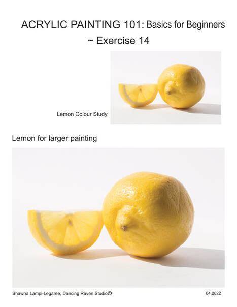
In todays video we are bringing together all that we have learned in the previous videos that are part of the ACRYLIC PAINTING 101 series. We will be painting our final lemon. It took me about 3 1/2 hours to do this 13x18 cm (5x7in) painting. I used Cadmium Yellow Medium value string for this painting as I did in the colour study! Check out how to make the value string in Lesson 9: VIDEO/ BLOG 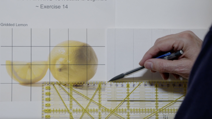 Draw a grid on your board of 3cm (1 1/4in) very lightly with a pencil. Using a kneaded eraser to remove enough of the graphite to ensure that the lines are faint, so that you can barely see them. There will be just enough graphite left to be able to see but not have the lines show through the yellow paint. 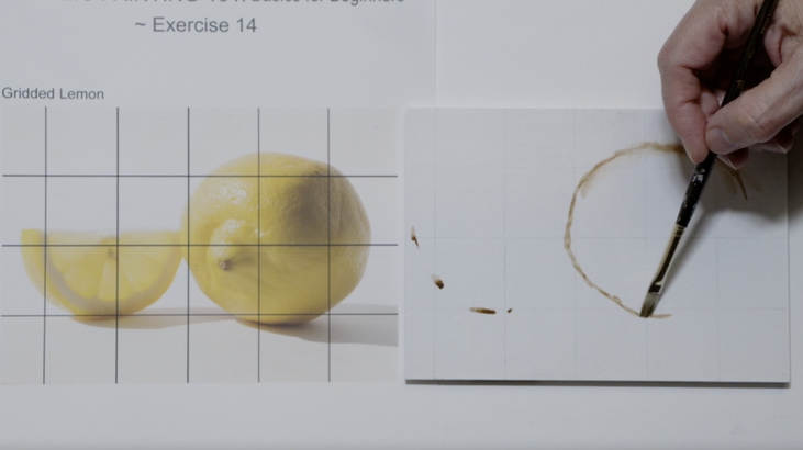 Begin to draw the elements using a very loose raw umber. I am using my favourite brush for this: Princeton Dakota Flat 2. I put registration marks where the lemon sections intersects with the grid. 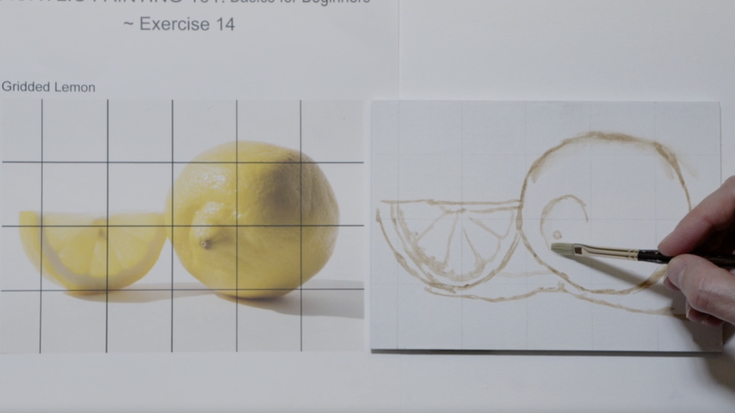 Now we are nearing the end of the drawing. Take a few minutes to let the raw umber dry and using the kneaded eraser remove all the lines as best you can. 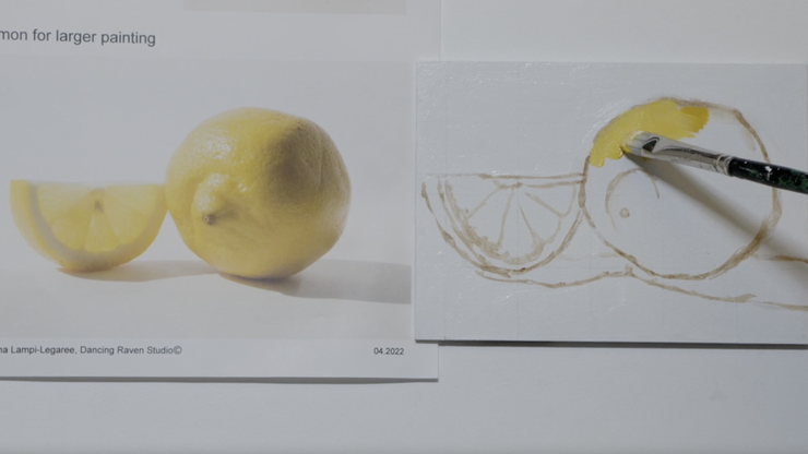 On to the first pass of paint. Remember this is where we just get the information down to the best of our ability. This will help us when we do the next layer of painting. When you come for the second pass then decisions about value and so forth are easier to see what is correct and what needs tweaking. 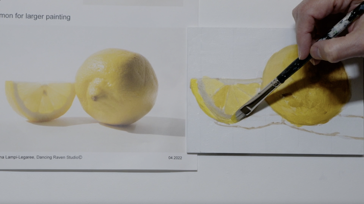 Building up the subtle shifts of value on the lemon slice. As the light comes through the lemon slice there is a lovely glow 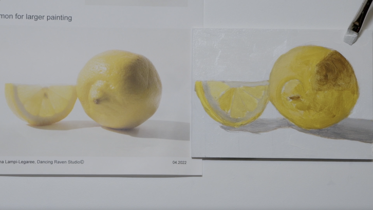 To keep it really simple I used white paint for the background , which fits since I photographed the lemon set up on white. 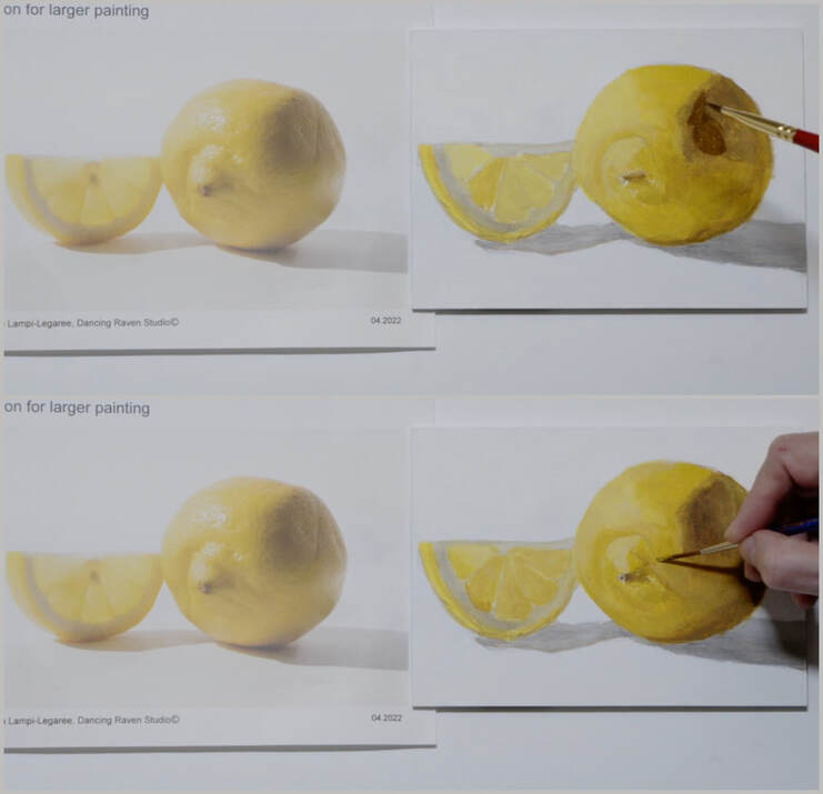 On to the second pass on the lemon where we shift the values and correct the shapes that we put down during the initial pass. 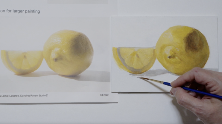 Tweaking the edges as the painting nears completion. 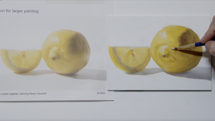 The final highlights. And the lemon is completed! 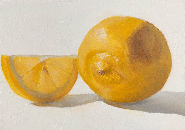 "A taste of Lemon", 13x18cm (5x7in) Acrylic on Masonite Board.
We are nearing the end of this particular journey. In this lesson I want to introduce you to the idea of doing a colour study prior to starting your next painting. It has turned out to be such an invaluable learning tool for me. Below is the Cadmium Yellow Medium value string that you will need to create to do this painting. I think in the video I thought the colour I had used was Cad Yellow Light...but I was wrong. I corrected that mistake. Cadmium Yellow Medium starts at a Value 8, add white to bring up the value to 9, and a 50/50 mixture of Raw Umber and Burnt Umber to bring the value down to Value 3. Don't worry about Value 1 & 2 as I found that I didn't hardly drop down to value 4 while painting. 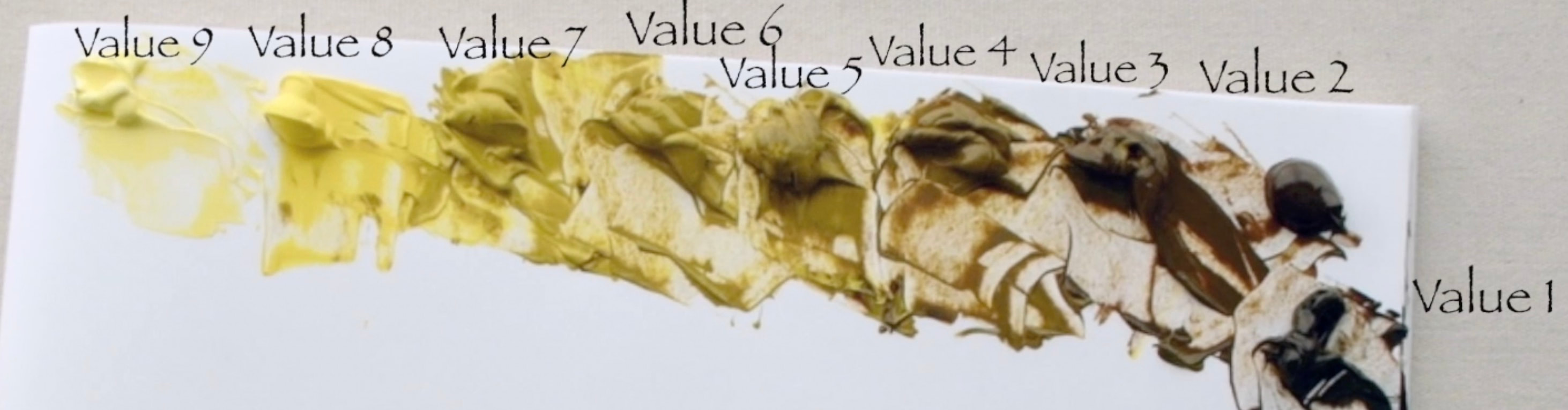 Below is the colour study that I completed. It measures 7 x 12.5 cm (2 3/4 x 5 in). It is simple and took just 30 minutes to complete. A small amount of extra time is so worthwhile to ensure that you will be happy with the final larger painting that will be 17.5x12.5cm (7x5in). 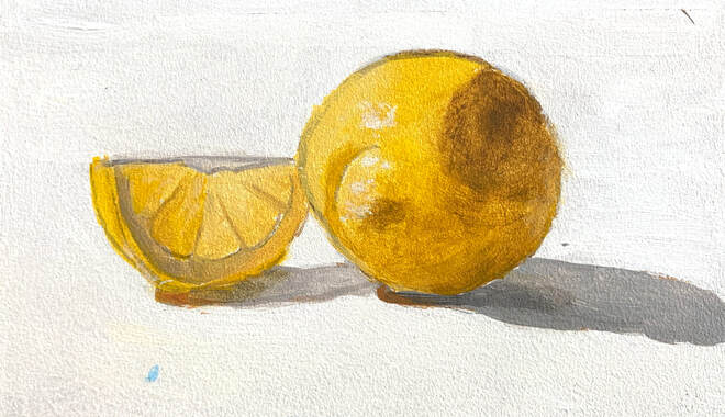 I have a pdf download of the lemons for both the small colour study and the final painting. Link is below
Join me as we explore the most magical part of painting...mixing and matching colours that we see in our subject matter. Grab the Colour Wheel that was created in Lesson 6, and chose a wide variety of paint colour chips from your local home paint store. We shall decide where they land on our colour wheel as this is the first step to figuring out what paints to use to recreate a specific colour. Sometimes colours are simple, but as soon as the chroma is dropped it can be a bit harder to know where to start. 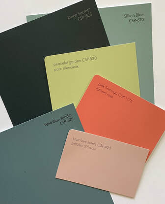 I love the names that home paint companies use on their chips: “Peaceful Garden”, “Deep Secret”, “Wild Blue Yonder”, “Kept Love Letters” and “Dancing Leaves” to name just a few that are in the video. They must have an app for that…or they all get some wine flowing and start naming them as a team. I would love to be part of a “name the paint” wine party…if they do that. Anyway, it is cute. 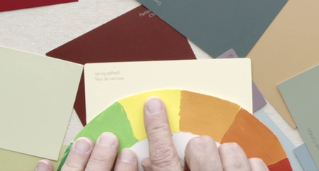 I started with what I thought was the simplest colour “Spring Daffodils”. Right away you know the colour is a yellow. That is simple…the complex part is Which Yellow? Cadmium Yellow Light seems wrong, but how about Cadmium Yellow Medium. Well that seems to be a match. Now if we add some of the neutral grey in, we will lower the chroma perfectly. 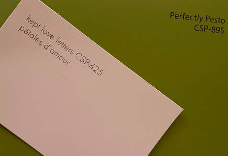 I chose to match the two colours “Perfect Pesto” and “Kept Love Letter”. To me this is the truly magical part of painting...mixing paint to match what one is seeing in their subject matter of choice. I will use two colour combos to get to the final colour. Neither are right or wrong, they are just different roads to get to the same destination. Let’s start with the “Perfect Pesto”. I am looking at the colour wheel and though it has a bit of green in it…I feel like it could be a yellow. So, let’s see if I am on the right path. The value of the colour chip is 5. The paints I used are Cadmium Yellow Light, Permanent Green Light, Raw Umber, Dioxazine Purple and Value 5 Neutral Grey. 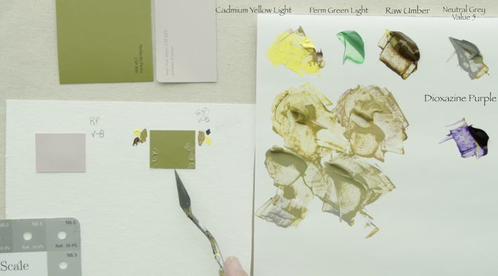 Version 1: Cadmium Yellow Light is a Value 9. This means I will start by lowering the value with Raw Umber until it is Value 5. Version 2: Next we mix Cadmium Yellow Light with Dioxazine Purple to a value 5. Notice the difference between the two value 5 versions. Take the first mixture of Cadmium Yellow Light and Raw Umber and mix in Value 5 Neutral Grey testing it on the paint chip until I have a match. Wow. That worked really well. What I notice with the Cadmium Yellow Light and Dioxazine Purple is that the colour has shifted to a more chromatic red yellow. By adding in the Value 5 Neutral Grey this will bring the chroma down without changing the colour. Keep adding in the grey until the colour is matched. Did you realize that I never even touched the Permanent Green Light? The colour may look like it was a Green Yellow but it turned out to come from Cadmium Yellow Light. Interesting isn't it. 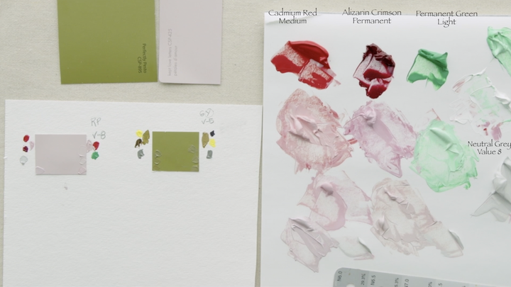 On to the “Kept Love Letter”. Using the colour wheel I can see that the paint chip tends slightly towards a Red Purple. I then determined that the value of this chip is Value 8. The paints I have chosen to work with are from our basic colour palette; Cadmium Red Medium, Alizarin Crimson Hue Permanent, Permanent Green Light, Titanium White and a Neutral Grey Value 8. Our goal is to create three puddles of Value 8. Using Titanium White to lighten the value of each of the three paint colours. Step 1: Cadmium Red Medium to Value 8 Step 2: Alizarin Crimson Hue Permanent to Value 8 Step 3: Permanent Green Light to Value 8 Step 4: Place an amount of Value 8 Neutral Grey close by. Version 1: I chose to do a 50/50 mixture of Cadmium Red Medium and Alizarin Crimson because I saw that the colour what flirting with being a Purple Red. Then the chroma was brought down with the Value 8 Neutral Grey paint. I had great success as I got to the colour in the first attempt. Sometimes that happens…but not always. Version 2: In this version we are going to use the Complimentary process. Take some Cadmium Red Medium into a separate pile, then add a bit of Permanent Green Light. Permanent Green Light is quite a blue colour, so using it with the CRM will bring it towards that Purple Red. Be timid with the amount of green paint you add in as you start…little bit by little bit. I didn’t find that this approach got me to exactly where I wanted to go. The colour was far too chromatic and adding more green to the red wouldn't have got the paint to where it needed to be. At this point I added a bit of the Value 8 Neutral Grey to bring the chroma down without changing the colour much more. This allowed the colour to be neutralized just a little bit more to completely match the paint chip. TA DA and magically we arrived at the two colours even with different approaches in the paint colours I used.
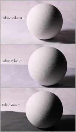
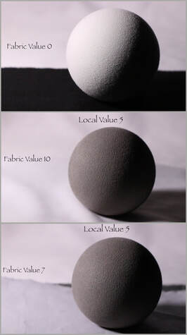
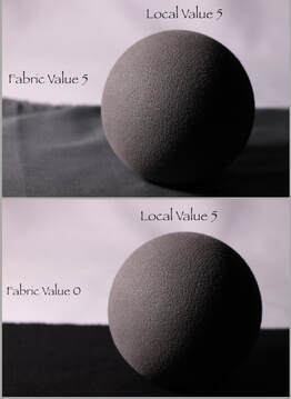
This weeks video has 4 parts: Part 1 - We look at a round object with the descriptive language we will use when thinking about light. Part 2 - We explore how a change of value on the ground impacts the light reflecting back into the object. We will be using two spheres with different Local Values. Local Value just means the value of the actual sphere without bright light on it. Part 3 - We examine the Modelling Factors responsible for creating the illusion of form on a 2-dimensional board. There will be the various values we will need to create. Part 4 - Is where we shall draw and paint the sphere from the image you can download HERE PART ONE - Light on a round object. 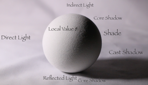 It is important to remember the sphere has two ways to graduates in two directions: Top to Bottom and Side to Side. The sphere is a local value 8, meaning that the whole object is value 8 before there is light shining brightly on it. There is Direct Light on the left Side Plane. The Top Plane there is Indirect Light The right Side Plane is the Shade In the right Under Plane there is Reflected Light bouncing back off the ground. In the Shade area the darkest part is the Core Shadow. Falling behind the sphere is the Cast Shadow Finally, we have the occlusion or accent shadow directly under the sphere where the ground and the sphere meet. PART TWO – How the ground value affects a round object. In part two the value of the ground that the sphere is resting on will be changed. Each value change will impact the light distribution in the under plane and on the right side plane that is the shade side.
PART 3 – MODELLING FACTORS To create the illusion of form on a 2-dimensional painting surface you will need at the very least 3 value shifts. In this case we are doing a sphere so we will need 3 values for the light area and 3 values for the dark area. 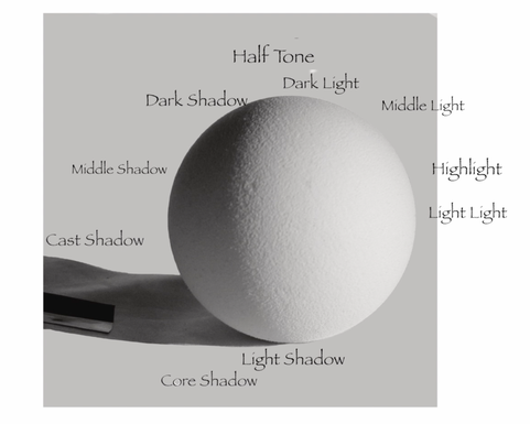 The Modelling terms we shall use consistently are as follows: The LIGHT area: Light Light - LL Medium Light - ML Dark Light - DL A transition value: HALFTONE: HT The dark SHADOW: Light Dark - LD Medium Dark - MD Dark Dark – DD Finally the last light factor: HIGHLIGHT - HL PART 4 – PAINTING THE SPHERE Now we are on to the final step....painting the sphere. In this part of the blog there are images that take us step by step through the process. Step 0: make the 1/2 step neutral value paints 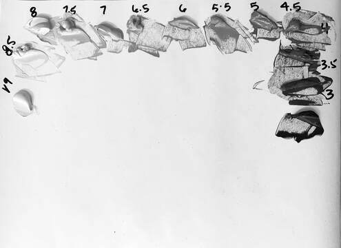 Step 1: Print the image at a proper printing place like Staples. Find the image HERE Then begin with the drawing. I used a Ball Jar to help me along as it was the exactly the right size! Step 2: Figure out the value of the background & do first painting pass on the background. 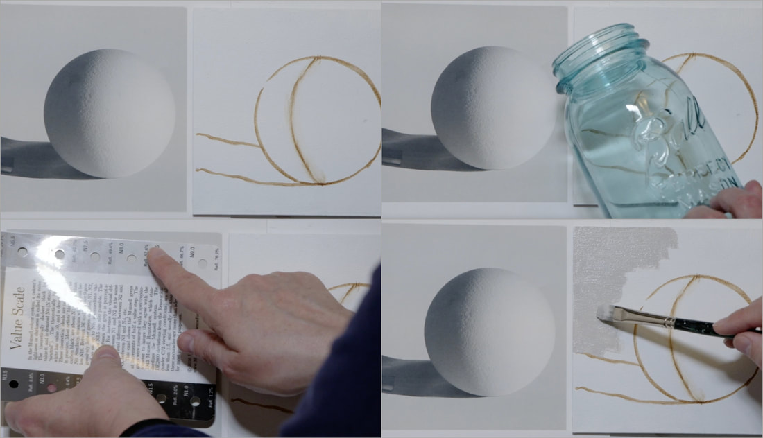 Step 3: Decide the Middle Dark, Dark Dark & Light Dark Values. Paint the full Shade side in the Middle Dark value. Step 4: Decide the values for the Light Light, Middle Light and Dark Light for the light area of the sphere. Paint the three values on the light side, starting with the Light Light, then to the Dark Light along the edge of the shade side, in between paint the Middle Light value. 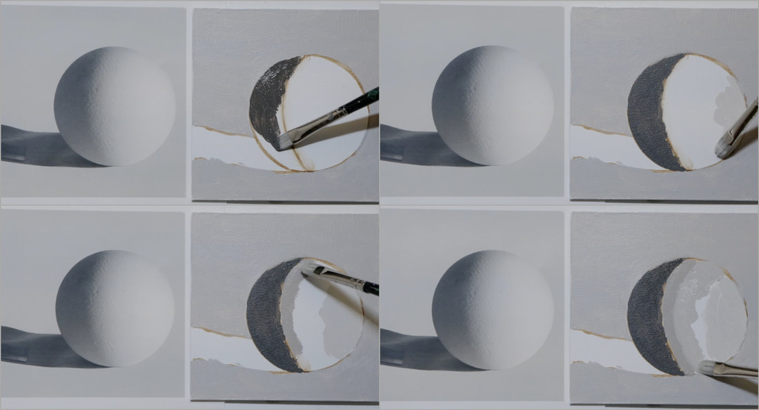 Step 5: Soften the edges between the Light Light, Middle Light and Dark Light paints. You can do that by using the 1/2 step value that goes between...so if your light is Value 9 the next 1/2 step is Value 8.5 that will sandwich between Value 8 and Value 9 perfectly. Step 6: Here we use the Winsor Newton One Stroke brush to soften between the values. Add small amounts of paint and use the brush to move the paint around. 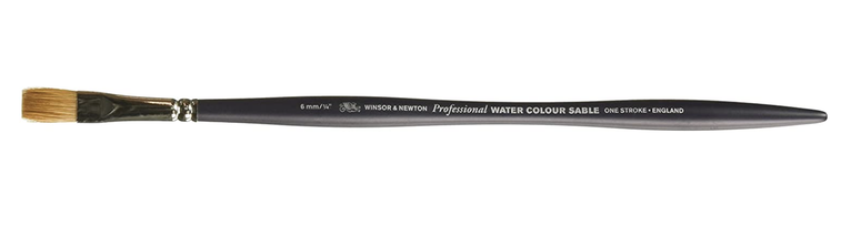 Make sure that you take the time you need to until you are happy with the modelling on the light part of the sphere Step 7 - Create the half tone. In the video I used the Middle Dark and the Dark Light to create the half tone. I think that it may have been easier to use a Value that is a 1/2 step darker than the Dark Light Value. Give that a try. Step 8: Paint in the cast shadow. Step 9: Paint in the Dark Dark into the shadow side where you see the darkest value in the Core Shadow. 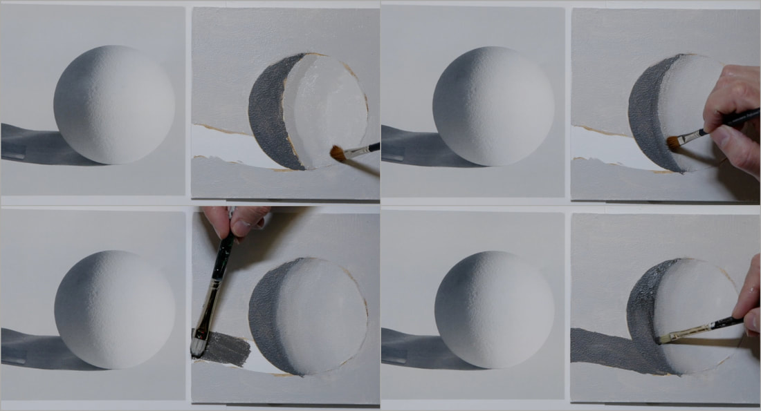 We are nearing the end. Step 10: Put in the Reflected Light in the left underside of the sphere. Mine could have been just a little lighter, go with what you feel looks best. Step 11: Place the occlusion (accent or crevasse) shadow at the base of the sphere. This is the darkest part of the whole painting. Step 12: Paint the background with a second pass focusing in on cleaning up the edges of the sphere and its cast shadow. Remember to turn the board/canvas as you work along to make it easier for yourself. 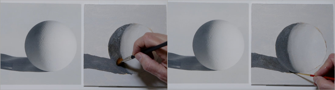
Every time I teach this beginner acrylic painting course, I remember that there are a lot of people who want to paint landscapes. Realistic greens can be a challenge to figure out for new painters. This lesson is about a simple combination of colours that create a perfect green that is a great place to start working from. The chart is the same one we used in Lessons 4 and 5 to create a Colour Chart. The colours we will be using for this lesson is Cadmium Yellow Light and Bone (Ivory) Black. Black is a low chroma Blue. If you put yellow and blue together, what do you get? Green. Because Black is a low chroma Blue using Black to bring down the chroma/value of a paint doesn’t always work out so well as it will change the hue at the same time. We will also be using the Neutral Grey paint mixtures that we created in Lesson 8. VIDEO & BLOG Post! I would recommend caution when using photos to match your greens too. I have found that the greens can be too chromatic (very garish) and often too blue If you have a simple photo editing program on your computer you can lower the saturation on the image which will result in a much better image to work from.
Cadmium Yellow Light starts at Value 9 straight out of the tube. We will only be going to Value 2 because there are only 8 spaces across the full chart. 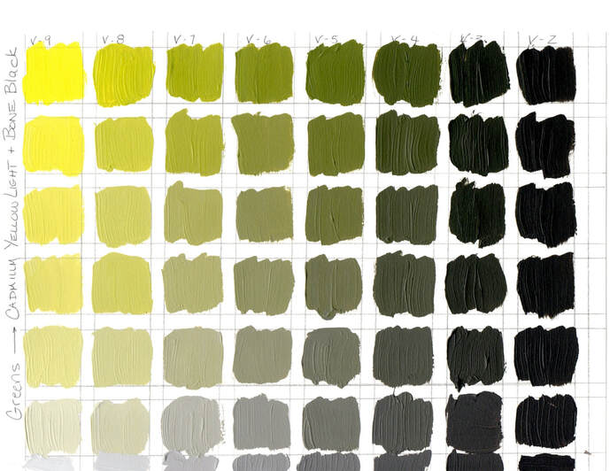 There are so many beautiful colours in this chart. I can see early spring green when the leaves are just unfurling after a very long cold winter. I can’t wait! Soon! Then as the spring turns to summer, the leaves turn to darker greens. Now I don’t live where Silver Birches grow but I do remember them from my childhood. If you know what the backside of the Silver Birch leaves look like…can you see that colour in this chart? Can you see the colour that would be the sun shining through the leaves? I would recommend making full tubes of the value paint mixtures from Value 8 to 2. It will give you a great starting place and save a lot of mixing time. Then you can drop the chroma by adding in the matching value of Neutral Grey paint. Here is the series of paintings that I did with this green mixtures.
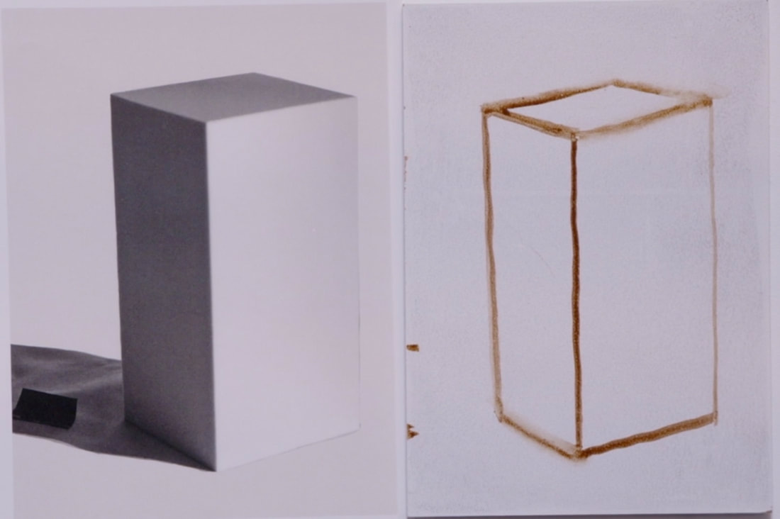
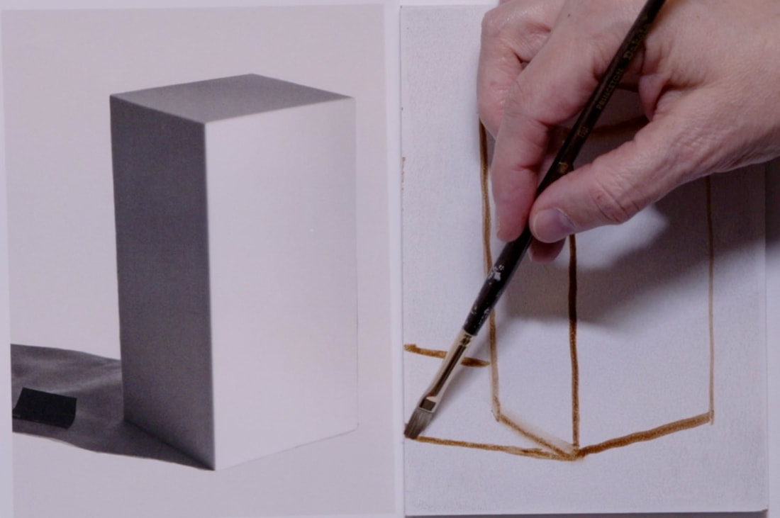
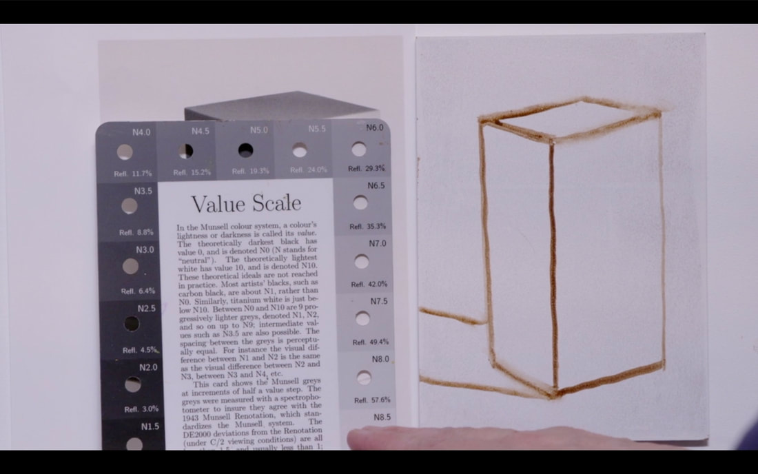
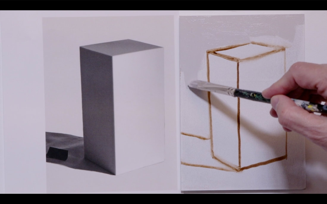
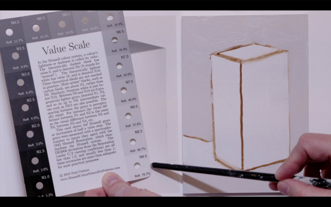
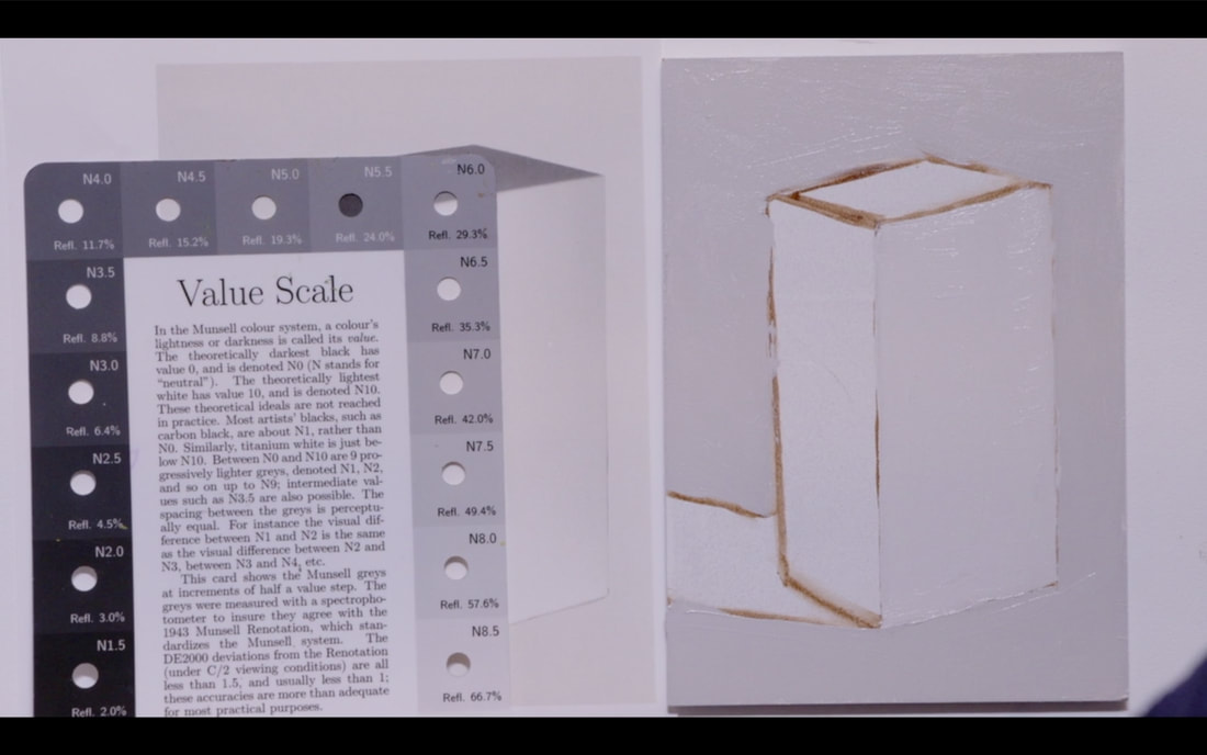
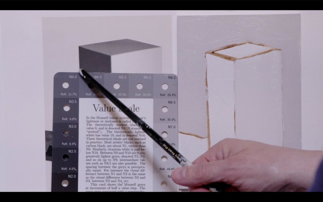
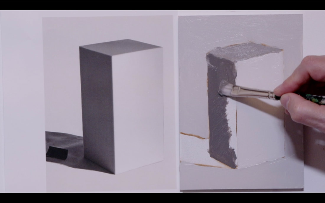
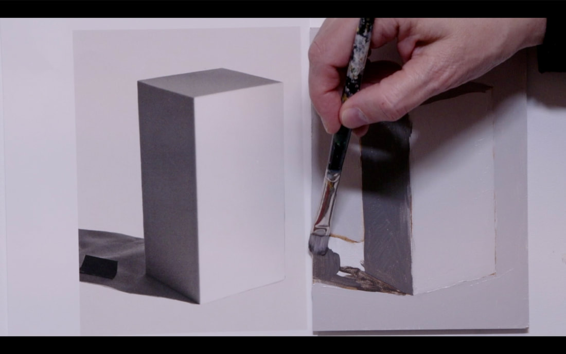
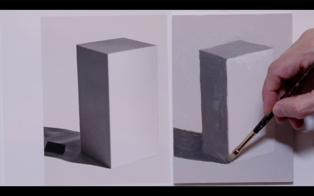
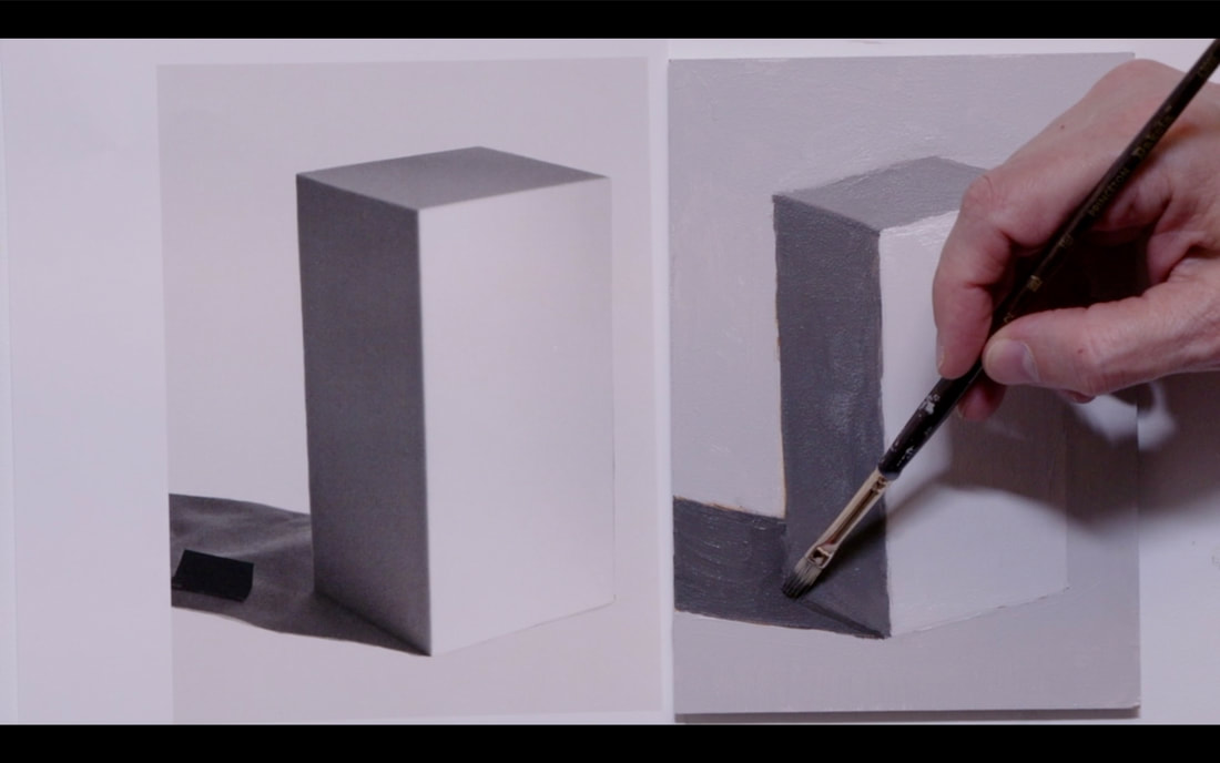
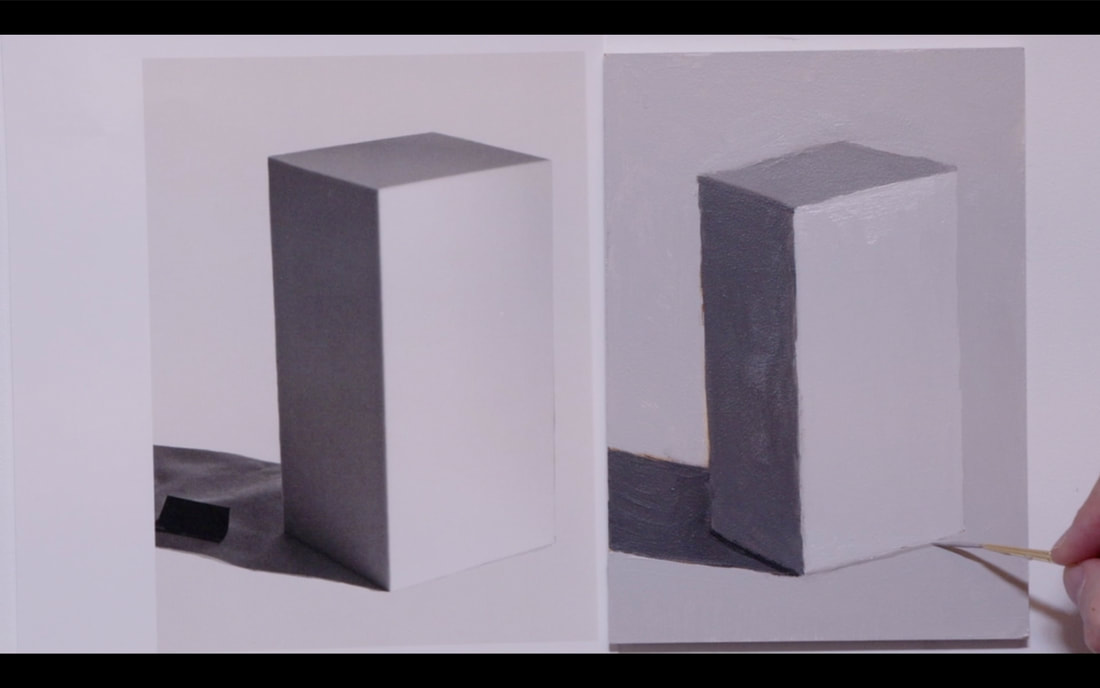
This video is in 3 parts. Part 1 We look at a rectangular object with 90 degree angles and very distinct planes and the descriptive language we will use Part 2 We explore how a change of value on the ground impacts the light reflecting back into the object. We will be using two rectangles with different Local Values. Part 3 is Drawing and painting the rectangle from the image you can download image HERE PART ONE - Light on rectangle object. In this part we are going to learn the terms that we use to describe various planes of the object and how the light interacts or doesn’t interact. Notice we have an object with 4 distinct planes. Only three planes are visible. We see the Front Plane, the Right-Side Plane and the Top Plane. 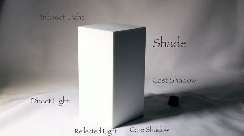 If we were outside, the Direct Light would be from the Sun, the Indirect Light would be the light bouncing back from the sky. Now on to the Right-Side plane which is the Shade area of the object and we have Reflected Light in the right-side plane as the light bounces from the ground back up into the Shade side Next the object is in the way of the light source creating a Cast Shadow. The Cast Shadow can be changed with the direction of the light changing. Longer Cast Shadow if the light is very low, and a much shorter one if the light is much higher or directly overhead. You may well notice that the Shade side is darker at the top and lighter as it goes down into the reflected light area. I took the opportunity to place a black object directly into the cast shadow. I did that so that you will understand that Cast Shadows are rarely fully black. As a new painter I would make my cast shadows far darker than they were. Also, if you use a photograph (as we shall be doing), you will find that the camera makes the shadows much darker than our eyes would see. It is a direct result of the cameras inability to handle both aspects light and shadow correctly at the same time. If you are ever in doubt about the value of the Cast Shadow place something black into the area before you photograph it, using your handy dandy Munsell Accurate Value Scale for Artists to get a correct reading of the Cast Shadow. Remember to write down the value some place so you remember it later. The darkest part of the whole painting is in the core shadow that connects the object to the table on the Shade side. This small area is important to paint because it anchors the object to the ground it is on. PART TWO - Changing of ground and how it impacts reflected light distribution In this part we are going to look at how the reflected light area of the Shade side changes as the values that the object is standing on are changed. The Local Value of the object is Value 8. I will change the ground value from Value 10 (white), to Value 7, to Value 5, then to Value 0 (black). Local Value of the object is Value 8. We are focusing our attention on the reflected light area in As we go through you will notice that the reflected light has become less and less bright until it totally disappears when the ground is Value 0. 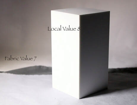 Let’s do this same exercise but now the rectangle object will have Local Value of 5. When I was doing this demonstration, I could see just a touch of Reflected Light happening on the Value 5 ground. Sadly, the camera is not that sensitive, and you are unable to see that. As we move to Value 7 you can see the reflected light really starting to appear on the Shade plane, with the Value 0 ground creating the brightest Reflected Light. 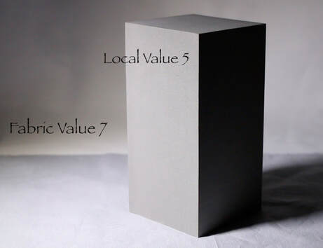 PART THREE - Painting the Rectangle object. Using Raw Umber I begin to draw the rectangle. I spend a lot of time backing up away from the easel to look at both the image and the board from a distance. Then I step forward to put a reference point where I think the corner is. I step away again to confirm that it is correct, then move forward to make changes if I need to. 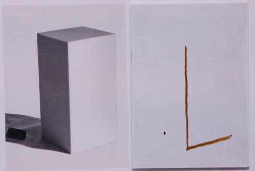 When we go to put the reference point on the top plane it is far too easy to have it tipped up and looking wrong. In our mind we know that the Top Plane is a square shape but in reality we are dealing with perspective. Move forward place a reference point, then step back to confirm that it is in the correct place. It may need to move a little to the right or left or a little down or up. Take your time on this part of the drawing. It is key to having your rectangle look correct 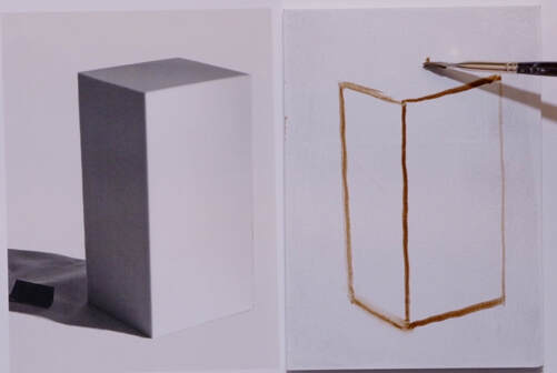 The top is so important. Take your time to get those angles as correct as possible. Then we are on to the Cast Shadow. See that I have put reference points on the side of the board then I draw from those points to the object.
ROTATE THE BOARD AS YOU NEED TO WHEN YOU PAINT. It makes it so much easier to get the edges straight. :) Now to choose the value of the background. I see that it could be an 8.5 but for simplicity I chose Value 8.
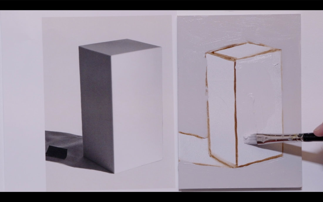
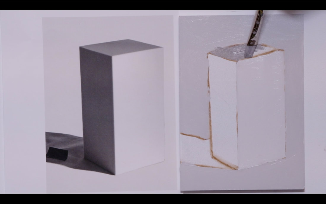
On to the Front Plane that is in Direct Light. It is definitely a Value 9!
Now we are figuring out the Top Plane value which I saw as Value 6. Photos do darken the values.
On to the Left Side Plane which is in Shade. I chose a Value 4 for that side.
Place the Cast Shadow in. Value 3 is what I chose. I did a second layer over the whole painting which gets us to the image below on the right side.
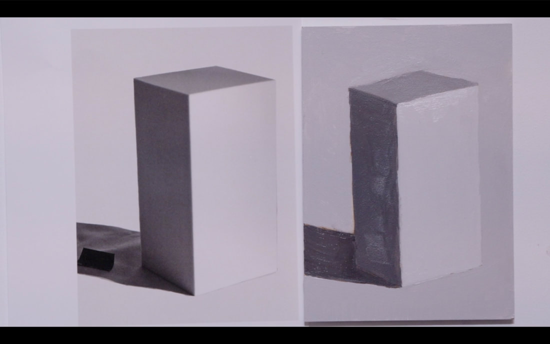
The final parts of the painting: Reflected Light painting into the Left Side Plane Core Shadow under the Left Side Plane to anchor the object to the ground A very thin light under the Front Plane again to give it the illusion that the object is one the ground.
Ta Da...The final painting! 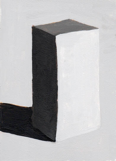 A reminder... YOU CAN ROTATE YOUR PAINTING AS YOU NEED TO. My lines are not straight because I was doing a video and I couldn't rotate the image.
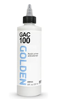
Welcome to Lesson 9 ¾. Make sure that you have your ticket ready as we begin the magical journey of how to prepare your panels. (Sorry I could not resist) You can use either Masonite or Birch cradled panels for this lesson. The first thing to use is a product that Golden makes called GAC 100 or 200. GAC 100 is a universal sealant that is flexible which means it can be used on canvas as well. If using a rigid board, then GAC 200 would be perfectly admissible. The difference between the two GACs is flexibility (100) and rigidness (200). According to Golden GAC 200 will crack if used on a flexible surface. This is a good thing to know. Why use GAC? GAC protects against Support Induced Discolouration happening as the painting ages. Common painting supports such as canvas, linen, masonite, MDF and birch boards contain water extractable materials that can cause discolouration.
Seal the front, back and edges of the board with two coats of GAC before we move on to finalizing with Gesso. There are boards that can be purchased that are already primed on the front. These boards will still need to be sealed on the sides and back. Moisture penetrating into the back of boards can cause damage as time goes forward. Now let’s create a sampler of different Gessoes by Liquitex and Golden. I am certain that other companies create Gesso but these are the two brands that are readily available in my studio. Using a 15x15cm (6x6in) board draw a grid to make 9 squares on it. Each of these squares will be a different Gesso. It is surprising how many kinds of Gesso are on the market. 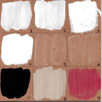 I used the following brands and types of Gesso: 1.Liquitex Gesso (Regular and Flexible) 2.Golden Gesso (Regular and Flexible) 3.Liquitex Super Heavy Gesso (Holds it shape is Flexible) 4.Golden Sandable Hard Gesso (Inflexible) 5.Liquitex Clear Gesso (Dries translucent and is Flexible) 6.Golden Clear Gesso (Dries translucent and is Flexible) 7.Golden Black Gesso (Flexible – can be thinned ulp to 25% with water) 8.Gesso Sandable Hard Gesso mixed with Raw Umber Paint 9.Clear Gesso mixed with transparent Quinacridone Magenta Why would Clear Gesso be used? If you have drawn on your painting surface and want to keep the paint from picking up graphite or charcoal, Clear Gesso will secure the drawing in place. If you are a texture person, then using the Liquitex Super Heavy Gesso might be the perfect way to add subtle textures to the painting. There are several other products that allow one to really create big textures for painting on top of. When the sampler is done, feel each one of the different Gessoes. This will help you to understand which one that will become your favourite go-to Gesso. There are a few ways to put Gesso on a board. I choose to use a roller but, you are certainly able to use a brush. If using a brush, choose a larger one that can be obtained from the hardware store which will certainly make doing larger boards easier. 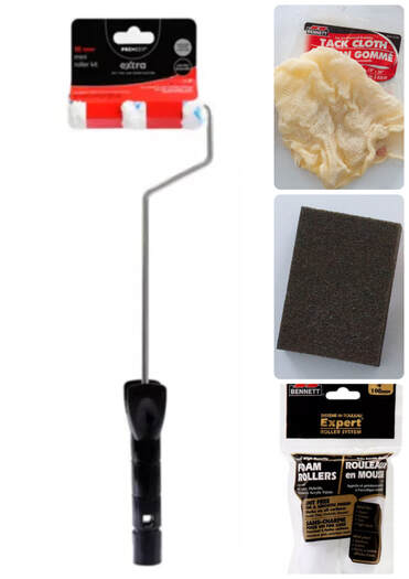 Above are the tools I use for painting Gesso on the boards. Handle of Paint brush, Foam Rollers, Sanding block & Tack cloth to clean up the dust from sanding. Starting with the edges, roll the gesso all around 4 sides, then elevate the board on wooden blocks and do the front (back) side. After 16 hours, lightly sand, use tack cloth to remove excess dust, add a new later of gesso and let dry again for 16 hours. I repeat that three times, then on to the other side of the board. Let the boards dry for a few days before working with them. I do a lot a the same time to maximize efficiencies. Happy Painting!
I got to do something on Friday afternoon that I haven’t done in two full years, though the last time I did it this way was in the winter of 2016. What did I do, you ask!?! I started to teach my Drawing 1 class in Ms. Townsend’s grade 7 class at Range Lake North School. The last time I was in RLN I was teaching drawing and painting to a grade 8 class. I completely forgot how FUN teaching art is. The giggles when I did the blind contour drawing of scissors was great. It is lovely to take the pressure off because they saw how mine turned out. 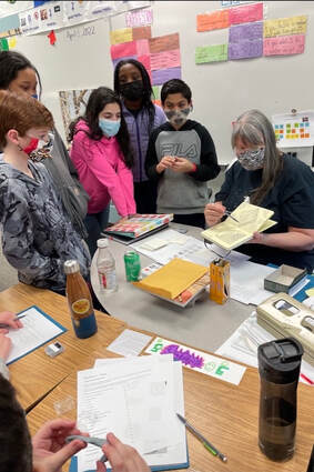 I teach in a very systematic, step by step approach. Each step of the way comes with a handout that becomes a future reference for the students. With each lesson I am developing skills that build one on top of another, which then allows to student to with greater confidence in their ability to draw. With the advent of computers young people don’t spend much time with a pencil/pen in their hand. This generally means that though they do print, they don’t do it often enough to not hold the pencil too tightly. This leads to two problems: 1. Their hand gets tired really quickly, and 2. They draw like they are carving marble. As a result, I spent a fair amount of time during the first few classes walking around helping them to draw lighter which in turns has them holding their pencil lighter. The one thing that dawned on me the evening before I went in, is that the masking mandate has been removed. Like so many, I have been in isolation and haven’t really done large group get togethers. I am happy to report that everyone in the class wore their mask…including me. 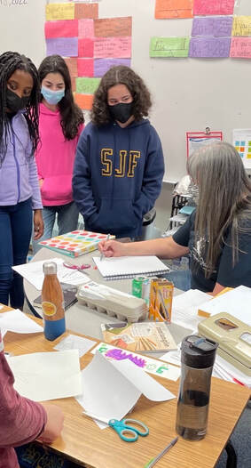 I am totally excited to do session two in 2 weeks and start their after school program then as well. So much fun!
|
Shawna Lampi-LegareeShawna is capturing moments of beauty from the world around her. Archives
June 2023
Categories
All
Mailing List
To receive an update about new paintings, workshops and other art related news, subscribe to my mailing list below. You can unsubscribe at any time. 
|