|
This weeks video is the 2nd in a 3 part series all focused in on exploring various colour wheels. I have done the Gurney Yurmby version but today I go backwards into my childhood to create the colour wheel that most of us are very familiar and comfortable with.
A colour wheel that we learned had primary, secondary and tertiary colours that could be mixed only from the three colours. Not really so truthful that claim...yes we could mix all 12 colours from 3 but we don't always get clear nice colours that we think about in a colour wheel. I have begun exploring this notion in a series of videos "Limited Palette: Red Blue Yellow - 1, 2, 3 and 4. (Click on the numbers to see the videos). What makes this colour wheel different from the "Yurmby" version, you ask? This version has 3 primary colours; Yellow, Red and Blue at equal distance around the wheel. But in the "Yurmby" colour wheel version (Blog post click here) there are 6 primary colours of Red/Blue/Green and Cyan/Magenta/Yellow. We will explore why that makes a such difference when I create the 3rd and final colour wheel version. You will notice that I have substituted paints for the secondary and sometimes for the tertiary colours so that the colour wheel does have the bright clear colours that we want in a colour wheel. In the traditional colour wheel I use the following colours: Cadmium Yellow Light (Primary), Cadmium Orange (Secondary) Cadmium Red Medium (Primary) Alizarin Crimson Hue Permanent (Liquitex) Dioxazine Purple (Liquitex) (Secondary) Ultramarine Blue Cerulean (Primary) Permanent Green Light. (Secondary) Thanks for dropping by. See you in the next art video.
0 Comments
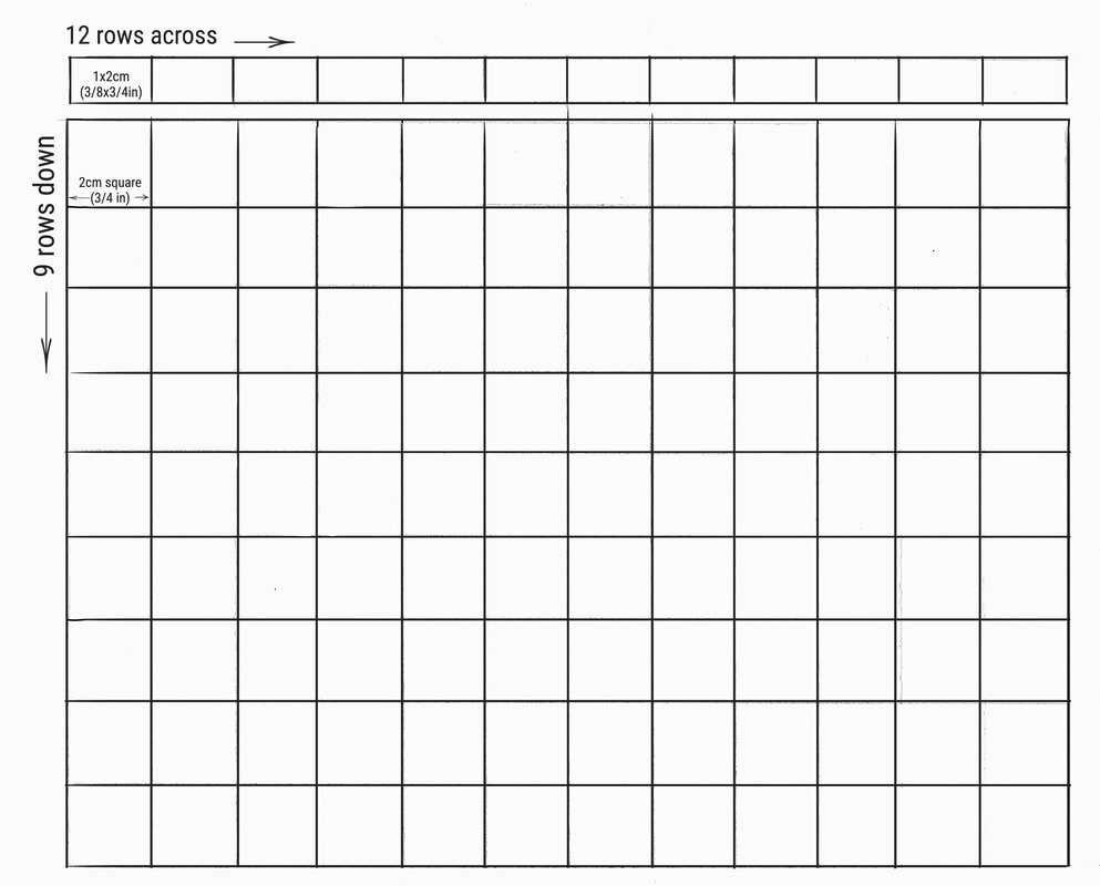
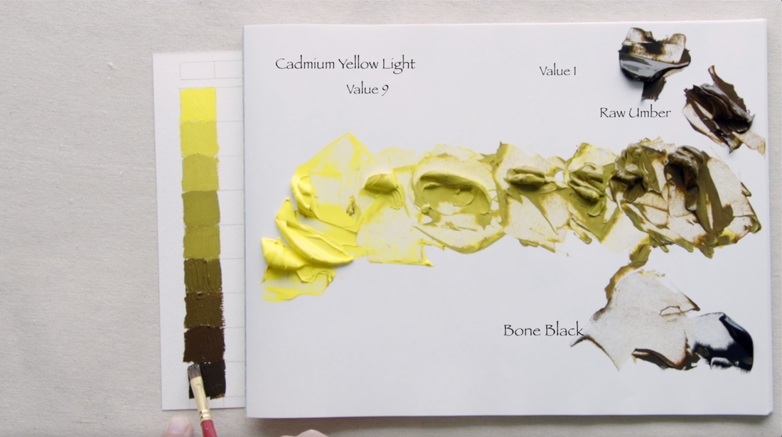
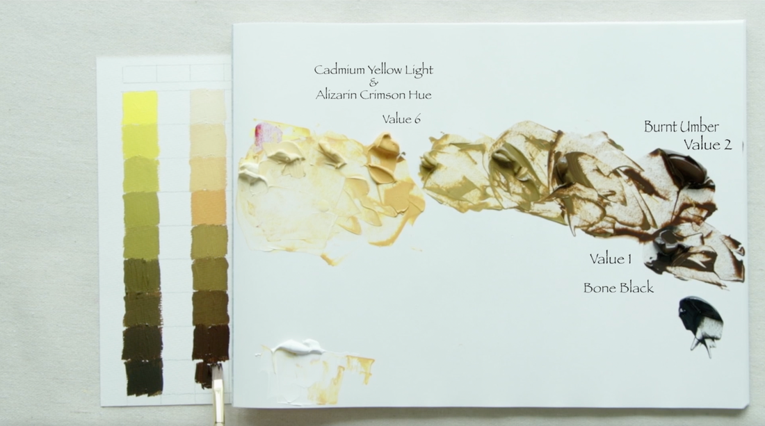
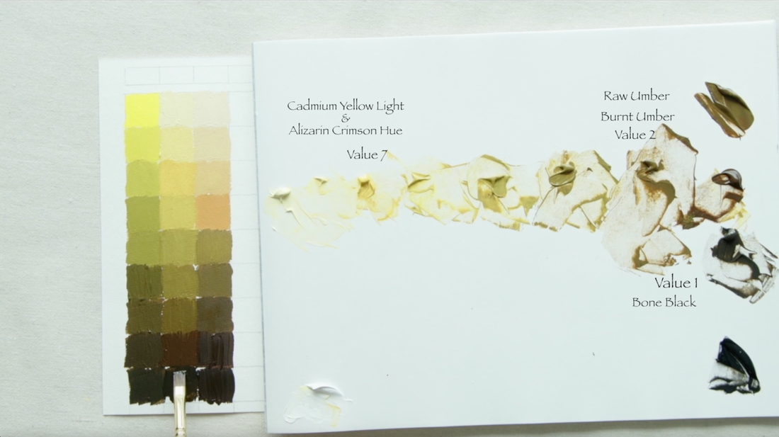
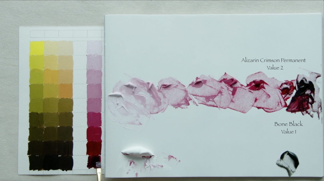
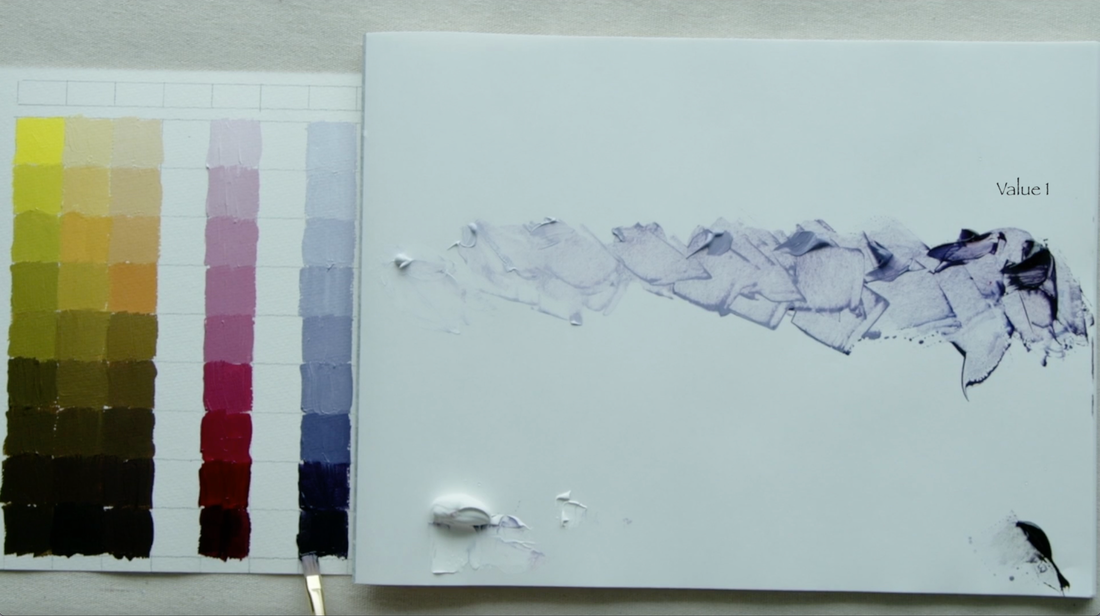
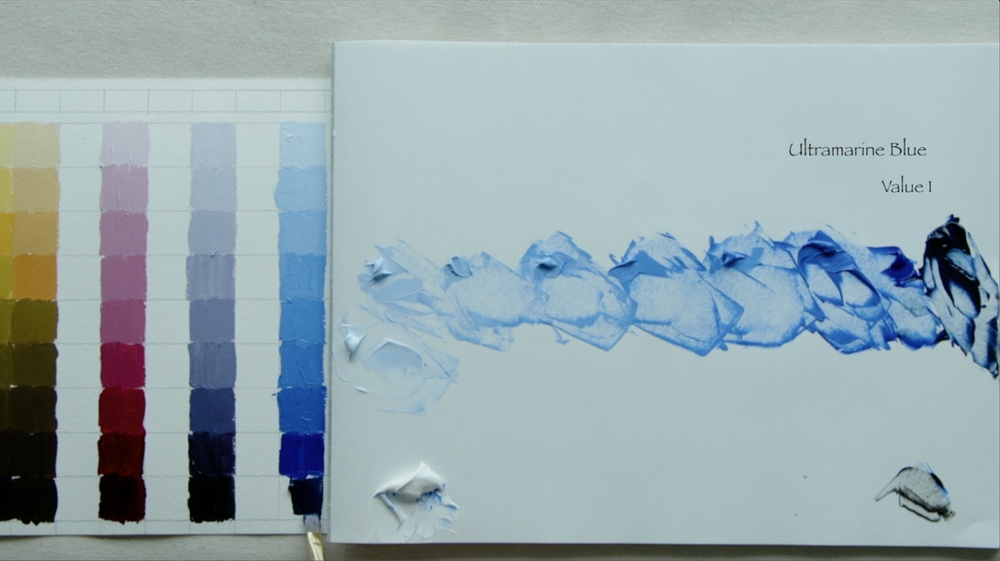
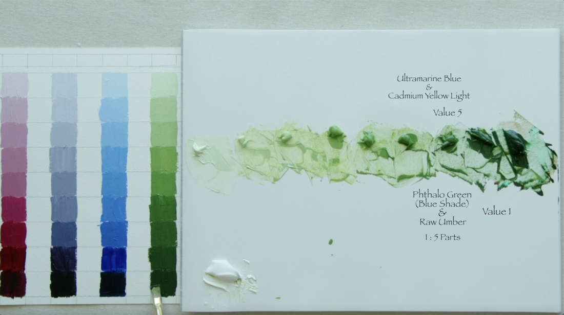
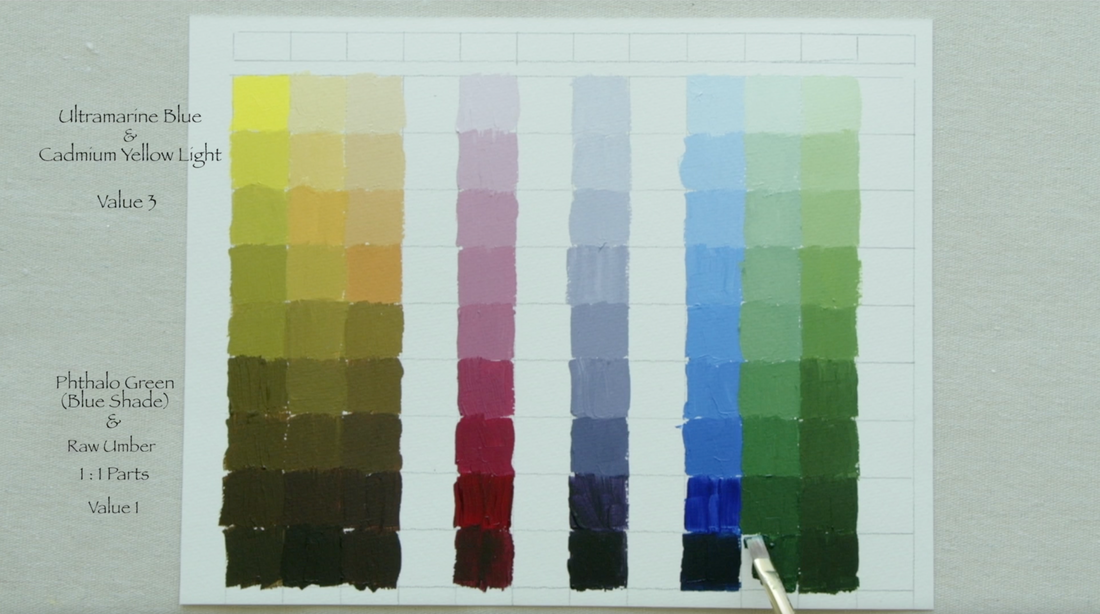
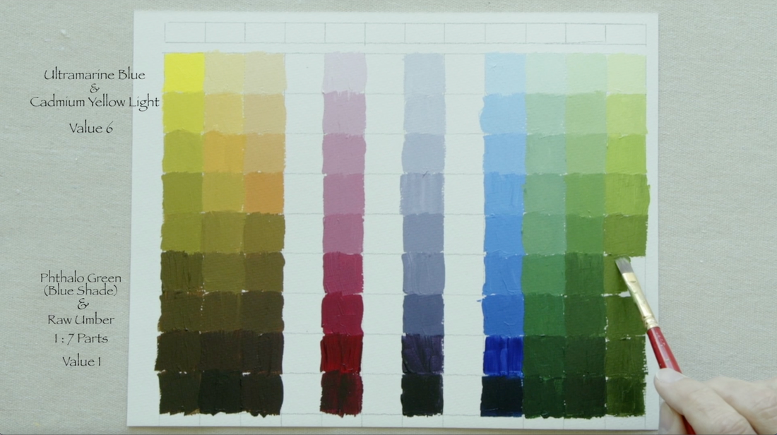
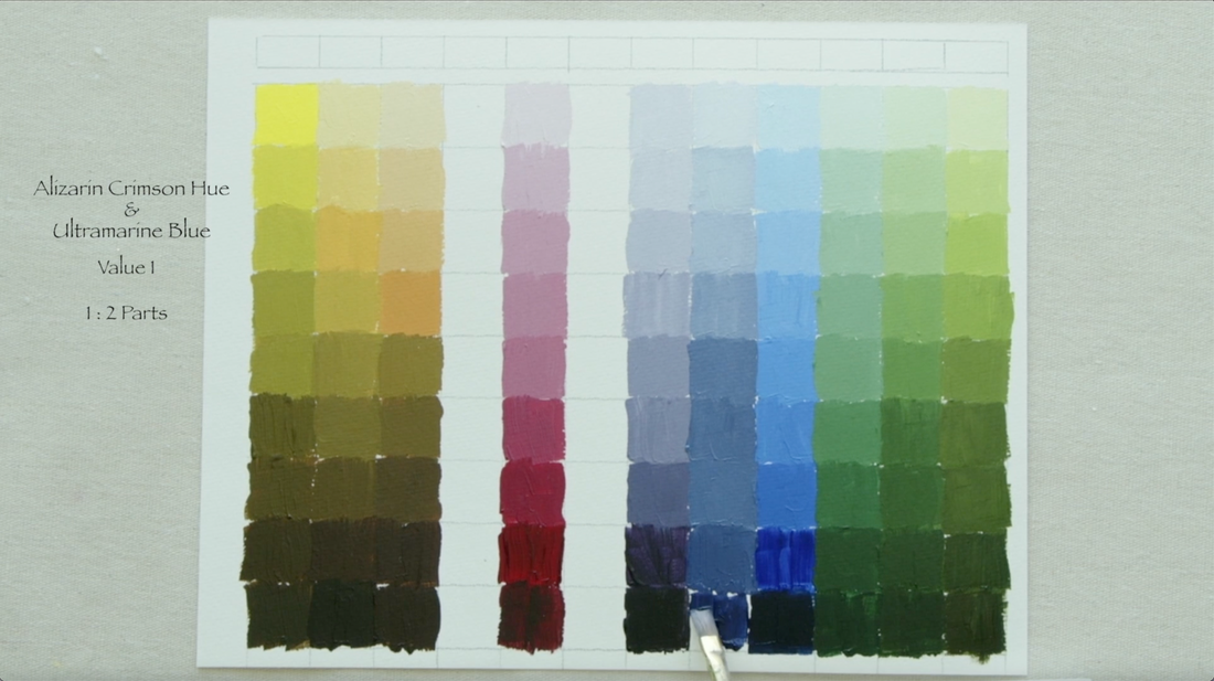
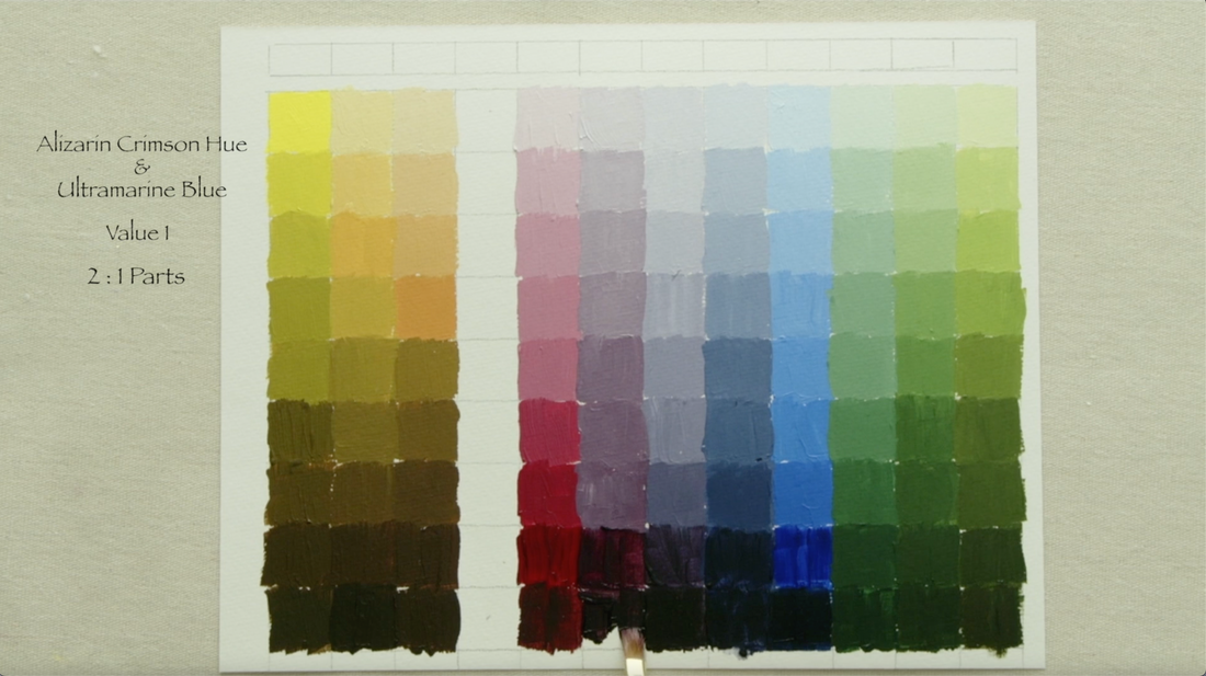
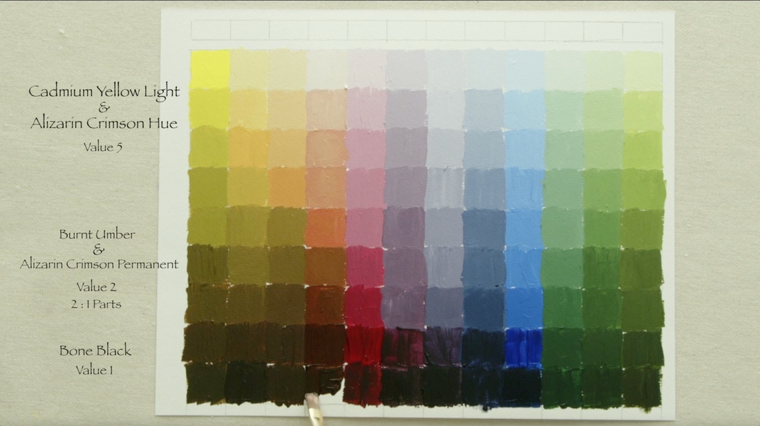
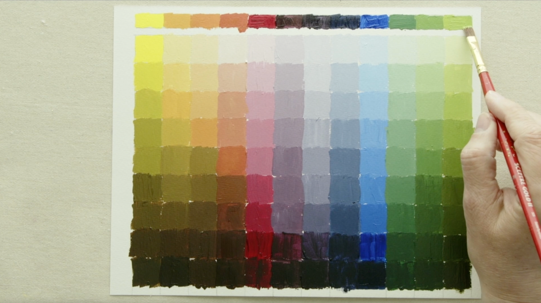
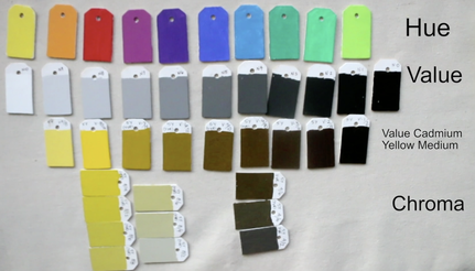
It is tempting to use black to darken the value of a colour that you're working with. Sometimes what looks like the easy answer gives us the wrong result. Why does it not turn out at all like we thought it would when we add black? It turns out that Black is a low chroma Blue, just like Burnt Umber is a low chroma Orange, and Raw Umber is a low chroma Yellow. They are very dark colours that can lead to confusion at times. In this video I will share a mixing strategy which will change the value of the paint but does not alter the colour we are trying to achieve. This is a very important concept. As we work with the 12 colours we mixed from Alizarin Crimson Hue (Liquitex), Ultramarine Blue and Cadmium Yellow Light (both Golden Paints) in the 1st video of this series, we will be creating value scales that are appropriate to each of the colours. This will require just a few more paint options to help us to create value strings that stay within the same colour range. Here are the extra colours you will need to gather: Raw Umber, Burnt Umber, Phthalo Green (Blue Shade) and Bone Black. I use very inexpensive pad of watercolour paper for this lesson. I cut the paper down to 26.5x20.5cm (10 1/2x8in). You can get your very own Munsell Accurate Value Scale by clicking the blue text! The measurements for the grid are on the image below. I use pencil, but you can use waterproof pen if you want. Let's start with changing the Cadmium Yellow Light (CYL) paint. CYL is a value 9 directly out of the tube, which means that from Value 8 to Value 1 another paint will have to be added. A low chroma, dark value paint that would give us the results that we are looking for is Raw Umber (Value 2). Raw Umber is a low chroma Yellow. Carefully mix and test each value on the Munsell Accurate Value Scale as you head from value 9 to value 3. Raw Umber alone is the Value 2 spot on the chart. The very last mixture is when Black (Value .5) is be added to the Raw Umber to bring it down to Value 1. This video is a bit higgly piggly in how I paint the value strings. Now on to the second colour which is between CYL and Alizarin Crimson Hue (AC). We will mix these two paints together to a Value 6 as this is the middle value in this section. Add white to create value 7,8 & 9. Then add Burnt Umber (Value 2), which is a low chroma Orange, to create Value 5, 4, & 3. Value 2 is Burnt Umber on its own, and as we have done before, add a bit of black to Burnt Umber to get to Value 1 on the scale. Below on the left is the CYL & AC mixture that we created to a Value 7. You can see this is has more of a Yellow base. We will mix Raw Umber (RU) and Burnt Umber (BU) together 1 : 1, equal amounts of each paint. Add white to create Value 8 and 9, then the RU & BU for Values 6, 5, 4, 3 and 2. Add Black to create the last value of 1. Sometimes the paint we choose makes it easy to make a colour value string. Alizarin Crimson Hue is that kind of colour, as straight out of the tube it is Value 2. Add white to create Value 3, 4, 5, 6, 7, 8 & 9. Using Black to take the AC to Value 1. Below on the left we will be using equal parts of Ultramarine Blue (UB) and Alizarin Crimson Hue (AC) to create this lovely purple. The paint mixture is a Value 1, add white to create all the other values! Easy Peasy!! Ultramarine Blue (UB) is Value 1, add white to create all the other values. This is fun! Below and left: Mix together Cadmium Yellow Light (CYL) and Ultramarine Blue (UB) to a value 5. We shall add white to make Value 6, 7, 8 & 9. Now we are going to mix 1 part Phthalo Green (Blue Shade) to 5 parts Raw Umber. The Phthalos are very powerful colours so to get the green that is appropriate we need to add a lot more Raw Umber for balance. Lower the values 4, 3 & 2, with Value 1 being the Phthalo Green/Raw Umber mixture which is Value 1. Above right: This green is much closer to the blue. We will be mixing UB with CYL to a Value 3, add white to go from Value 4 to Value 9. Mix Phthalo Green (Blue Shade) 1 to 1 with Raw Umber. Use this mixture to do Value 2 & 1. Below left: We will again be mixing CYL with UB this time to a value 6. This creates a green with more of a yellow focus. Add white to accomplish the lighter values of 7, 8 & 9. We will be making a mixture of 1 part Phthalo Green (Blue Shade) to 7 parts Raw Umber to construct the darker values of 5, 4, 3, 2 & 1. Back to the Alizarin Crimson Hue (AC) and Ultramarine Blue (UB). Using 1 part AC and 2 parts UB to make this delicious colour. We are back to the easy ones, as this mixture is a Value 1. Add white for all other values. Below Left: On to the last purple. 2 parts AC and 1 part UB makes a value 1 mixture...add white for all the other values. Above and right. Here we are at the very last colour value string. Mix AC with CYL until the combination reaches a Value 5. Add white to form values 6, 7, 8 & 9. To darken this mixture you will need to use 2 parts Burnt Umber to 1 part Alizarin Crimson Hue which both are Value 2. Use this to form Value 4 & 3. Value 2 is the BU/AC mixture, then add black to bring to a Value 1. Here we are at the end. I just placed the 12 pure colours across the top for reference. I actually made two of these strips and you will see how I use the second one in the final video of this series. I hope that this has been helpful! Any comments or questions...leave them here or on the video. Thanks for stopping by. Lesson 1 - Terms & Hue, Value & ChromaLike every single medium there is consistent language that is regularly used to share ideas and concepts. Acrylic painting is not an exception. In this video I go through the basic terminology that artists use to communicate with. This is language that I used through out the whole course and beyond. As well, I do a quick demonstration of the 3 elements of Colour: Hue, Value & Chroma. Find the link to download the handout for this lesson below.
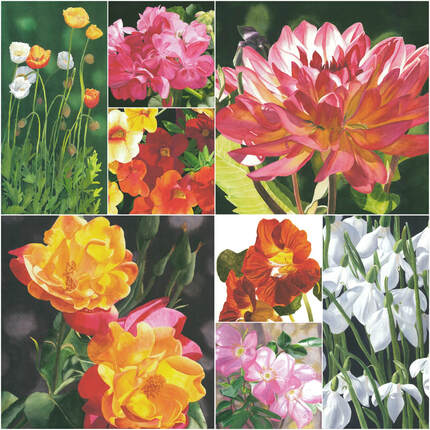
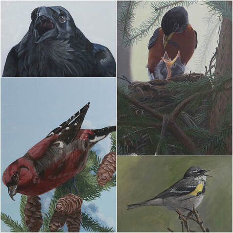
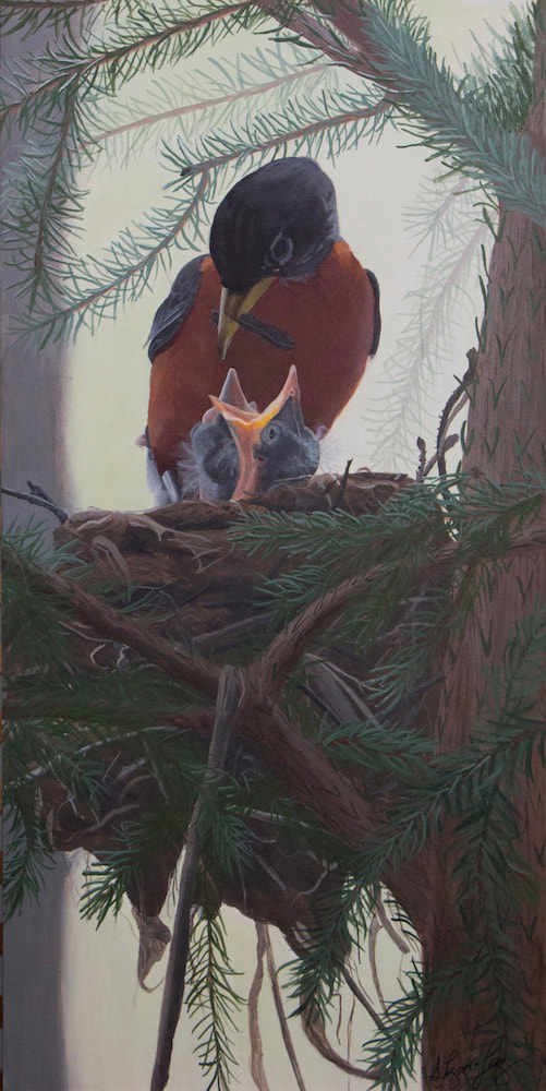
Explaining my art in just a few seconds is not easy. Every artist needs to figure out what is called an “elevator” pitch. How can I hook someone in a very short period of time so that they will be interested enough to go and check out my paintings? It is not so easy to do. Part of my challenge is that I like to paint such a variety of themes. Flowers, birds and still-life’s make the top of my lists…but other topics sneak in randomly. It took me awhile to codify my watercolour flower paintings to I ‘paint summer sunshine all winter long’ (as winter is very long in Yellowknife). I think that works quite well to explain in a simple way what painting flowers make me feel like. I am quite happy with that. Now birds are relatively new to my painting life and I have yet to come up with that perfect phrase that captures how I feel about painting these amazing creatures. I love their antics and how sometimes we don't even notice them around us as they go forth creating new life and living their lives. Maybe you can help me to find the perfect phrase to explain my bird paintings. Check out more bird paintings HERE and comment below what strikes you when you first look at them.
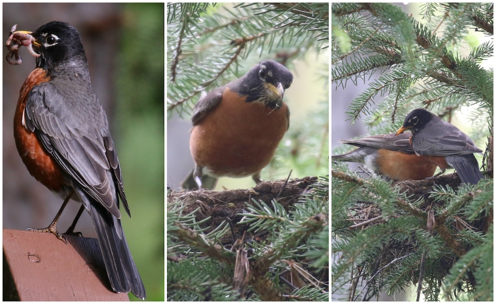
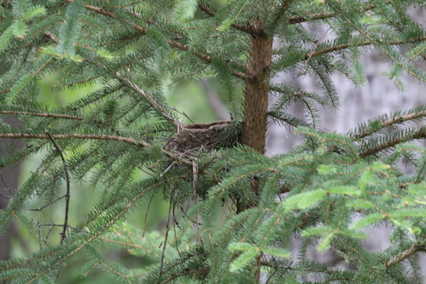
Thanks for dropping by. See you next week Friday. We traveled a fair amount in 2018. The second trip we took last year was to drive from Yellowknife, to the Yukon for Arctic Winter Games meetings (my husbands), then all the way to Tuktoyaktuk and back to Yellowknife. We stopped the second night in northern BC at the Liard Hot Springs. Ian is a hot spring kind of guy… me not so much. My oldest had lent me his 300mm camera lens to use until he came to visit in July and I just walked around looking for birds. I noticed this robin with a beak full of grubs, of course I took some photos. Then it flew to its nest. So cool. Because the area is a park there were boardwalks and stairs to protect the flora and fauna. I just walked up the stairs and was eye level to the nest! I spent a long time photographing the parents coming and going. Sadly, by the time we came through two weeks later the chicks had already fledged. Thanks for stopping by. I will be back next Friday! See you then.
|
Shawna Lampi-LegareeShawna is capturing moments of beauty from the world around her. Archives
June 2023
Categories
All
Mailing List
To receive an update about new paintings, workshops and other art related news, subscribe to my mailing list below. You can unsubscribe at any time. |
