|
Join me as we explore the most magical part of painting...mixing and matching colours that we see in our subject matter. Grab the Colour Wheel that was created in Lesson 6, and chose a wide variety of paint colour chips from your local home paint store. We shall decide where they land on our colour wheel as this is the first step to figuring out what paints to use to recreate a specific colour. Sometimes colours are simple, but as soon as the chroma is dropped it can be a bit harder to know where to start. 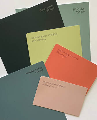 I love the names that home paint companies use on their chips: “Peaceful Garden”, “Deep Secret”, “Wild Blue Yonder”, “Kept Love Letters” and “Dancing Leaves” to name just a few that are in the video. They must have an app for that…or they all get some wine flowing and start naming them as a team. I would love to be part of a “name the paint” wine party…if they do that. Anyway, it is cute. 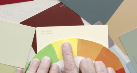 I started with what I thought was the simplest colour “Spring Daffodils”. Right away you know the colour is a yellow. That is simple…the complex part is Which Yellow? Cadmium Yellow Light seems wrong, but how about Cadmium Yellow Medium. Well that seems to be a match. Now if we add some of the neutral grey in, we will lower the chroma perfectly. 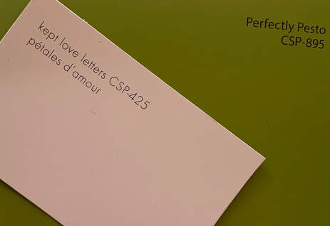 I chose to match the two colours “Perfect Pesto” and “Kept Love Letter”. To me this is the truly magical part of painting...mixing paint to match what one is seeing in their subject matter of choice. I will use two colour combos to get to the final colour. Neither are right or wrong, they are just different roads to get to the same destination. Let’s start with the “Perfect Pesto”. I am looking at the colour wheel and though it has a bit of green in it…I feel like it could be a yellow. So, let’s see if I am on the right path. The value of the colour chip is 5. The paints I used are Cadmium Yellow Light, Permanent Green Light, Raw Umber, Dioxazine Purple and Value 5 Neutral Grey. 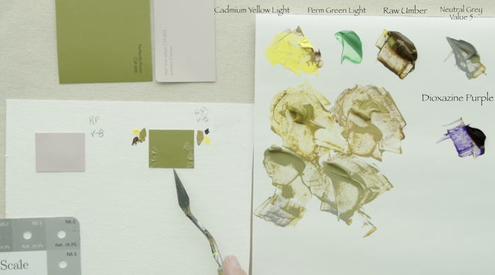 Version 1: Cadmium Yellow Light is a Value 9. This means I will start by lowering the value with Raw Umber until it is Value 5. Version 2: Next we mix Cadmium Yellow Light with Dioxazine Purple to a value 5. Notice the difference between the two value 5 versions. Take the first mixture of Cadmium Yellow Light and Raw Umber and mix in Value 5 Neutral Grey testing it on the paint chip until I have a match. Wow. That worked really well. What I notice with the Cadmium Yellow Light and Dioxazine Purple is that the colour has shifted to a more chromatic red yellow. By adding in the Value 5 Neutral Grey this will bring the chroma down without changing the colour. Keep adding in the grey until the colour is matched. Did you realize that I never even touched the Permanent Green Light? The colour may look like it was a Green Yellow but it turned out to come from Cadmium Yellow Light. Interesting isn't it. 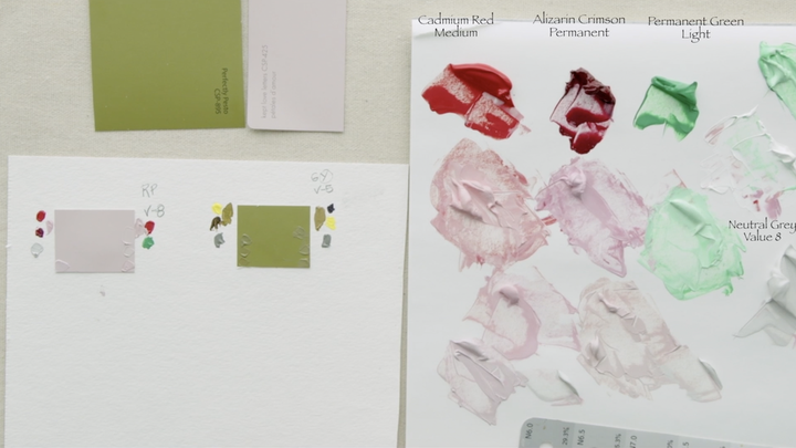 On to the “Kept Love Letter”. Using the colour wheel I can see that the paint chip tends slightly towards a Red Purple. I then determined that the value of this chip is Value 8. The paints I have chosen to work with are from our basic colour palette; Cadmium Red Medium, Alizarin Crimson Hue Permanent, Permanent Green Light, Titanium White and a Neutral Grey Value 8. Our goal is to create three puddles of Value 8. Using Titanium White to lighten the value of each of the three paint colours. Step 1: Cadmium Red Medium to Value 8 Step 2: Alizarin Crimson Hue Permanent to Value 8 Step 3: Permanent Green Light to Value 8 Step 4: Place an amount of Value 8 Neutral Grey close by. Version 1: I chose to do a 50/50 mixture of Cadmium Red Medium and Alizarin Crimson because I saw that the colour what flirting with being a Purple Red. Then the chroma was brought down with the Value 8 Neutral Grey paint. I had great success as I got to the colour in the first attempt. Sometimes that happens…but not always. Version 2: In this version we are going to use the Complimentary process. Take some Cadmium Red Medium into a separate pile, then add a bit of Permanent Green Light. Permanent Green Light is quite a blue colour, so using it with the CRM will bring it towards that Purple Red. Be timid with the amount of green paint you add in as you start…little bit by little bit. I didn’t find that this approach got me to exactly where I wanted to go. The colour was far too chromatic and adding more green to the red wouldn't have got the paint to where it needed to be. At this point I added a bit of the Value 8 Neutral Grey to bring the chroma down without changing the colour much more. This allowed the colour to be neutralized just a little bit more to completely match the paint chip. TA DA and magically we arrived at the two colours even with different approaches in the paint colours I used.
0 Comments
Your comment will be posted after it is approved.
Leave a Reply. |
Shawna Lampi-LegareeShawna is capturing moments of beauty from the world around her. Archives
June 2023
Categories
All
Mailing List
To receive an update about new paintings, workshops and other art related news, subscribe to my mailing list below. You can unsubscribe at any time. 
|