|
We are about to dive deep into one of the most valuable paint mixes in our arsenal. This value string will become a huge tool as we go along. In fact, we will be using the Neutral Grey Scale in the upcoming Lessons 9 to 13. Before we start, I want to share with you an apparatus that will help you to ensure that your Neutral Grey Scale is correct in both value and whether there is enough of the Raw Umber mixed into the Bone Black. It is called a Munsell-Accurate Value/Grey Scale for Artists. A fellow named Paul Centore created it and sells it through eBay: https://www.ebay.com/itm/223003792036 What are the properties that make this tool something I would recommend for any artist to get? Well, let me tell you. It has a ½ step value range from Neutral (N) 9.0 to N1.0. It is plasticized so that you can put your paint right on it to compare the value to and it wipes off easily. There are holes in each of the value steps. This allows you to place it over an object and find the right value (as long as you squint) of what you are looking at. 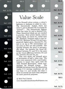 Before we start mixing paint, draw the 3 grids for the value scales on the inexpensive watercolour paper that you have bought from the craft area in a local store. This will become the chart you can place in your binder. 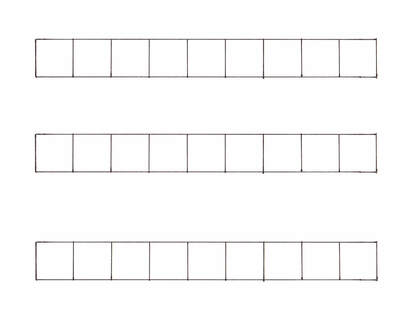 With the palette paper placed in landscape, we will start with making a value string with Titanium White and Bone Black from Value 9 to 1 at the top of the page. The paint comes out at Value 0.5 directly out of the tube. This string is a low chroma blue. If you added it to another colour without neutralizing it, you would also change the colour rather than changing the chroma only. 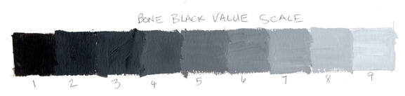 The second value string will be placed at the bottom of the palette paper using Titanium White and Raw Umber. Again, we will do it from Value 9 to 1. Raw Umber has a value of 2 right out of the tube which means to get to Value 1 we need to add a small amount of Bone Black to complete our string. 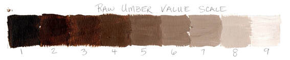 Surprisingly we have made our colour mixing life much easier by doing these value strings as we come to the next step of putting both paint combinations together. Take a bit of the Bone Black V9 and place it in between the two strings on the palette paper. Add a small amount of the corresponding Raw Umber V9 and mix. Test against the Munsell-Accurate Value Scale until it matches the value and the colour of the N9.0 square. Proceed with the rest of the values doing the same testing until the Neutral Value string is mixed. 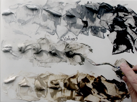 Now we need to make larger amounts to fill these small containers, that way you don’t have to spend extra time each of the next 5 lessons mixing the Neutral Grey Scale again and again. I would recommend that you start with Value 9 make a big puddle of each and then bring them together and place them in the container. This means that if the container is filled and there is more paint mixed already, you can add more of the Bone Black and Raw Umber into their corresponding piles and bring the value down to Value 8 and so on and so forth until you have done the whole scale. 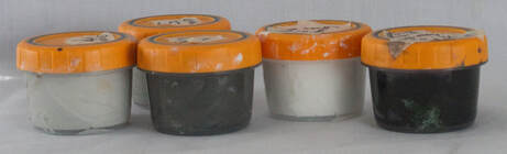
1 Comment
Each pigment that we use has a range of attributes that have an impact while mixing the paints together. We use language to explain one of the key properties when we use the term ‘bias’ of the paint. We say that the paint is either ‘cool’ or ‘warm’. This way of expressing does help us to visualize this particular trait of the pigment. We will use one new paint colours in this lesson. The first modification is that I have exchanged the low chroma Yellow Ochre for the much higher chroma Cadmium Yellow Medium. The higher chroma Yellow will be helpful in this lesson. When I say that a “red is cool”, that means that the pigment has a blue bias to the colour. An example is Alizarin Crimson and Quinacridone Crimson, both reds have a very definite blue bias. We would categorise these paints as being a Red Purple. Both these pigments are moving away from Red towards Purple on the colour spectrum. But a warm Red is leaning more towards Yellow which means we see more Orange in the Red as we do in Cadmium Red Medium. How would this cool/warm factor impact mixing between the primary colours trying to create the perfect orange or purple or green? This is what we shall explore in this video and blog post. 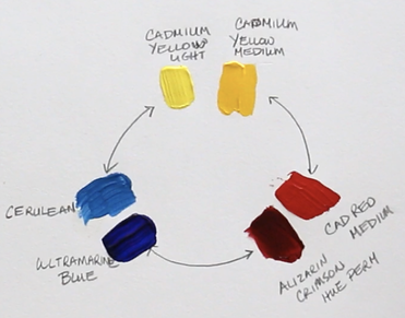 Cadmium Yellow Light (has a touch of blue in it – Cool) Cadmium Yellow Medium (has definite tones of red – Warm) Cadmium Red Medium (tones of yellow – Warm) Alizarin Crimson Hue (tones of blue – Cool) Ultramarine Blue (tones of red which makes it look purple – Cool) Cerulean Blue (tones of yellow – Warm) We will experiment with mixing Cadmium Yellow Medium (warm) with Cadmium Red Medium (warm) to see the resulting colour that we create. The colour that we get is Orange and it is the most chromatic orange that we will be able to create with the paints we are working with. Why is this? Well, there is no hint of blue in either of those two colours. All we have is Yellow and Red being mixed together. But when we work with Cadmium Yellow Light (cool) and Alizarin Crimson Hue (cool) both these colours have blue in them. Now we have mixed Yellow, Red and tiny bit of Blue which means the resulting orange is duller and has a lower chroma. 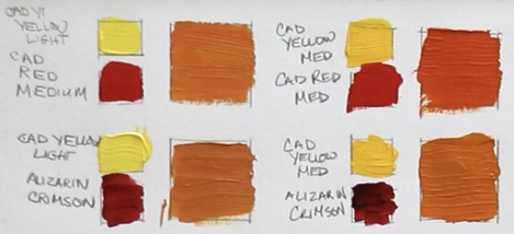 As we explore creating purples with the reds and blues we are using, what do we notice? The purple made with the Alizarin Crimson Hue (cool) and Ultramarine Blue (cool) is very dark, but when we add white it is the purer purple. This is because we are only mixing colours that have Red and Blue. Once we mix Cadmium Red Medium (warm) and Cerulean Blue (warm) and the purple is very low chroma which looks greyed out. We have now mixed Red, Blue and a fair amount of Yellow to get this particular purple. 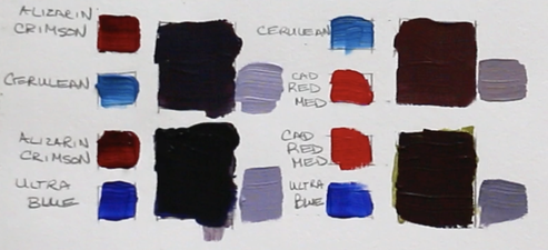 The same result happens when we mix the greens from Yellow and Blue. Cadmium Yellow Light (cool) and Cerulean Blue (warm) create the most chromatic green. Again, we are only mixing Yellow and Blue with these two pigments. But put together Cadmium Yellow Medium (warm) and Ultramarine Blue (cool) the green is smokier in look because both those pigments have added Red into the mixture. 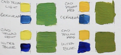
Today we are doing a traditional colour wheel. It seems like a comfortable place to start as most people understand the idea that there are three primary colours - Yellow, Red & Blue; three secondary colours - Green, Purple & Orange, and the tertiary colours we mix are between the primary and secondary paint colours. We have been taught about this version of a colour wheel since childhood. Though I have learned that when I go to mix colours with the idea of 3 primary colours, I don’t always have as much success. In future videos I will explore other variations of colour wheels because there is a lot more to think about in this colour mixing world. 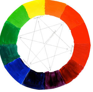 We are making our own colour wheel because of the inherent limitations that paint pigments have. Our eyes are so sensitive to many values and colours but the pigments that we work with don’t have a very great range at all. When we paint, we are attempting to create a recognizable 3-dimensional illusion on a 2-dimensional surface. We hope our painting expresses our experience with whatever object/place that we want to share with the art viewer. This colour wheel tool will be used in future videos of ACRYLIC PAINTING 101: Basics for Beginners course.
|
Shawna Lampi-LegareeShawna is capturing moments of beauty from the world around her. Archives
June 2023
Categories
All
Mailing List
To receive an update about new paintings, workshops and other art related news, subscribe to my mailing list below. You can unsubscribe at any time. 
|