|
In this lesson we are exploring the idea of Chroma with the focus of the third aspect of colour. The three elements of colour are: Hue, Value & Chroma. Head over to this Video ( Click HERE) for a visual representation of these 3 elements. This is the first of several videos that we will be using the Neutral Grey Value paint mixes that we created in Lesson 8 (Click here) to change the Chroma of the Yellow Hue of Cadmium Yellow Medium (CYM). Draw a Chroma chart out. Image is below and if you head over to the class handouts you will be able to download a proper sized pdf with the measurements on it. 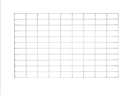 First, we need to create a Value string of the CYM. Straight out of the tube Cadmium Yellow Medium paint starts off at Value 8. The value mixes will be from Value 9 to Value 1. To get to Value 9, add Titanium White. To create Values 7 to 2 use a 50/50 mix of Raw Umber (low chroma Yellow) and Burnt Umber (low Chroma Orange). Why do we use this mixture? Cadmium Yellow Medium lands halfway between Yellow and Orange. If we brought down the value with either Raw Umber or Burnt Umber it would change the Hue as well as the value. But the 50/50 combo of those two paints will only adjust the Value not the Hue. The 50/50 mix of Raw Umber and Burnt Umber is Value 2. To get to Value 1 add the Black you are using. In my case, that is Bone Black by Golden. Across the top we have the Value mixes of the CYM. Now across the bottom add the corresponding Neutral Value paints. 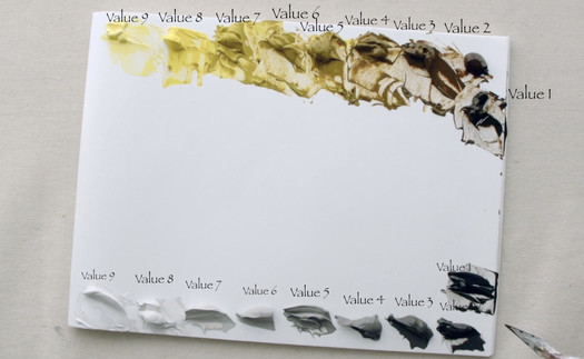 The goal of this chart is to change the Chroma. We do this by adding the same value of Neutral Grey paint into the identical value of the Cadmium Yellow Medium. The Neutral Grey value string is a Chroma 0. Cadmium Yellow Medium straight out of the tube, on the other hand, is a Value 8 / Chroma 16 on the chart. The very high Chroma rating is why Yellow tends to be a difficult colour to use. For this reason, I thought it was a great place to learn how to manage working with highly chromatic colours. As the value of CYM drops, so does the Chroma naturally. Each value seems to be 1 Chroma drop. This means that Value 7 is Chroma 14, Value 6 is Chroma 12, Value 5 is Chroma 10, ect. If you are really wanted to go down the rabbit hole with Munsell with the focus on Chroma. Head on over to Nielson Carlin and follow his videos on Chroma Charts.
0 Comments
We are about to dive deep into one of the most valuable paint mixes in our arsenal. This value string will become a huge tool as we go along. In fact, we will be using the Neutral Grey Scale in the upcoming Lessons 9 to 13. Before we start, I want to share with you an apparatus that will help you to ensure that your Neutral Grey Scale is correct in both value and whether there is enough of the Raw Umber mixed into the Bone Black. It is called a Munsell-Accurate Value/Grey Scale for Artists. A fellow named Paul Centore created it and sells it through eBay: https://www.ebay.com/itm/223003792036 What are the properties that make this tool something I would recommend for any artist to get? Well, let me tell you. It has a ½ step value range from Neutral (N) 9.0 to N1.0. It is plasticized so that you can put your paint right on it to compare the value to and it wipes off easily. There are holes in each of the value steps. This allows you to place it over an object and find the right value (as long as you squint) of what you are looking at. 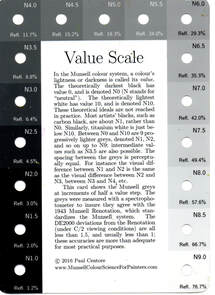 Before we start mixing paint, draw the 3 grids for the value scales on the inexpensive watercolour paper that you have bought from the craft area in a local store. This will become the chart you can place in your binder. 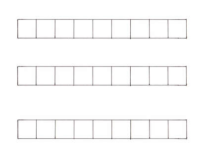 With the palette paper placed in landscape, we will start with making a value string with Titanium White and Bone Black from Value 9 to 1 at the top of the page. The paint comes out at Value 0.5 directly out of the tube. This string is a low chroma blue. If you added it to another colour without neutralizing it, you would also change the colour rather than changing the chroma only. 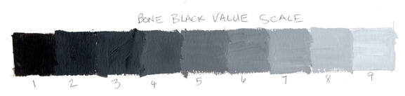 The second value string will be placed at the bottom of the palette paper using Titanium White and Raw Umber. Again, we will do it from Value 9 to 1. Raw Umber has a value of 2 right out of the tube which means to get to Value 1 we need to add a small amount of Bone Black to complete our string. 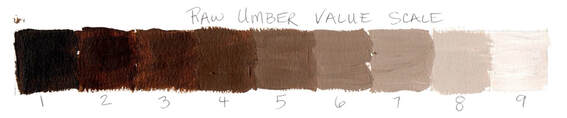 Surprisingly we have made our colour mixing life much easier by doing these value strings as we come to the next step of putting both paint combinations together. Take a bit of the Bone Black V9 and place it in between the two strings on the palette paper. Add a small amount of the corresponding Raw Umber V9 and mix. Test against the Munsell-Accurate Value Scale until it matches the value and the colour of the N9.0 square. Proceed with the rest of the values doing the same testing until the Neutral Value string is mixed. 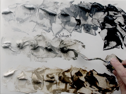 Now we need to make larger amounts to fill these small containers, that way you don’t have to spend extra time each of the next 5 lessons mixing the Neutral Grey Scale again and again. I would recommend that you start with Value 9 make a big puddle of each and then bring them together and place them in the container. This means that if the container is filled and there is more paint mixed already, you can add more of the Bone Black and Raw Umber into their corresponding piles and bring the value down to Value 8 and so on and so forth until you have done the whole scale. 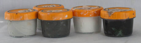
Each pigment that we use has a range of attributes that have an impact while mixing the paints together. We use language to explain one of the key properties when we use the term ‘bias’ of the paint. We say that the paint is either ‘cool’ or ‘warm’. This way of expressing does help us to visualize this particular trait of the pigment. We will use one new paint colours in this lesson. The first modification is that I have exchanged the low chroma Yellow Ochre for the much higher chroma Cadmium Yellow Medium. The higher chroma Yellow will be helpful in this lesson. When I say that a “red is cool”, that means that the pigment has a blue bias to the colour. An example is Alizarin Crimson and Quinacridone Crimson, both reds have a very definite blue bias. We would categorise these paints as being a Red Purple. Both these pigments are moving away from Red towards Purple on the colour spectrum. But a warm Red is leaning more towards Yellow which means we see more Orange in the Red as we do in Cadmium Red Medium. How would this cool/warm factor impact mixing between the primary colours trying to create the perfect orange or purple or green? This is what we shall explore in this video and blog post. 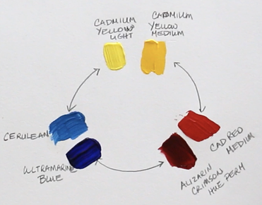 Cadmium Yellow Light (has a touch of blue in it – Cool) Cadmium Yellow Medium (has definite tones of red – Warm) Cadmium Red Medium (tones of yellow – Warm) Alizarin Crimson Hue (tones of blue – Cool) Ultramarine Blue (tones of red which makes it look purple – Cool) Cerulean Blue (tones of yellow – Warm) We will experiment with mixing Cadmium Yellow Medium (warm) with Cadmium Red Medium (warm) to see the resulting colour that we create. The colour that we get is Orange and it is the most chromatic orange that we will be able to create with the paints we are working with. Why is this? Well, there is no hint of blue in either of those two colours. All we have is Yellow and Red being mixed together. But when we work with Cadmium Yellow Light (cool) and Alizarin Crimson Hue (cool) both these colours have blue in them. Now we have mixed Yellow, Red and tiny bit of Blue which means the resulting orange is duller and has a lower chroma. 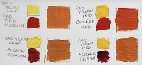 As we explore creating purples with the reds and blues we are using, what do we notice? The purple made with the Alizarin Crimson Hue (cool) and Ultramarine Blue (cool) is very dark, but when we add white it is the purer purple. This is because we are only mixing colours that have Red and Blue. Once we mix Cadmium Red Medium (warm) and Cerulean Blue (warm) and the purple is very low chroma which looks greyed out. We have now mixed Red, Blue and a fair amount of Yellow to get this particular purple. 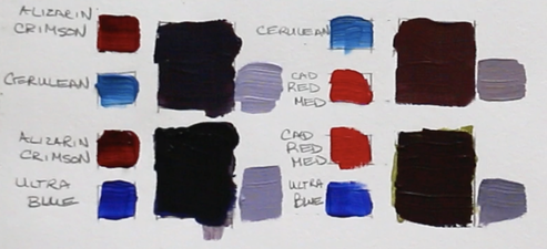 The same result happens when we mix the greens from Yellow and Blue. Cadmium Yellow Light (cool) and Cerulean Blue (warm) create the most chromatic green. Again, we are only mixing Yellow and Blue with these two pigments. But put together Cadmium Yellow Medium (warm) and Ultramarine Blue (cool) the green is smokier in look because both those pigments have added Red into the mixture. 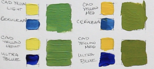
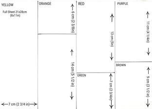
Today we are doing a traditional colour wheel. It seems like a comfortable place to start as most people understand the idea that there are three primary colours - Yellow, Red & Blue; three secondary colours - Green, Purple & Orange, and the tertiary colours we mix are between the primary and secondary paint colours. We have been taught about this version of a colour wheel since childhood. Though I have learned that when I go to mix colours with the idea of 3 primary colours, I don’t always have as much success. In future videos I will explore other variations of colour wheels because there is a lot more to think about in this colour mixing world. 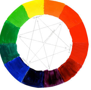 We are making our own colour wheel because of the inherent limitations that paint pigments have. Our eyes are so sensitive to many values and colours but the pigments that we work with don’t have a very great range at all. When we paint, we are attempting to create a recognizable 3-dimensional illusion on a 2-dimensional surface. We hope our painting expresses our experience with whatever object/place that we want to share with the art viewer. This colour wheel tool will be used in future videos of ACRYLIC PAINTING 101: Basics for Beginners course.
Now we get to explore the magic even further. This is one of the major the practices that I love to do the most. That is exploring paint colours and how they interact with each other. Pure magic and so liberating. Today we start with Cadmium Yellow Light as the colour we are mixing into each of the paints we are working with in this lesson. 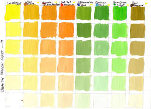 I do work with a limited palette because I am not what artist Karin Jurick called a ‘condiments girl’. That is a person who uses 30 or 40 or more different colours of paint. That very idea feels stressful to me in two ways. One in the cost and the second in trying to remember what I mixed to get that perfect colour. Too many options would be difficult to manage for me. Thankfully ever artist is different, and we all enjoy our own way of painting. This colour chart that we are doing has only 8 colours, a warm and cool of Yellow, Red, Blue, a Green and Raw Umber. You have a choice which Blue or Green you use. You are more than welcome to change the Cerulean Blue for Phthalo Blue (green) and to change the Permanent Green Light to a Phthalo Green (blue). These are your charts after all. Colour Charts are my biggest TOOL that I use on repeat. Having them as a resource helps me to save a lot of time and paint as I begin a new work. What always is interesting to me is that I can see that there are maybe 2 or 3 different ways to get to a colour I want to mix. With this knowledge I can choose which small grouping of paints will be the best for the overall painting. You are also building a great deal confidence in your colour choosing process because you have a paint mixing strategy that works every single time. You have created and invaluable resource out of the paint colours that you want to use. Below are a more colour charts. 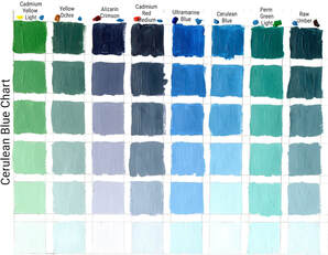 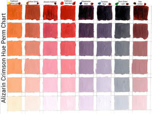 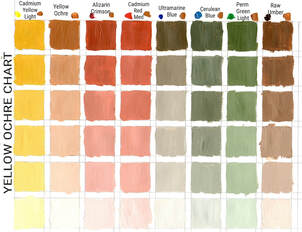
Many years ago, I did my first set of colour charts. I was reading Richard Schmid’s ALLA PRIMA II Everything I know about Painting –and more and he talked about doing colour charts. He said that it took him two weeks to create them all but that the time he saved over the years was immeasurable. He also mentioned that his paintings took a giant leap forward because he could see the colours he was looking at and how to recreate them. In lesson 4 it’s all about creating your very first colour chart. We will start with the paint directly out of the tube and add white. We are keeping it simple. Now every paint is a different value out of the tube. Cadmium Yellow Light is the lightest value of all the paints (other than white) that we are using during this course. It is a value 9, so adding white means that we are only working from Value 9 to Value 10 (white). This will create very subtle value shifts. But when we get to Ultramarine Blue, that is a different story. Its value out of the tube is 2, which is dark. The 6 spaces we are using represent much larger value jumps of this colour. There are some other skills that we are developing as we make our charts. If you are just starting with a palette knife you know how awkward it feels. That changes with practice using it, and colour charts are a perfect way to ‘practice until perfect’. The second skill is learning to recognize value shifts, a valuable understanding as we learn to create the illusion of form. 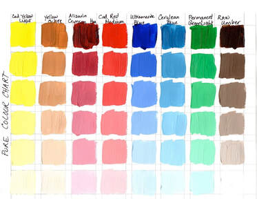 Subscribe on Youtube to keep up to date with the latest of my Acrylic Painting 101 class. There are a number of videos to come yet. It is a fairly comprehensive beginner acrylic painting course.
In Lesson 3 we start to play with our paint, which is always the fun part! We will create a test page that explores the acrylic paint quality of transparency and opacity. This is a practical lesson that will help you to chose the best paint options when you go to start a new project. I also touch on the idea of "cool" or "warm" bias of paint. We will circle back to this quality of the acrylic paint in a later lesson. Below is the worksheet with all the measurements to create your own chart for this lesson.
Subscribe on Youtube to keep up to date with the latest of my Acrylic Painting 101 class. There are a number of videos to come yet. It is a fairly comprehensive beginner acrylic painting course.
All about reading our Paint Tubes this week!This is a very short lesson. I discovered over the years that knowing what information is on your paint tubes helps to save money! It helps to know if the paint is made with one pigment or multiple pigments. When mixing paint the more pigments the more complex it is. I try to keep to working with single pigment paint colours, tho there are some exceptions. The one exception is Alizarin Crimson Permanent Hue. I did a test on the various options and chose to use the brand Liquitex for this pigment. 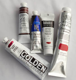 Subscribe on Youtube to keep up to date with the latest of my Acrylic Painting 101 class. There are a number of videos to come yet. It is a fairly comprehensive course.
Lesson 1 - Terms & Hue, Value & ChromaLike every single medium there is consistent language that is regularly used to share ideas and concepts. Acrylic painting is not an exception. In this video I go through the basic terminology that artists use to communicate with. This is language that I used through out the whole course and beyond. As well, I do a quick demonstration of the 3 elements of Colour: Hue, Value & Chroma. Find the link to download the handout for this lesson below. 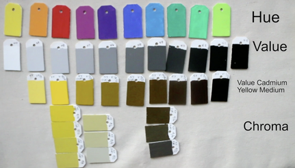
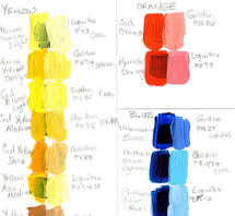
Supplies neededThis is a class that is designed for absolute beginners. Someone like you, who might have gone to an acrylic paint night (pre-covid or post-covid) where you had such a great time that it sparked a deeper interested in learning to paint. Or you might be like me, who wanted to do acrylic painting for a long time but it took a while to get brave enough to to even attempt. I was unsure even where to start and mistakenly spent money for supplies that I ultimately never used and had to get rid of after I actually started painting. I hope that this video will save you both time and money. Over the years I have taught this class many times. Each time I go back through and tweak each lesson to contain the most up to date information that I have learned. This course is not exception. Below is an image from way back in 2015 when I began to teach this class here in Yellowknife NWT until all our lives were all so rudely interrupted in 2020.  Below is the video for this week. I go through some of the supplies you will need. I also show you the difference between the various acrylic paints and explain the differences between acrylic paint consistencies that you will find at the store. I share some of my favourite paint brushes, metal palette knifes, masonite boards and so forth. Let's begin right now with the supplies that you're going to need to be successful with this class!
|
Shawna Lampi-LegareeShawna is capturing moments of beauty from the world around her. Archives
May 2023
Categories
All
Mailing List
To receive an update about new paintings, workshops and other art related news, subscribe to my mailing list below. You can unsubscribe at any time. 
|