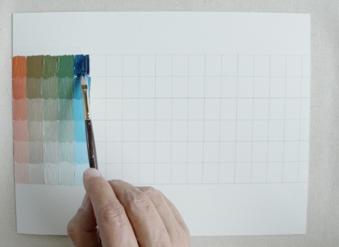
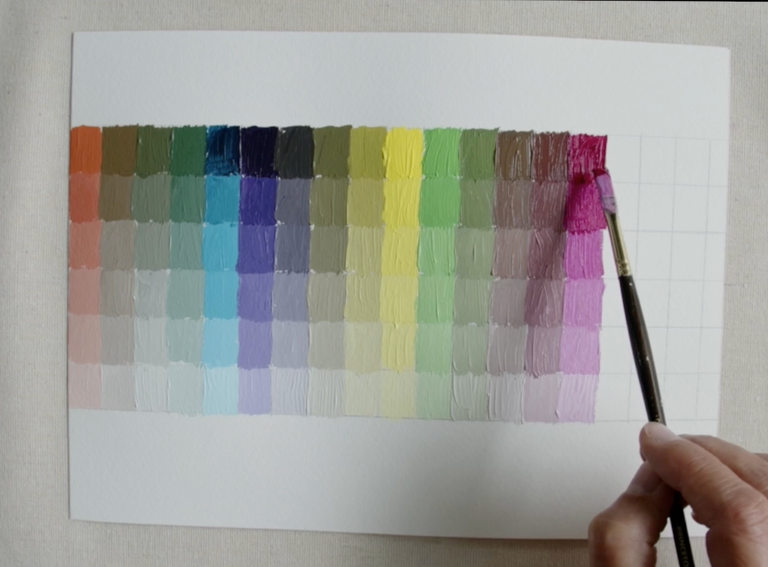
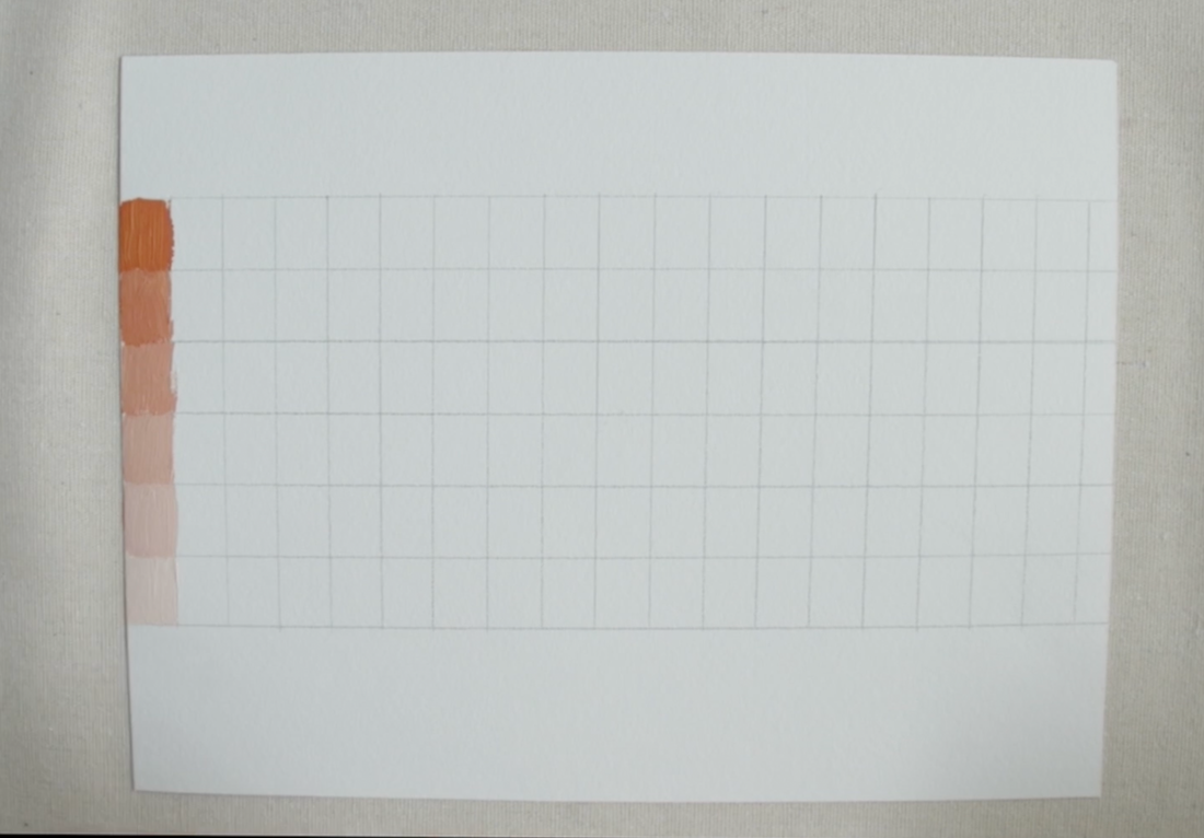
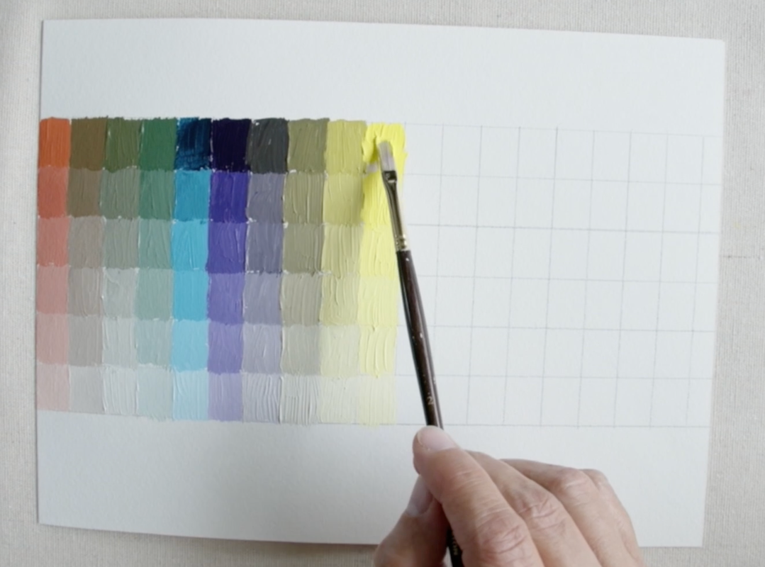
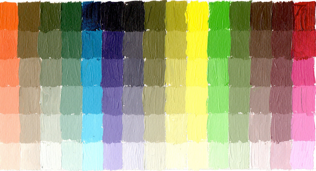
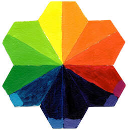
Complimentary Colour Chart, Colour Study of Rainbow Lorikeet & 4 Colour Studies compared.This video has three parts: Part 1 - creating a Complimentary Colour Chart Part 2 - doing a colour study using all the colour mixing information that we have done Part 3 - Comparing 4 different colour studies of the Rainbow Lorikeet with different Red/Blue/Yellows. Below is the Complimentary Colour Chart that I created. This time around I did 3 steps between the Orange and Blue, Purple to Yellow and Green to Red. Only as I was completing it did I realize that I should have done 4 steps between. Oh dear. The measurements for the chart are below. 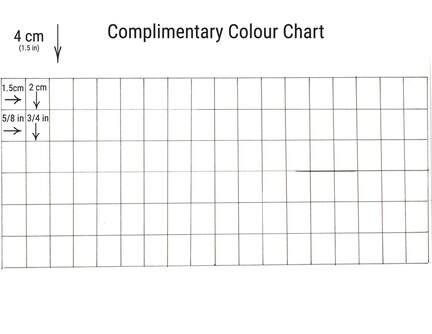
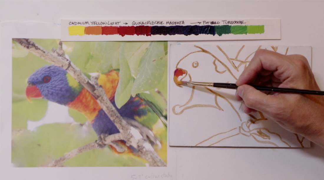
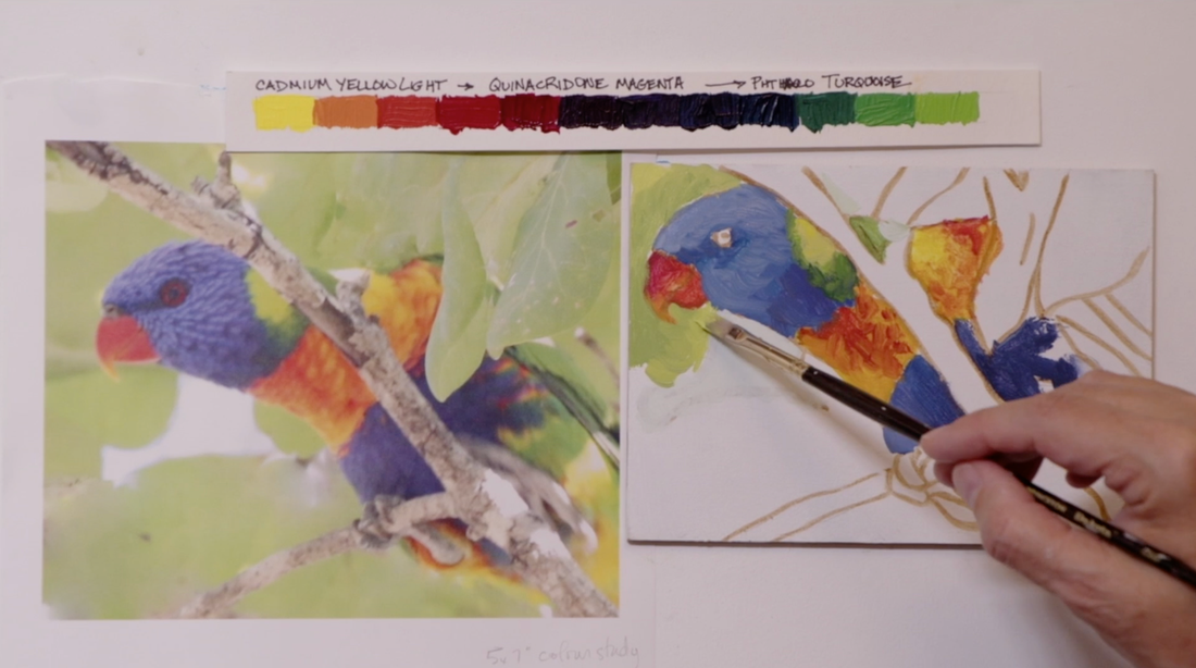
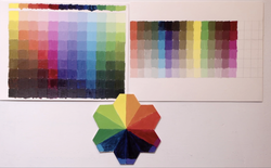 Here we have the whole range of colours we have mixed mainly from 3 tubes of paint. The Colour Value Scale always requires a range of other pigments to ensure the value changes that are made are in the same hue family. Now we are on to our colour study of the Rainbow Lorikeet!
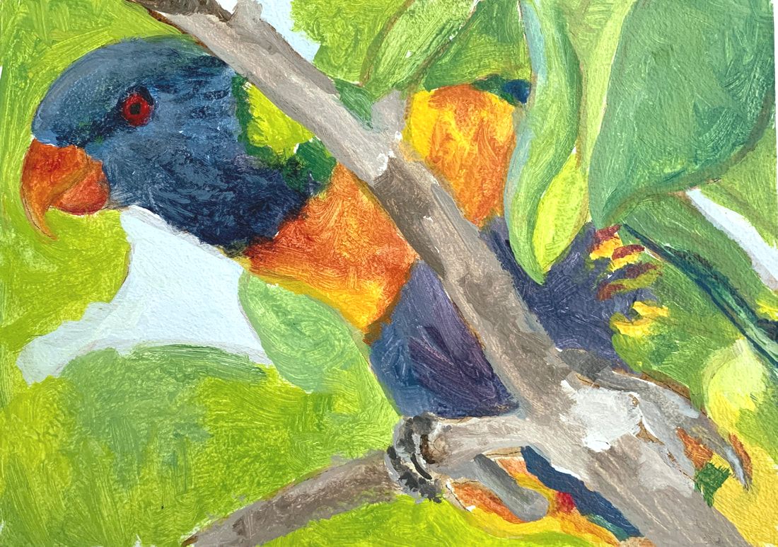
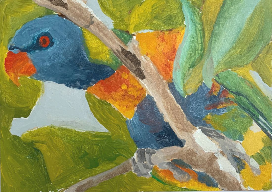
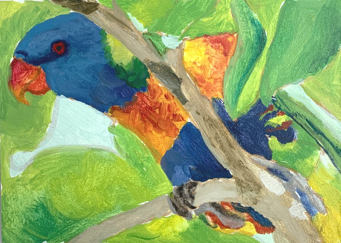
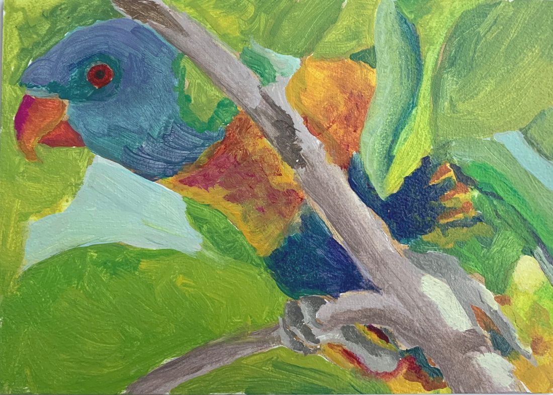
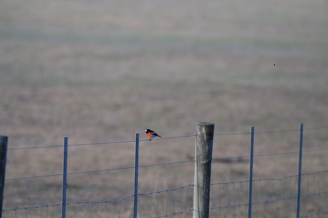
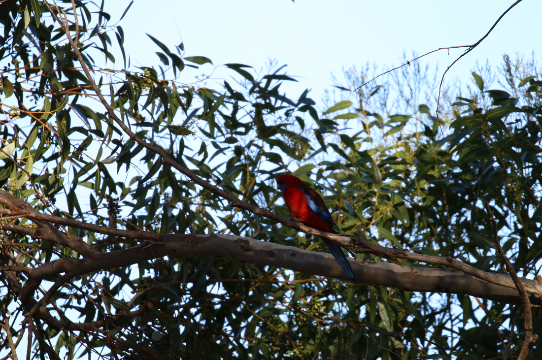
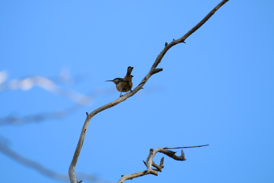
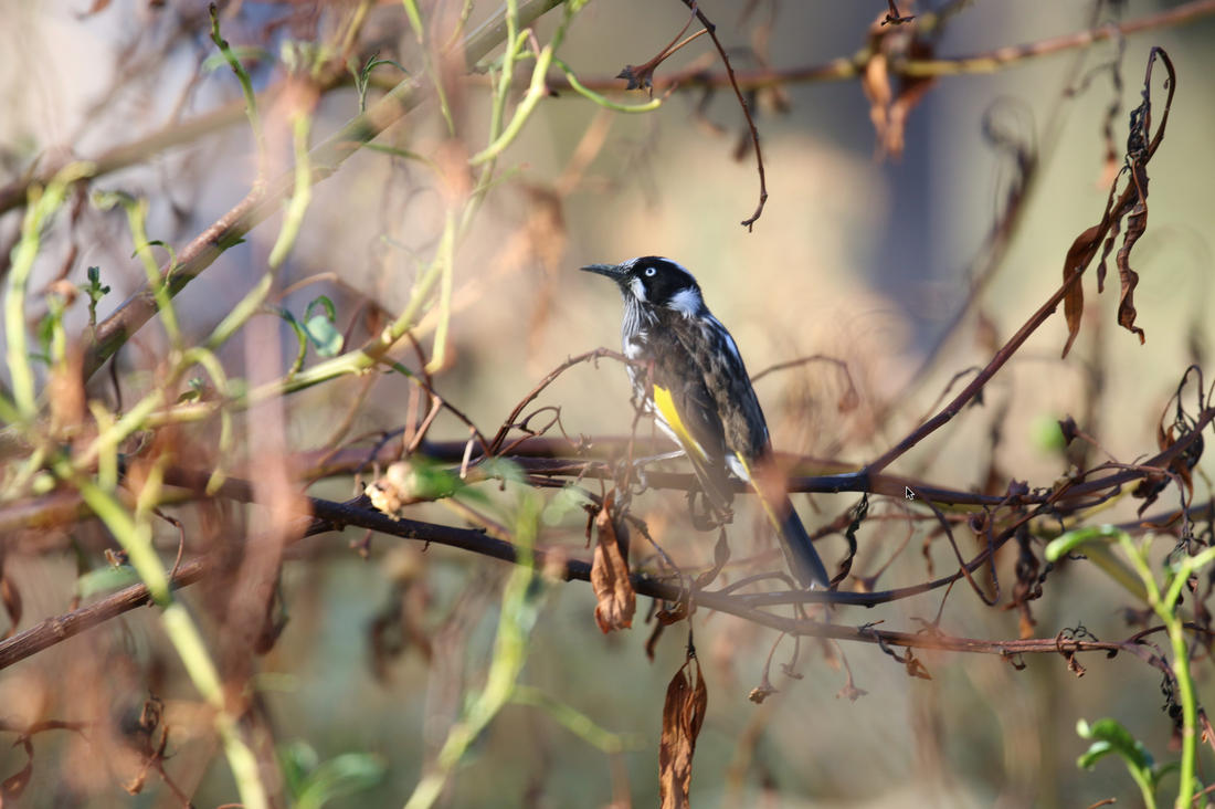
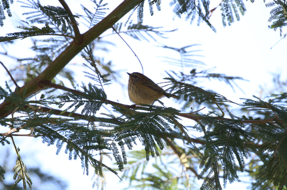
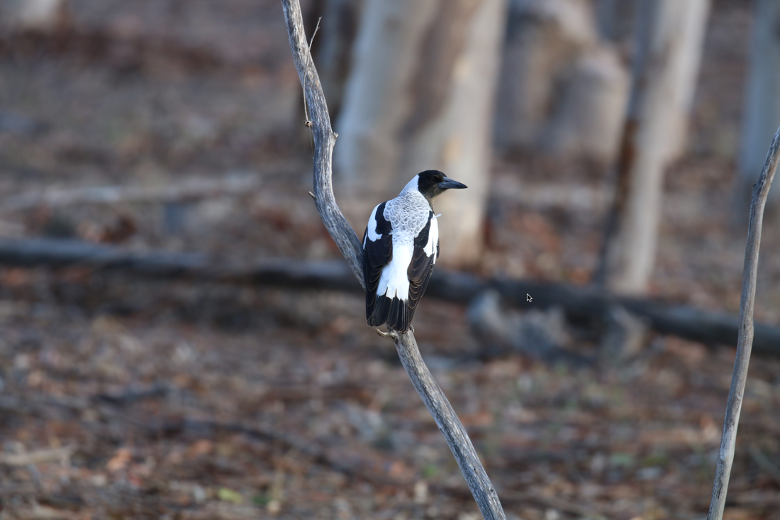
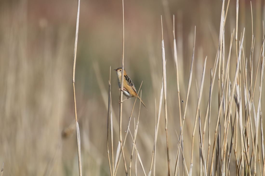
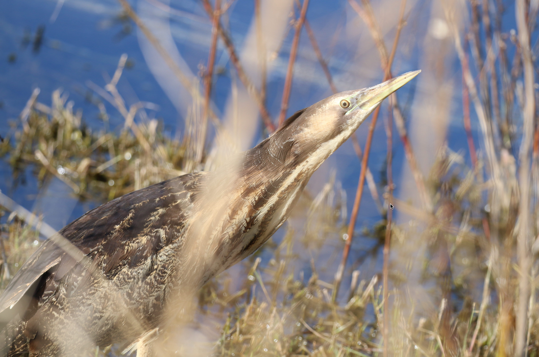
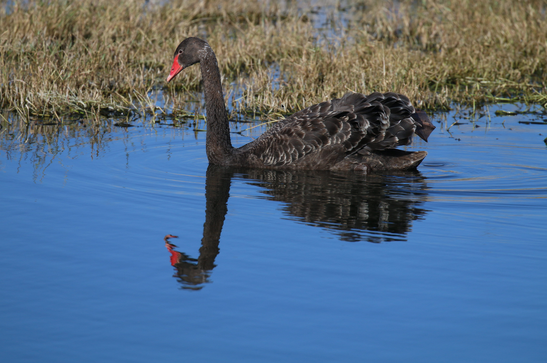
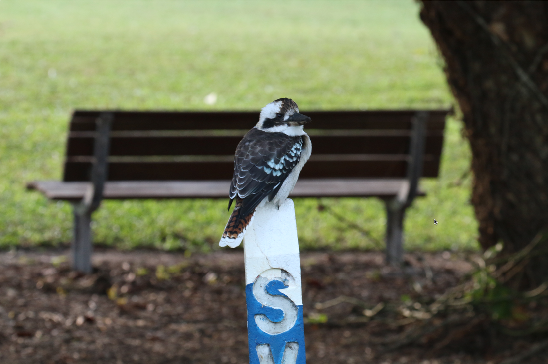
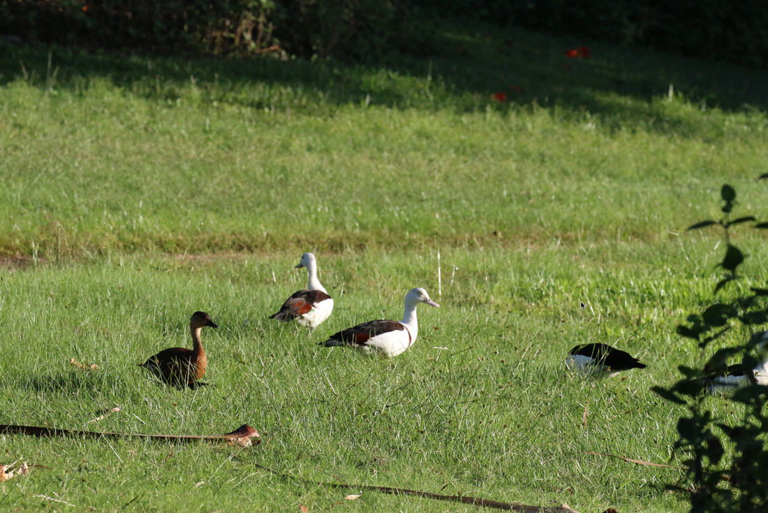
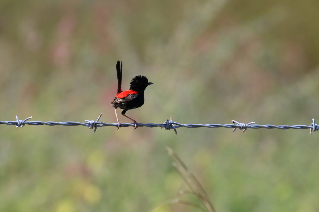
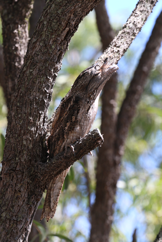
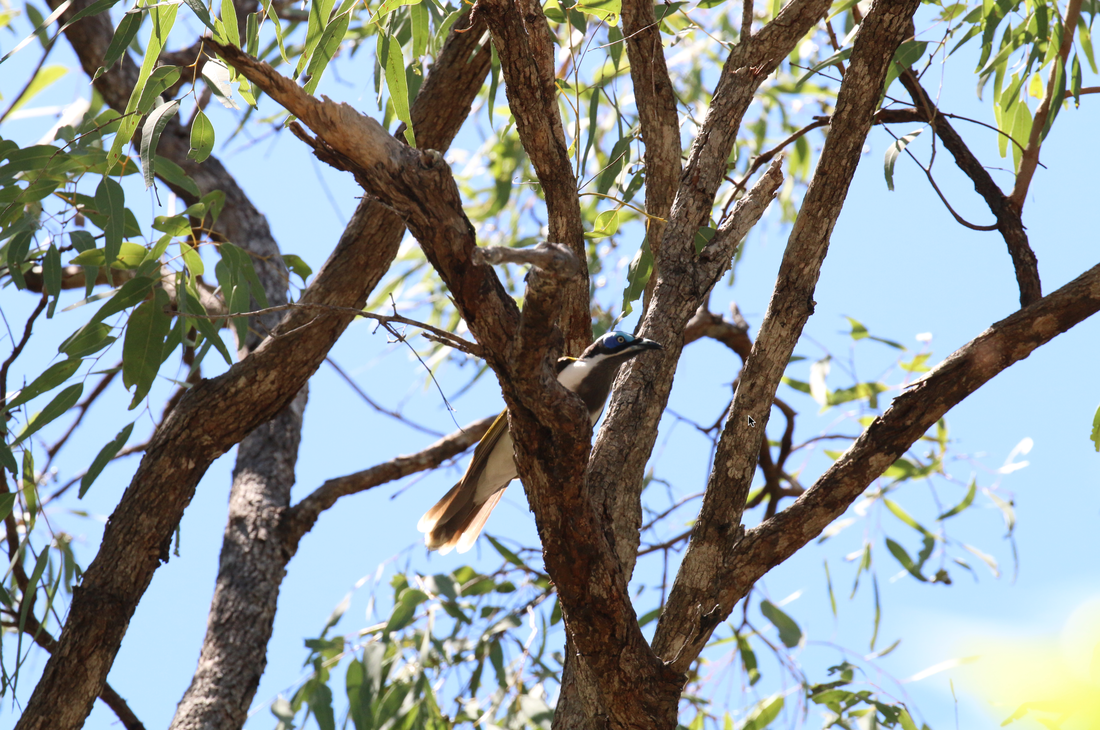
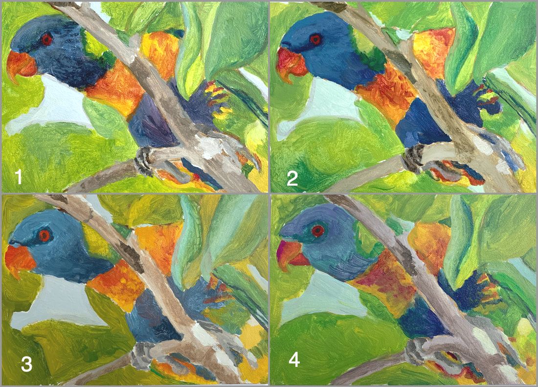 Here are all 4 together on the screen. Seeing them all side-by-side, you really get a sense of what works and what doesn't work. Personally, I really like the beak colours in #3 which is Cadmium Yellow Medium and Cadmium Red Light. But I would still need to use some Cadmium yellow light on the bird’s body. I like the Blues on the bird in the first colour study. I think that Ultramarine Blue is more representative of the blue on the bird. Looking at the greens now. I would say that I am not a fan of either version 3 or 4. In the first two colour studies I prefer these greens. I think I would use both blues with Cadmium Yellow Light to create a variety greens When looking at the branches I prefer colour study 3. Doing these colour charts and studies took some time but the helpful information that they provide is invaluable. Each of the colour studies took about 1 ½ to 2 hours when I include the pre-mixing of paint. These kinds of challenges it helps to get a sense of the potential of the various pigments that we work with. Below are photos of birds around Melbourne. I toured with the late Paul Hackett in 2018. Look at the very last photo...these are Orange Bellied Parrots. When I was there Paul said that there were only 18 left in the wild. These were two of the 18. They were trying to breed them and release the young but I don't know what kind of success they have had with that program. The second day I spent on a bird tour was up in north Queensland with Doug Harrington of Birdwatching Tropical Australia. The very first bird we saw was only 200 metres from where Doug picked me up...just hanging around on a post... a Kookaburra! I bet you know what song popped into my head when I saw it! Are you singing it?
0 Comments
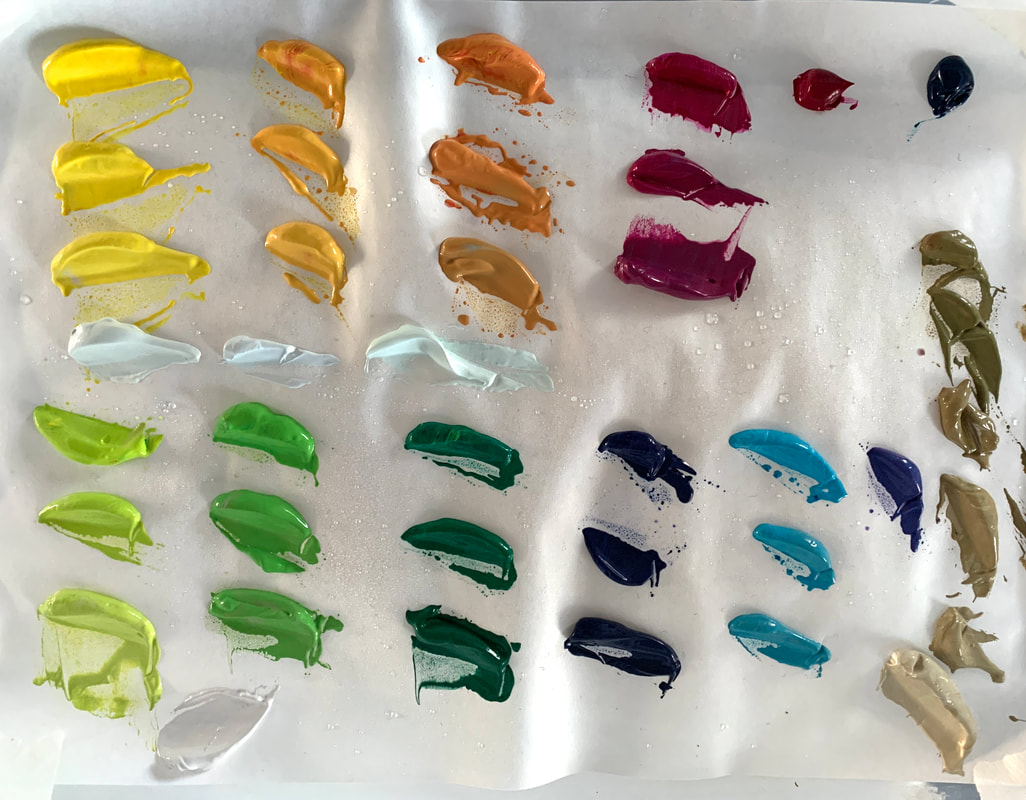
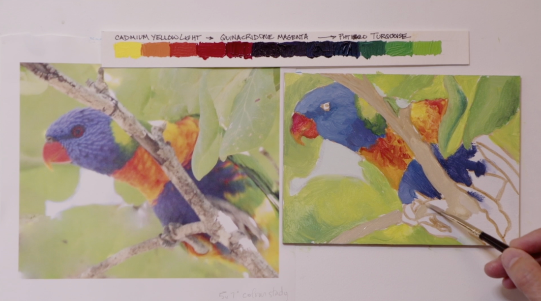
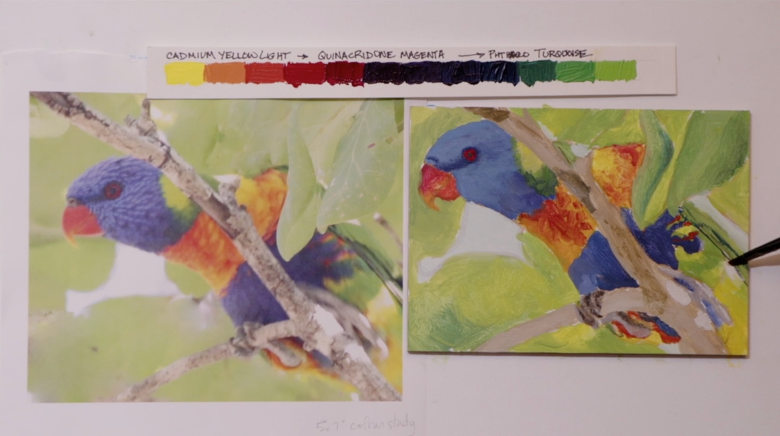
This is the second in installment of the Limited 3 colour Palette exploration that I have been doing. Links for the play list KICKSTART YOUR COLOUR MIXING is below. We are making 12 colours out of these three paints. This video has two parts: the first part I'm going to make the 12 colours quickly and then we will dive into making a colour value scale with each of the colours that we have created. The three colours that we're going to use is cadmium yellow light, quinacridone magenta and phthalo turquoise. This is a set of colours that would be considered CMY which stands for Cyan/Magenta/Yellow. Phthalo turquoise is kind of close towards Cyan.
Now when I get to mixing the purples I start with two parts of magenta and one part of the phthalo turquoise, then one to one, and lastly one part magenta and two parts phthalo Turquoise. The value of each of the paints is so dark this is the only way to ensure the purples shift from red to blue. With the Cadmium Yellow Light and the other two colours I’m actually matching a value and every once in a while, you can see my value checker. This Yellow is a value 9 and the other two colours are sitting at Value 3 or 1. For the Quin Magenta (Value 3) I make value mixtures of 7, 6 and 5 to keep it simple. Then with Phthalo Turquoise it is easy to make three steps across at Value 7, 5 and 3. This gets us around the whole 12 segments of our tessellation. I always start with the yellow when I do these kinds of things. Here we can see the oranges, from yellow to red, that we create from Quinacridone Magenta. 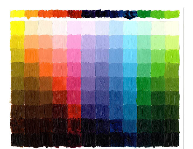 Learning how to change a colour and still be in the same colour way is really important.
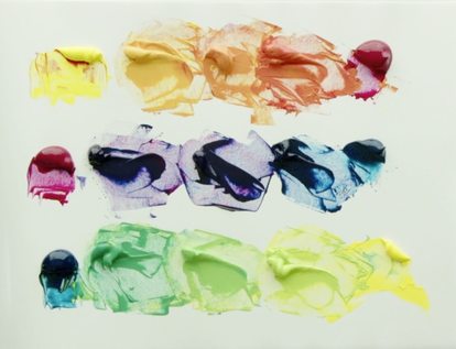
Starting with Cadmium Yellow Light which is at Value 9. Using Raw Umber to darken from Value 8 to Value 2. For Value 1 we will add a bit of black. Adding Quinacridone Magenta to create an orange that is Value 7. Add white to create Value 8 & 9, then add equal amounts of Raw Umber (low Chroma Yellow) and Burnt Umber (Low Chroma Orange) for this particular orange. This will bring us to Value 2, add black to get to Value 1. As we step to the middle orange, which is mixed to a Value 6, then using Burnt Umber to darken from Value 5 to Value 2. Again add black right at the end to get it to value 1. Create the third step of orange to a Value 5 which is noticeably more red. Take 2 parts Burnt Umber and 1 part Alizarin Crimson Hue Permanent to create Values 4 to 2, then add black to create Value 1. On to Quinacridone Magenta, add white to create Values 9 to 4, the pure paint is Value3, add black to get to value 2 and 1. As we move from Quinacridone Magenta to Phthalo Turquoise we are entering into our delicious purple range. The first combination is 2 parts Quinacridone magenta to 1 part Phthalo Turquoise. This value string is simple in that the darkest value of the two paints is Value 1. Using white to create from Value 9 to Value 2, pure mixture for the last square. Step two of the purples is equal parts Quin Magenta to Phthalo Turquoise. This purple very pretty. To create step three use 1 part Quin Magenta to 2 parts Phthalo Turquoise. Notice how the purples go from being more red to being more blue as we move across this colour value chart. The Phthalo Turquoise string is as simple to create as just adding white to make Value 9 to Value 2, pure paint for Value 1. On to the last three colours for our Colour Value Chart. On to the Greens. The first string the green we mixed is as Value 3, it is very blue. Adding white to create Values 4 to 9. To create Value 2 and 1, we will use 3 parts Phthalo Green (Blue shade) to 1 part Raw Umber. Section 2 our green is at Value 5, we will create a mixture of equal parts Phthalo Green (Blue Shade) & Raw Umber to create from Value 4 to Value 1. Here we are at the last value String! We created a green that has more yellow as it is now at Value 7. Use white to create Value 8 & 9. Then to darken this last mixture we will use 1 part Phthalo Green (Blue shade) to 5 parts Raw Umber ( Low Chroma Yellow) to make Value 6 to Value 1. I place the pure tones right across the top and there's a rainbow of beautiful colours. Join me for the next video as we will do the complimentary mixtures using these three colours and the final colour study. |
Shawna Lampi-LegareeShawna is capturing moments of beauty from the world around her. Archives
June 2023
Categories
All
Mailing List
To receive an update about new paintings, workshops and other art related news, subscribe to my mailing list below. You can unsubscribe at any time. 
|