|
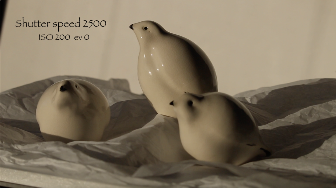
This week's video is a tips and tricks one. I am actually going to focus in on how to photograph white birds on snow! I will be using my friend Astrid Kruse's little ceramic birds that she makes. It turns out that birds are not known for being where you want them to be when you are ready to film. Plus it's really cold outside. It has been hovering at -30 and colder all week. Check out Astrid's work HERE. If you figure out what I'm going to paint for the next video put a comment below. :) I recommend staying to the end of the video as I will be sharing some of the images that I have taken. Let's grab our camera and let's get going.
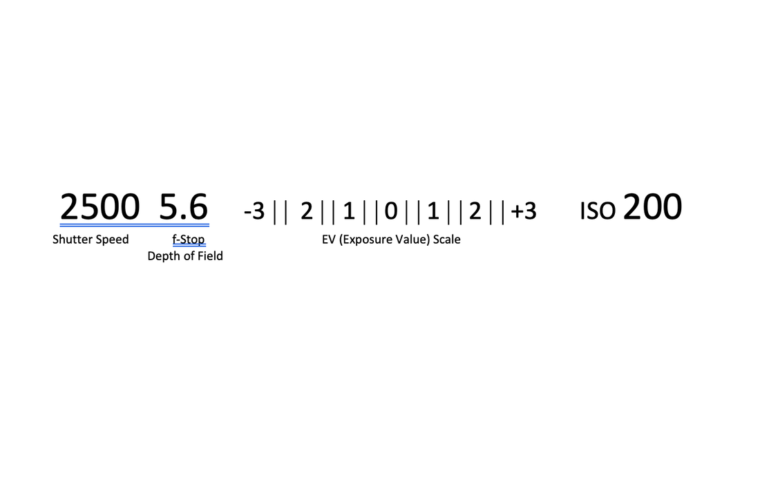
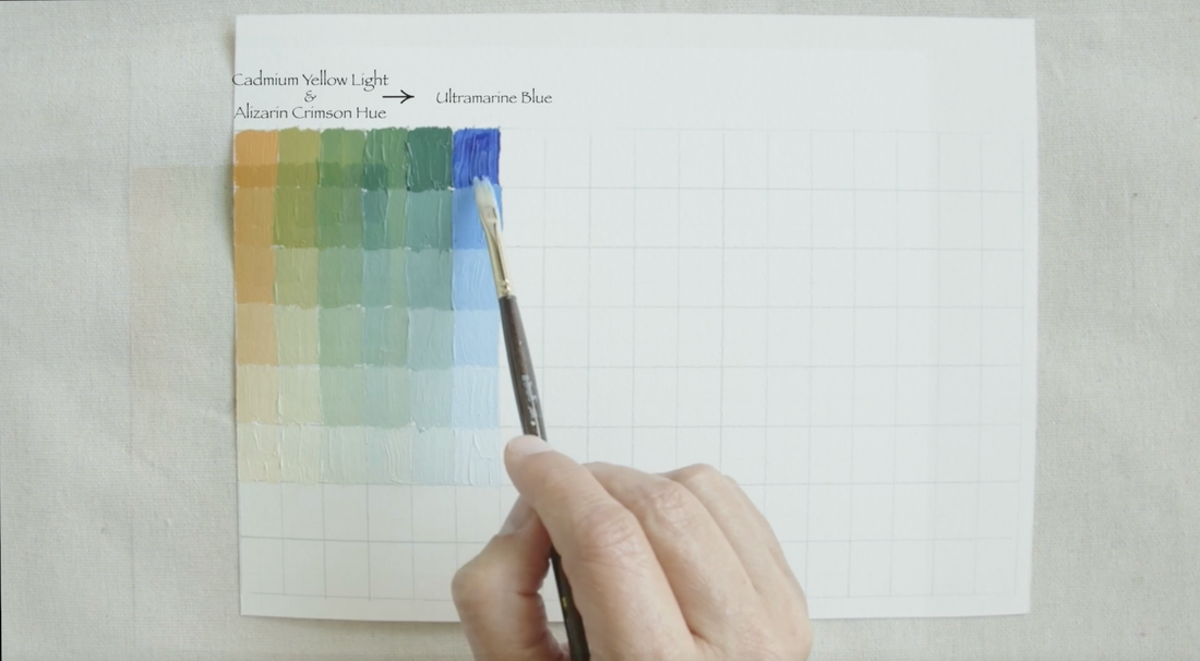
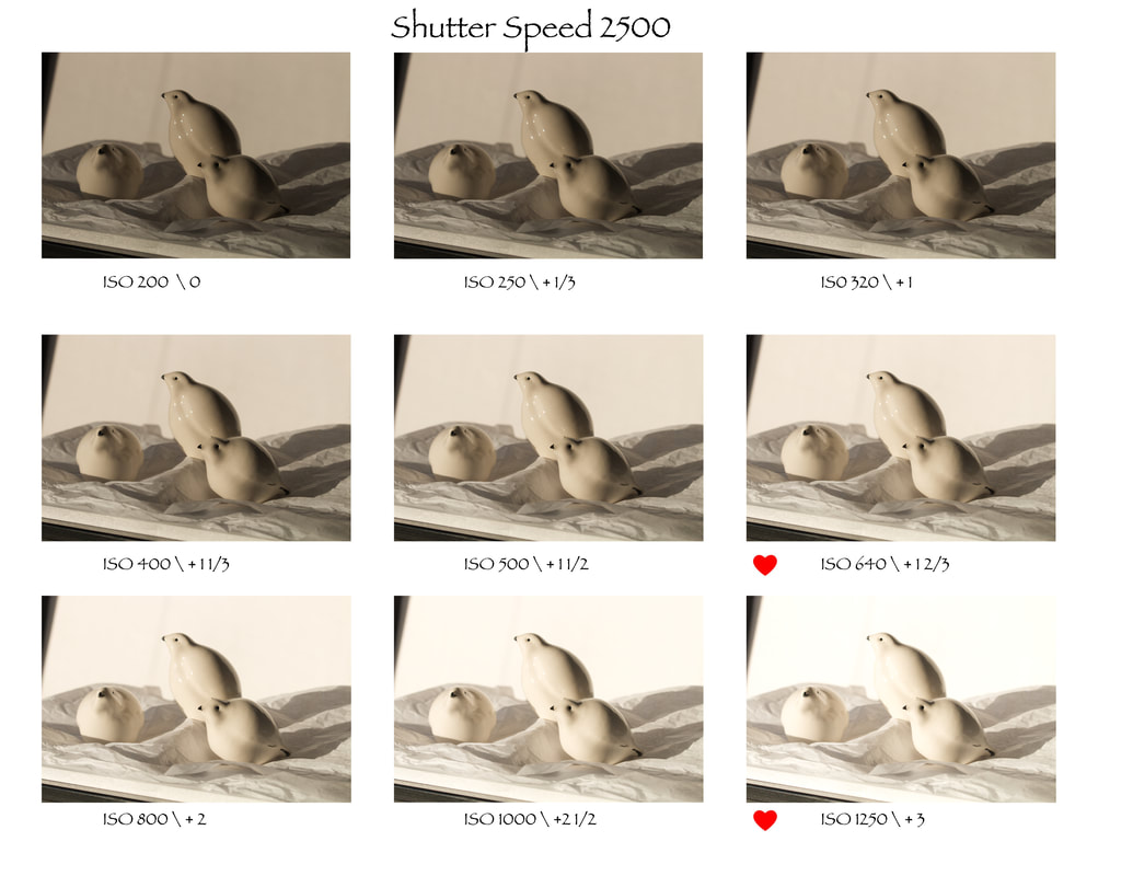 in the above image you can see each step that I go through in one place beginning with ISO 200 and ending at ISO 1250
Each ISO jump brought me into the "over exposure" range of the Exposure Value Scale. I want you to take a minute just to focus in on the shadows. As you look at the range of images you can see how dark the cast shadows are. Cameras tend to read the shadows as really dark compared to what our eyes can see. I can have the bird at a perfect light reading but then the shadows tend to be too dark. If I then made adjustments for the shadow, the bird will end up way too over exposed. The two images with hearts are the correct exposures: ISO 640 the ceramic birds are perfect and ISO 1250 is where the cast shadows are what my eyes were seeing. Often I will work with two very different images so that I can get the object expose properly but also the cast Shadow are the shadow area expose properly. At the end of the video I shared a bunch of images that I've taken from being overexposed, properly exposed to underexposed. I would warn against photographing cloudy day when the light is really flat. On those days in the winter there is so much light bouncing around that it just flattened everything out. You will notice it when you're walking as it tends to affect your depth perception.
0 Comments
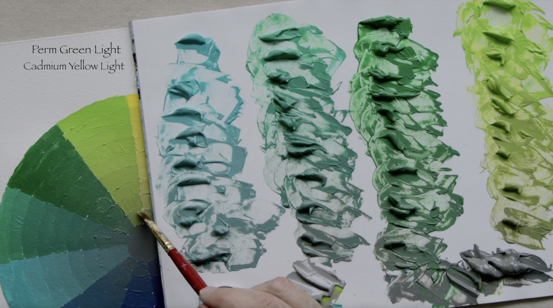
This weeks video is the 2nd in a 3 part series all focused in on exploring various colour wheels. I have done the Gurney Yurmby version but today I go backwards into my childhood to create the colour wheel that most of us are very familiar and comfortable with.
A colour wheel that we learned had primary, secondary and tertiary colours that could be mixed only from the three colours. Not really so truthful that claim...yes we could mix all 12 colours from 3 but we don't always get clear nice colours that we think about in a colour wheel. I have begun exploring this notion in a series of videos "Limited Palette: Red Blue Yellow - 1, 2, 3 and 4. (Click on the numbers to see the videos). What makes this colour wheel different from the "Yurmby" version, you ask? This version has 3 primary colours; Yellow, Red and Blue at equal distance around the wheel. But in the "Yurmby" colour wheel version (Blog post click here) there are 6 primary colours of Red/Blue/Green and Cyan/Magenta/Yellow. We will explore why that makes a such difference when I create the 3rd and final colour wheel version. You will notice that I have substituted paints for the secondary and sometimes for the tertiary colours so that the colour wheel does have the bright clear colours that we want in a colour wheel. In the traditional colour wheel I use the following colours: Cadmium Yellow Light (Primary), Cadmium Orange (Secondary) Cadmium Red Medium (Primary) Alizarin Crimson Hue Permanent (Liquitex) Dioxazine Purple (Liquitex) (Secondary) Ultramarine Blue Cerulean (Primary) Permanent Green Light. (Secondary) Thanks for dropping by. See you in the next art video. I hope you enjoy this video of a flower that my father-in-law grew beside his house. It is not a very showy flower but I had a lovely 17 hours painting it. All the way along memories of Don kept coming. I shared just a few of them during this video. I mentioned our last trip with Don in August of 2015. Below is the photo of Great-Grampa with Burke, Ian and Stephen. 4 generations of love all in one place. 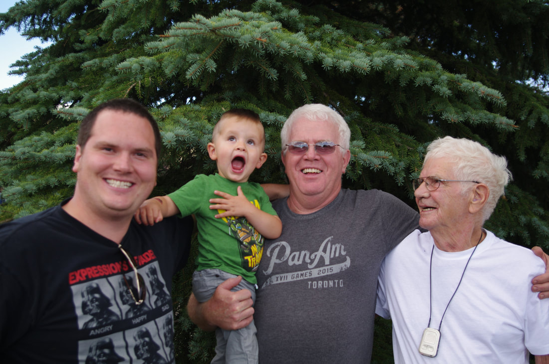 In the photo collage below is Don holding a log above his shoulder. That is quite the feat given that his heart was in very bad shape. No one, including Don, knew that his heart was in trouble. We still miss Don. 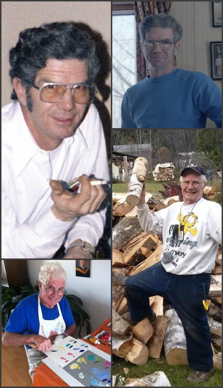 Thank you for join me. See you in the next art video.
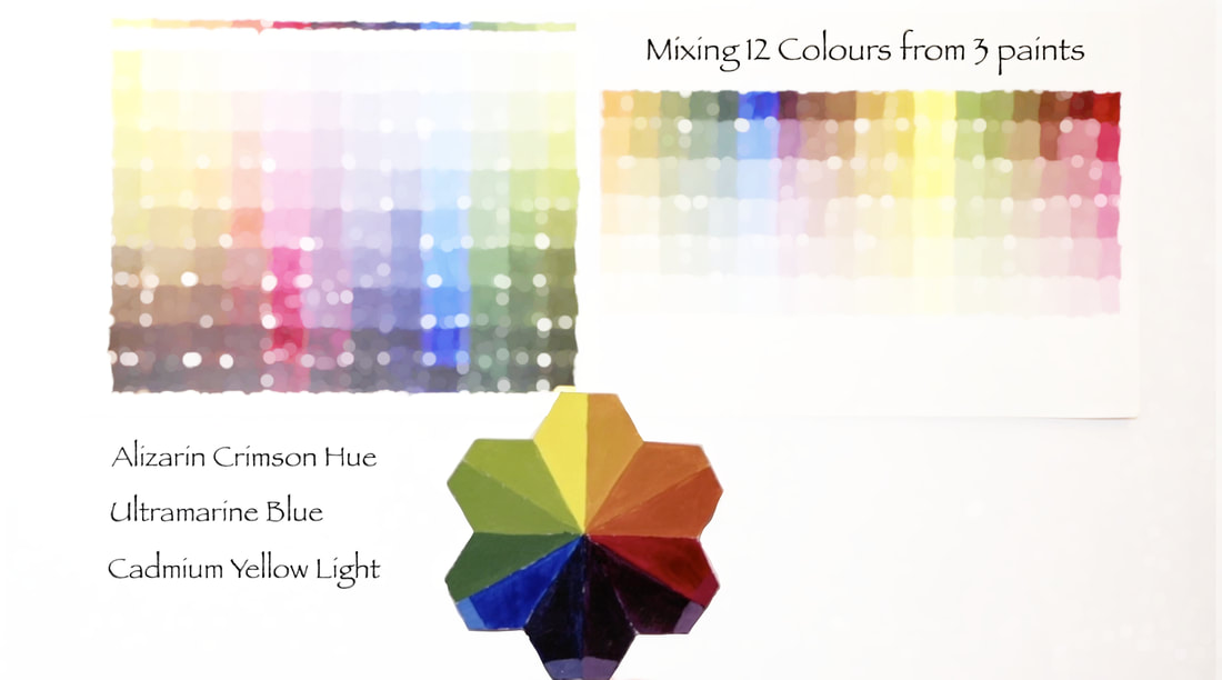
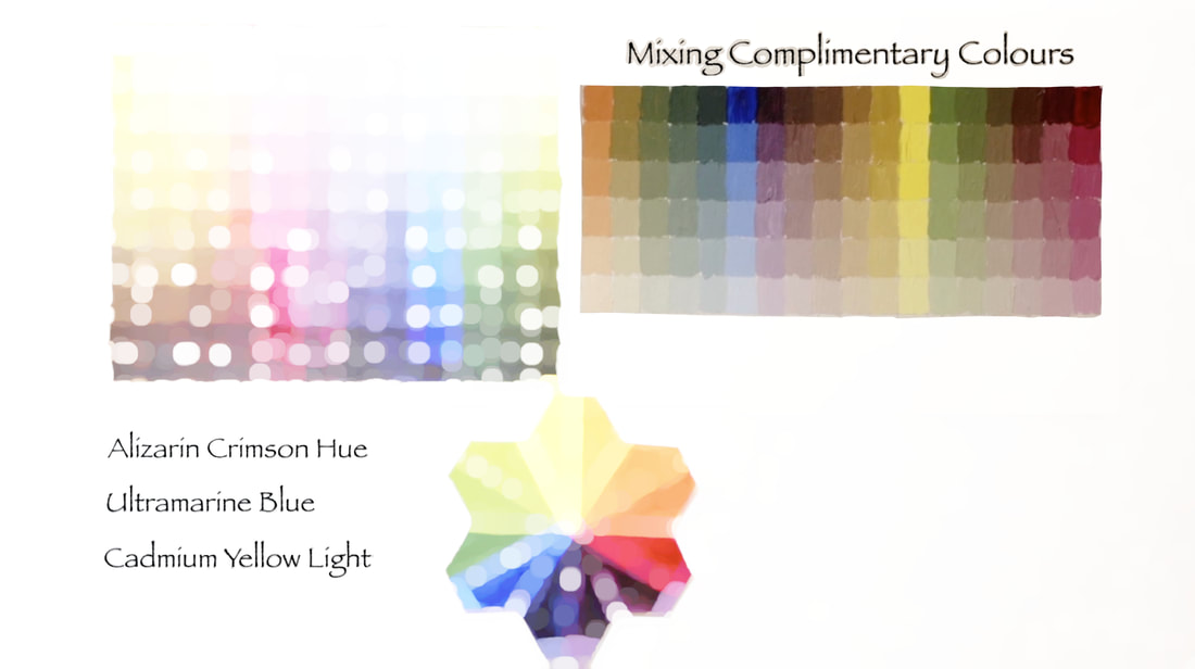
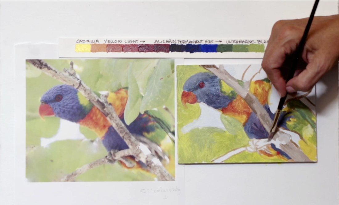
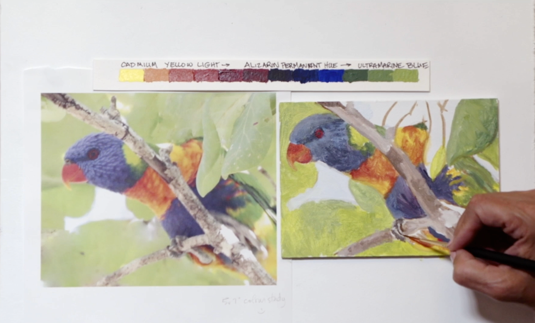
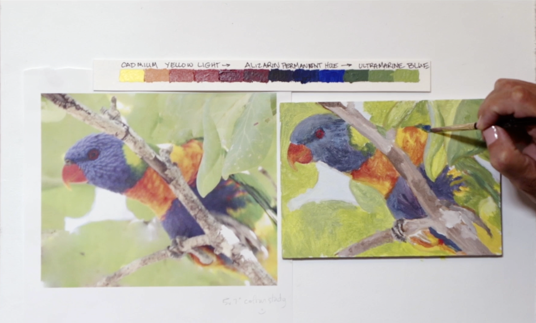
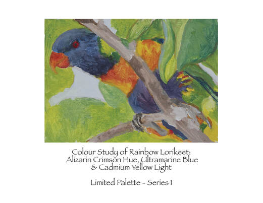
Here we are at the end of this first series that we worked with a Limited Colour Palette of just a Red, a Blue and a Yellow. The paint colours used are Alizarin Crimson Hue (Liquitex), Ultramarine Blue and Cadmium Yellow Light (both Golden Paints). To download the print ready pdf for the colour study click HERE 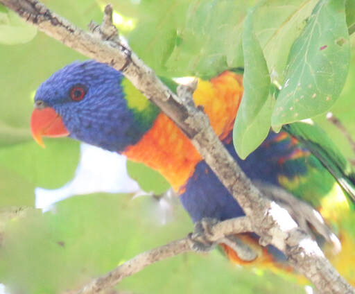
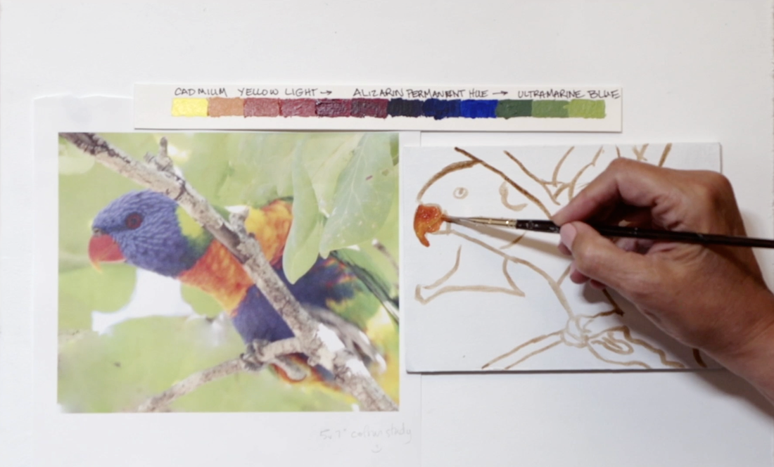
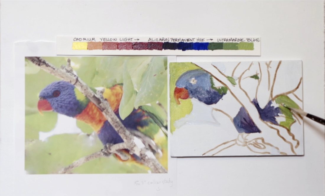
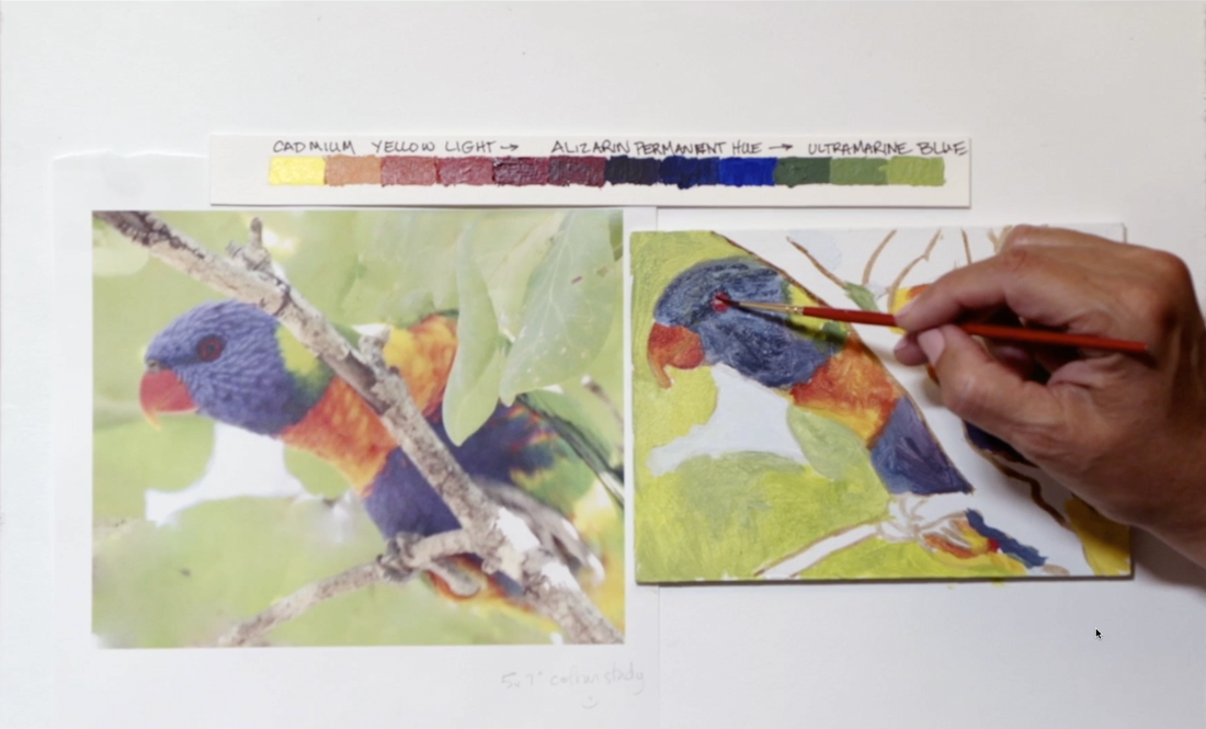
I am so excited to finally get on to the Colour Study! It took about an hour to paint this 13x18cm (5x7in) Rainbow Lorikeet. Don't be in a rush. You want to take your time so that you get all the info you need from this study.
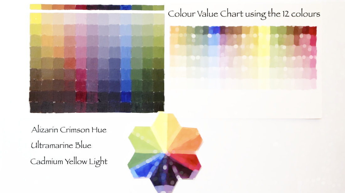
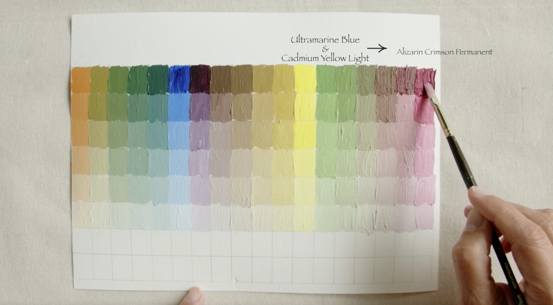
 Now we are getting to the substance of what the three colours: Alizarin Crimson Hue (AC), Ultramarine Blue (UB) and Cadmium Yellow Light (CYL) can do. Below is the grid with measurements on it to make your own Complimentary Colour Chart. The page size is 20x28cm (8x11in). 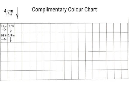
See that didn't take long, but look at the amount of information we have now. WOW. We are ready to tackle our first colour study. Join me in the next video for the colour study.
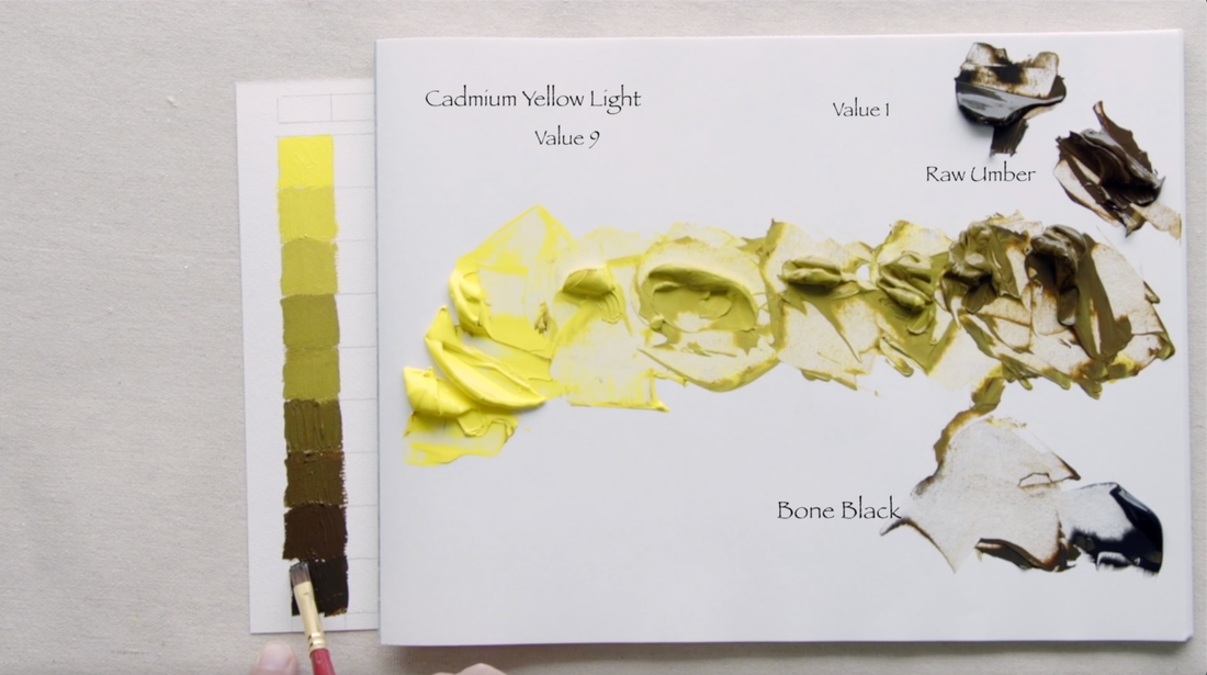
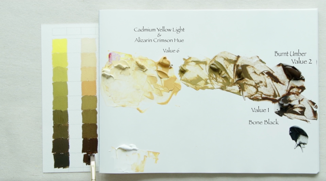
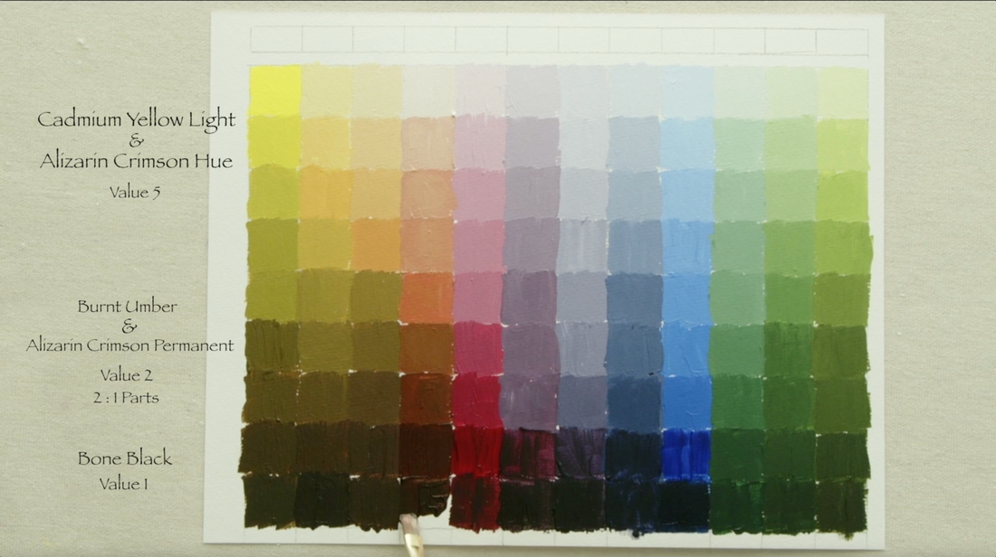
It is tempting to use black to darken the value of a colour that you're working with. Sometimes what looks like the easy answer gives us the wrong result. Why does it not turn out at all like we thought it would when we add black? It turns out that Black is a low chroma Blue, just like Burnt Umber is a low chroma Orange, and Raw Umber is a low chroma Yellow. They are very dark colours that can lead to confusion at times. In this video I will share a mixing strategy which will change the value of the paint but does not alter the colour we are trying to achieve. This is a very important concept. As we work with the 12 colours we mixed from Alizarin Crimson Hue (Liquitex), Ultramarine Blue and Cadmium Yellow Light (both Golden Paints) in the 1st video of this series, we will be creating value scales that are appropriate to each of the colours. This will require just a few more paint options to help us to create value strings that stay within the same colour range. Here are the extra colours you will need to gather: Raw Umber, Burnt Umber, Phthalo Green (Blue Shade) and Bone Black. I use very inexpensive pad of watercolour paper for this lesson. I cut the paper down to 26.5x20.5cm (10 1/2x8in). You can get your very own Munsell Accurate Value Scale by clicking the blue text! The measurements for the grid are on the image below. I use pencil, but you can use waterproof pen if you want. 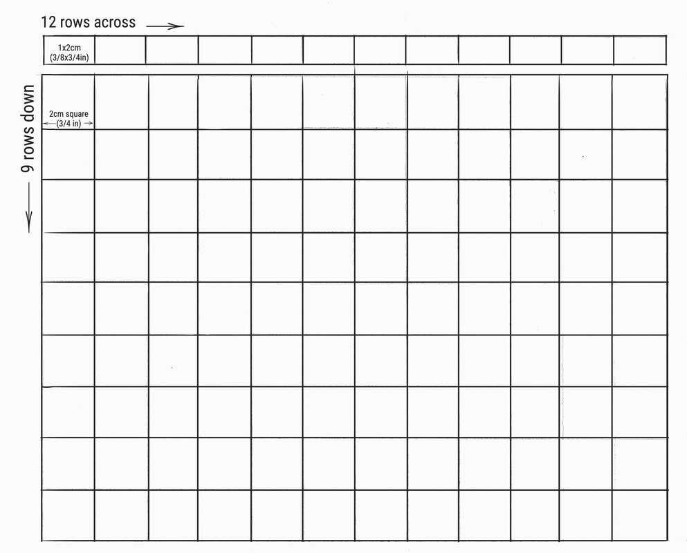 Let's start with changing the Cadmium Yellow Light (CYL) paint. CYL is a value 9 directly out of the tube, which means that from Value 8 to Value 1 another paint will have to be added. A low chroma, dark value paint that would give us the results that we are looking for is Raw Umber (Value 2). Raw Umber is a low chroma Yellow. Carefully mix and test each value on the Munsell Accurate Value Scale as you head from value 9 to value 3. Raw Umber alone is the Value 2 spot on the chart. The very last mixture is when Black (Value .5) is be added to the Raw Umber to bring it down to Value 1.
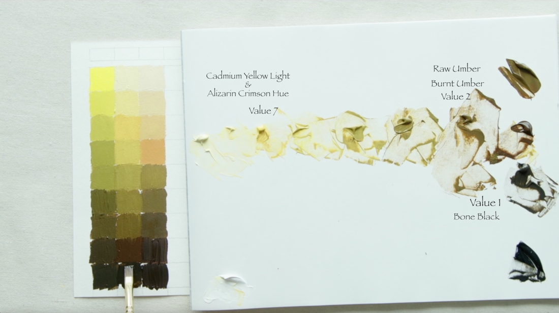
This video is a bit higgly piggly in how I paint the value strings. Now on to the second colour which is between CYL and Alizarin Crimson Hue (AC). We will mix these two paints together to a Value 6 as this is the middle value in this section. Add white to create value 7,8 & 9. Then add Burnt Umber (Value 2), which is a low chroma Orange, to create Value 5, 4, & 3. Value 2 is Burnt Umber on its own, and as we have done before, add a bit of black to Burnt Umber to get to Value 1 on the scale. Below on the left is the CYL & AC mixture that we created to a Value 7. You can see this is has more of a Yellow base. We will mix Raw Umber (RU) and Burnt Umber (BU) together 1 : 1, equal amounts of each paint. Add white to create Value 8 and 9, then the RU & BU for Values 6, 5, 4, 3 and 2. Add Black to create the last value of 1.
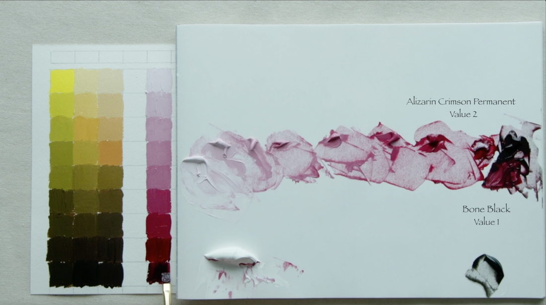
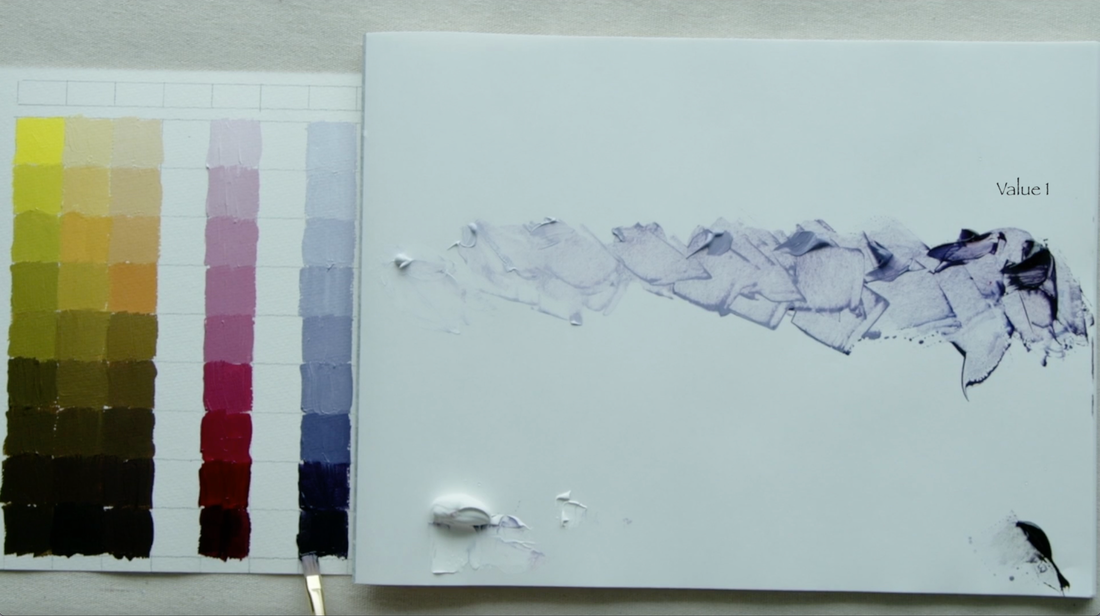
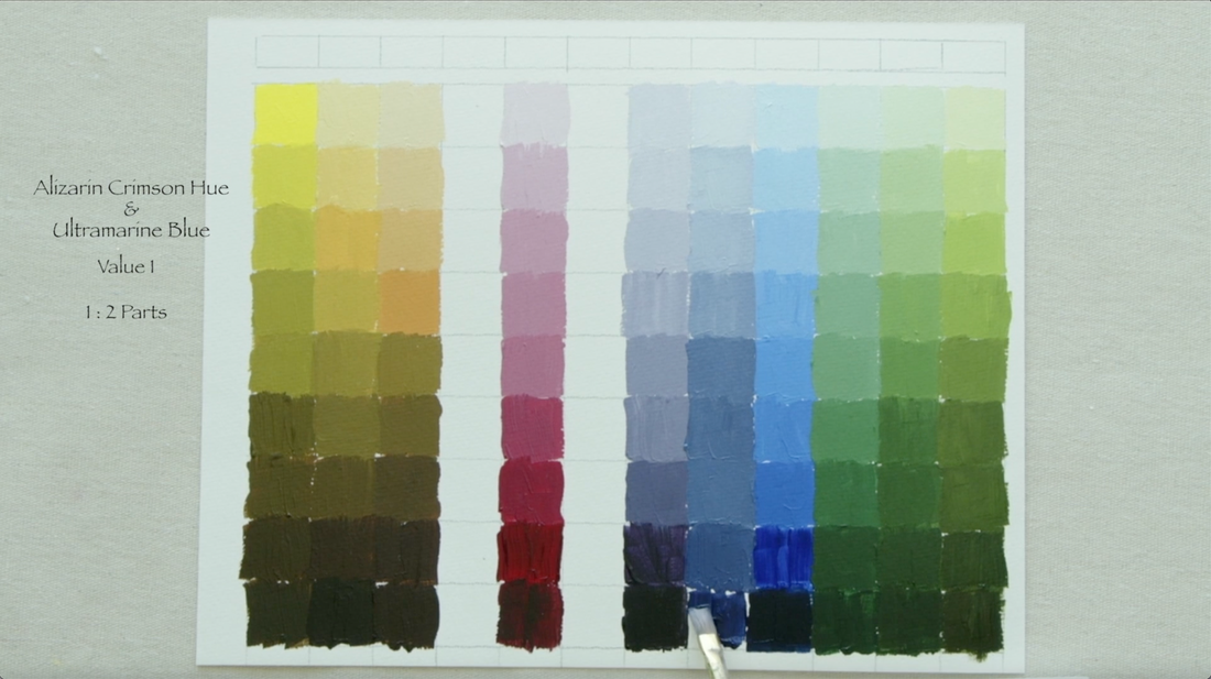
Sometimes the paint we choose makes it easy to make a colour value string. Alizarin Crimson Hue is that kind of colour, as straight out of the tube it is Value 2. Add white to create Value 3, 4, 5, 6, 7, 8 & 9. Using Black to take the AC to Value 1. Below on the left we will be using equal parts of Ultramarine Blue (UB) and Alizarin Crimson Hue (AC) to create this lovely purple. The paint mixture is a Value 1, add white to create all the other values! Easy Peasy!!
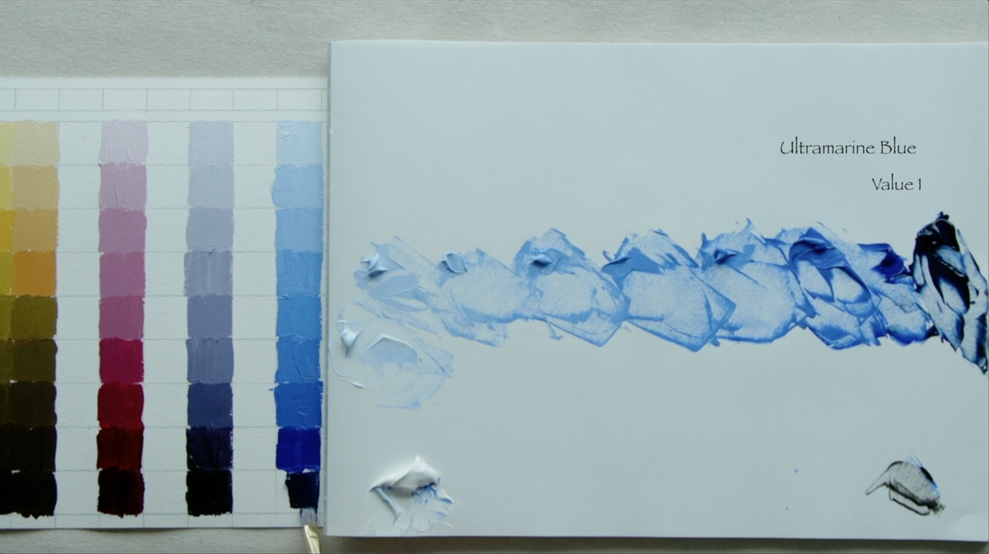
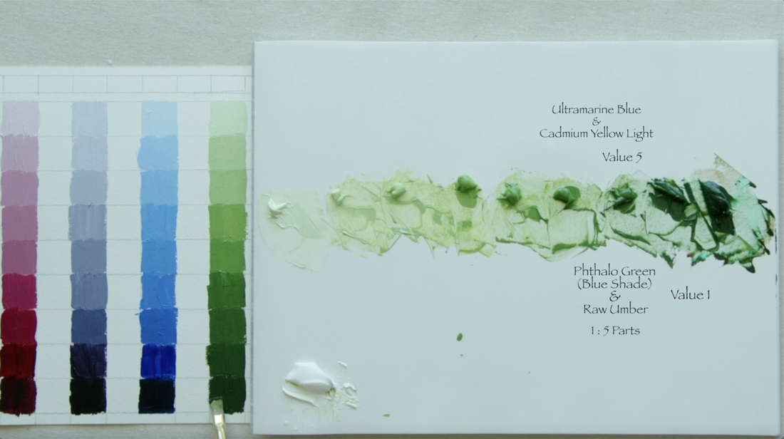
Ultramarine Blue (UB) is Value 1, add white to create all the other values. This is fun! Below and left: Mix together Cadmium Yellow Light (CYL) and Ultramarine Blue (UB) to a value 5. We shall add white to make Value 6, 7, 8 & 9. Now we are going to mix 1 part Phthalo Green (Blue Shade) to 5 parts Raw Umber. The Phthalos are very powerful colours so to get the green that is appropriate we need to add a lot more Raw Umber for balance. Lower the values 4, 3 & 2, with Value 1 being the Phthalo Green/Raw Umber mixture which is Value 1.
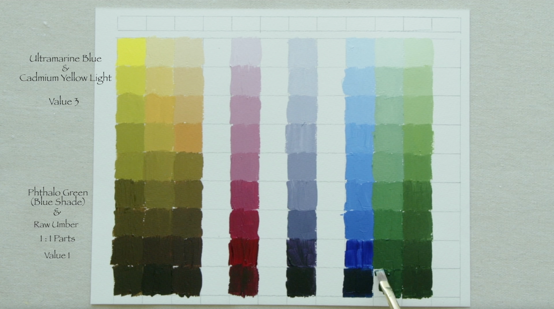
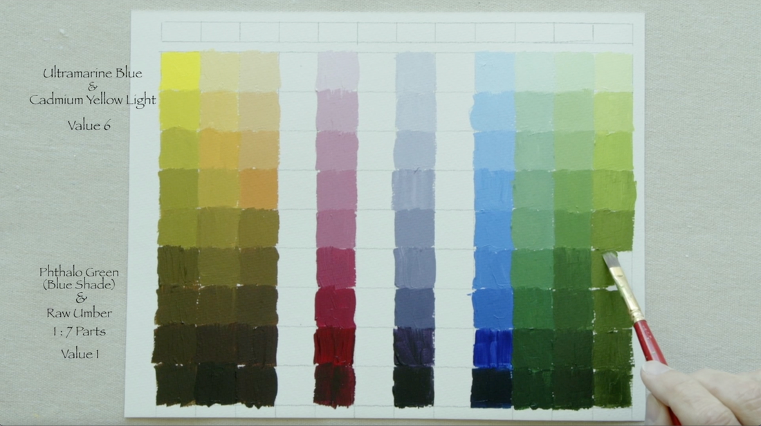
Above right: This green is much closer to the blue. We will be mixing UB with CYL to a Value 3, add white to go from Value 4 to Value 9. Mix Phthalo Green (Blue Shade) 1 to 1 with Raw Umber. Use this mixture to do Value 2 & 1. Below left: We will again be mixing CYL with UB this time to a value 6. This creates a green with more of a yellow focus. Add white to accomplish the lighter values of 7, 8 & 9. We will be making a mixture of 1 part Phthalo Green (Blue Shade) to 7 parts Raw Umber to construct the darker values of 5, 4, 3, 2 & 1.
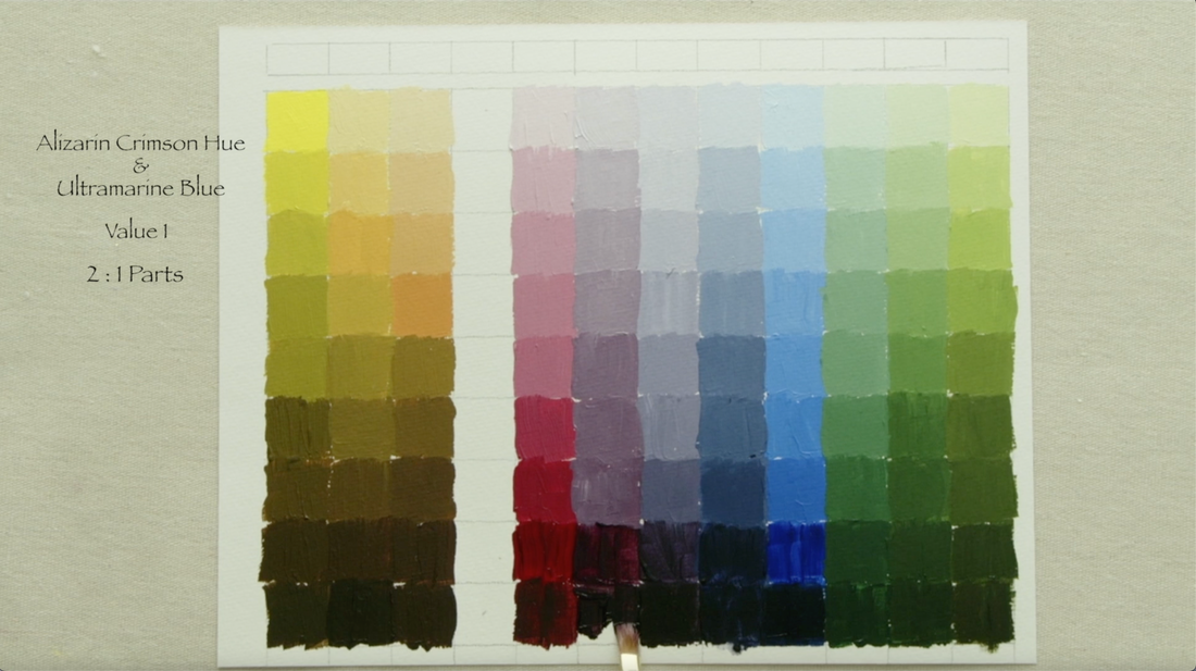
Back to the Alizarin Crimson Hue (AC) and Ultramarine Blue (UB). Using 1 part AC and 2 parts UB to make this delicious colour. We are back to the easy ones, as this mixture is a Value 1. Add white for all other values. Below Left: On to the last purple. 2 parts AC and 1 part UB makes a value 1 mixture...add white for all the other values.
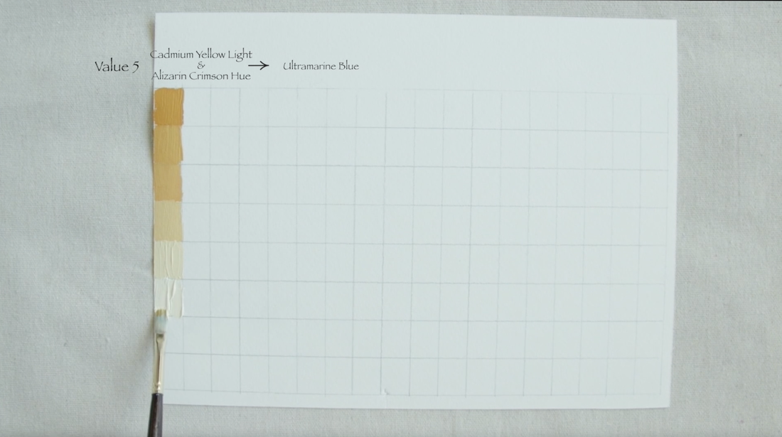
Above and right. Here we are at the very last colour value string. Mix AC with CYL until the combination reaches a Value 5. Add white to form values 6, 7, 8 & 9. To darken this mixture you will need to use 2 parts Burnt Umber to 1 part Alizarin Crimson Hue which both are Value 2. Use this to form Value 4 & 3. Value 2 is the BU/AC mixture, then add black to bring to a Value 1. Here we are at the end. I just placed the 12 pure colours across the top for reference. I actually made two of these strips and you will see how I use the second one in the final video of this series. I hope that this has been helpful! Any comments or questions...leave them here or on the video. Thanks for stopping by. 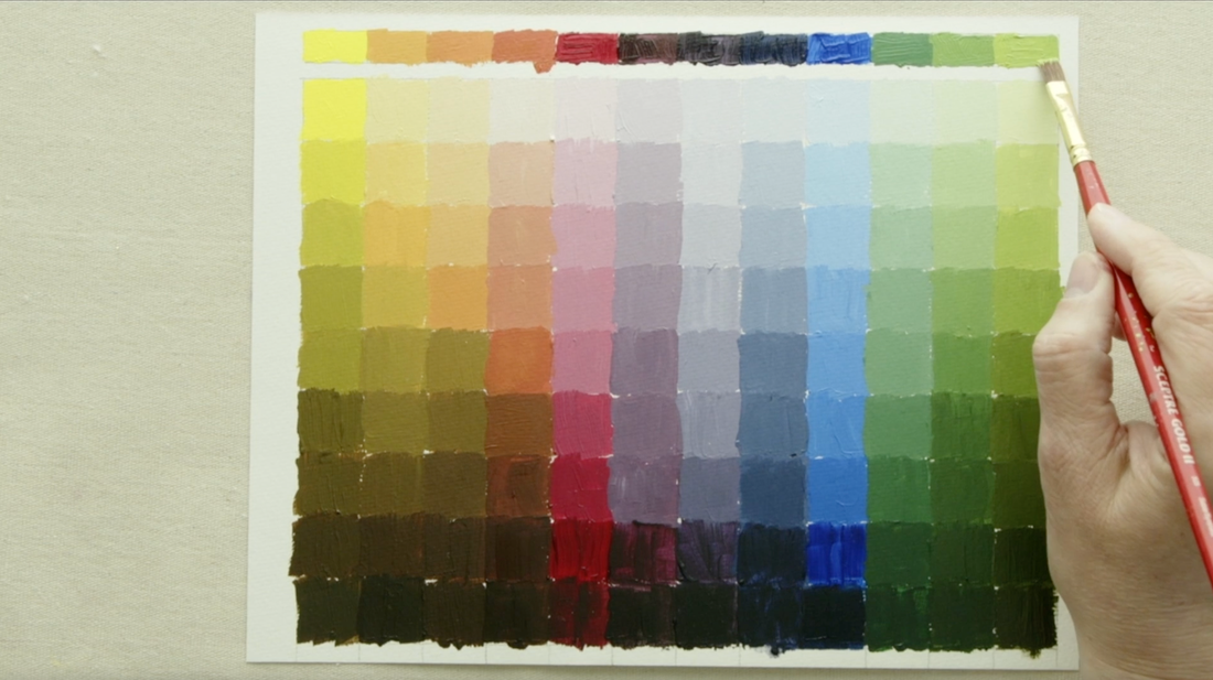 When I started to think about doing a small painting for World Gorilla Day, I went into my photos from a wildlife place in Australia that I visited in 2018. My feelings about primates in captivity are complex. As I am pretty sure that seeing a Gorilla in the wild may not be something that happens for me which means that I appreciate being able to see one in person. They are magnificent creatures. On the day that we went to the open range zoo, we were the first people through the doors. I noticed the Western Lowland Gorilla was up on a rise and as soon as it saw us coming through the door it made a beeline for a shelter. As it moved to the shelter I noticed that It held a blankie in one of its back feet, dragging it along behind as it was trying to get away. The blankie caught me by surprise and reminded me of one of my son's that when he was stressed would gather his blankie around him. I continued to take a few photos but at one point looking through my camera viewfinder I realized that the Gorilla facial expression was one of stress. I immediately stopped taking photos and turned away. The thing humans forget, and I forgot on that day, is that we are the only animals who have the whites of their eyes always showing. Other animals find that stressful and I have learned to squint my eyes when approaching wildlife that I want to photograph. As I turned my face away from the Gorilla I thought that I am only one person but the place was soon filled with many more people. While I was there I don't remember seeing another Gorilla. I know that, like humans, Gorillas are social beings. The fact that this amazing animal will live 40 years or longer in captivity and alone deeply saddens me. I know that it has caregivers who are part of its social network, but that is just not the same. 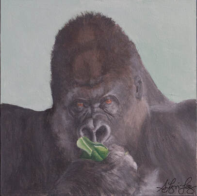 According to WWF "Gorillas are gentle giants and display many human-like behaviours and emotions, such as laughter and sadness. In fact, gorillas share 98.3% of their genetic code with humans, making them our closest cousins after chimpanzees and bonobos." " Females become sexually mature around seven or eight years old but don’t begin to breed until a couple of years later. Males mature at an even greater age. Once a female begins to breed, she'll likely give birth to only one baby every four to six years and only three or four over her entire lifetime. This low rate of reproduction makes it difficult for gorillas to recover from population declines. Both gorilla species have been decreasing in numbers for decades, and a 2010 United Nations report suggests that they may disappear from large parts of the Congo Basin by the mid-2020s." Imagine they are so close to being extinct. It saddens me that the human race continues make it nearly impossible for some animals to coexist with us on the planet. We destroy habitat for so many reasons but the results are always the same...extinction for some. Why did I want to take the time to do a painting to celebrate Gorillas, because they are magnificent inhabitants on our planet. I wanted to remind people that we have a far greater responsibility than any other mammal on this planet to protect all the other mammals who coexist with us. WE seem to forget that we too are mammals. Ebay Auction will go live on Sept 29th. Watch for it here and elsewhere.
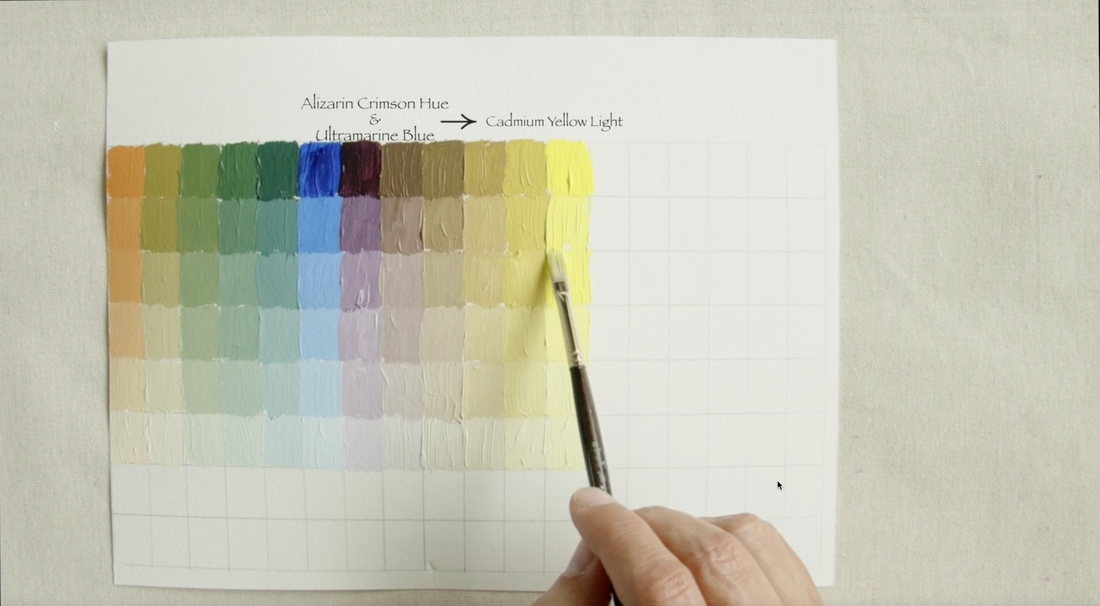
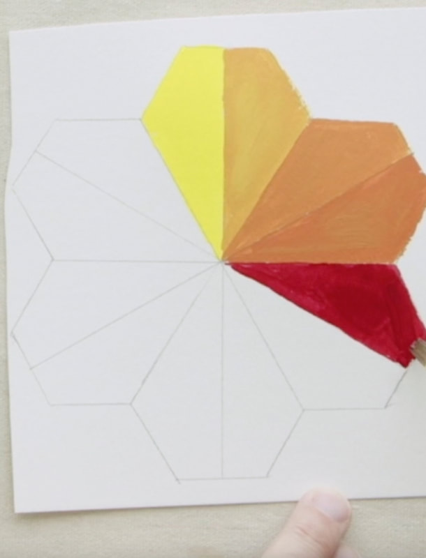
I am so excited to start this next series of videos. I will be working with a very limited palette of just 3 colours. We have all heard that you can make every colour you need with literally one Red, one Blue and one Yellow . But alas that doesn't always seem to work out well. My plan for the first part of the fall/winter is to explore this notion. This is the first video in a mini-series of 4 videos. The Colours: Alizarin Crimson Hue (Liquitex), then Ultramarine Blue (Golden) and the last Cadmium Yellow Light (Golden). All the paints I use are heavy body. Today I am working solely on mixing between the primaries to create secondary colours of Orange, Purple and Green. Make your own pretty rainbow tessellation! Download the image below, print it and transfer to the super inexpensive watercolour paper. The measurements are on the image. Remember to draw a line through the centre to create 12 sections. :) Let's get going! 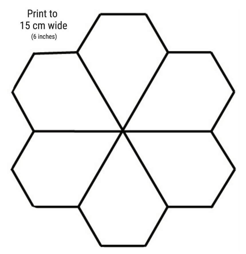 Here is the set up as I prepare to start mixing! Yellow to Red, Red to Blue, Blue to Yellow. 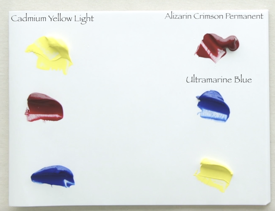 Cadmium Yellow Light (CYL) squeezes out of the tube at Value 9, but Alizarin Crimson Permanent Hue (AC) is a Value 2. To keep to the 12 segments I needed to do 3 mixtures between each of the primaries. With the Yellow to Red I chose to focus on mixing to actual values. I mixed to Value 7, Value 5.5 and Value 4. 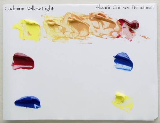 We are now on to Red to Blue. Here I had to adopt a different way of mixing the colours. As we know AC is at Value 2, but Ultramarine Blue (UB) starts off at Value 1. Trying to match a value isn't going to work when both paints start off so dark. The first mixture I chose to do 2 parts AC + 1 part UB, the middle mixture were equal parts AC + UB, and the third mixture was 1 part AC + 2 parts UB. Keep it simple! 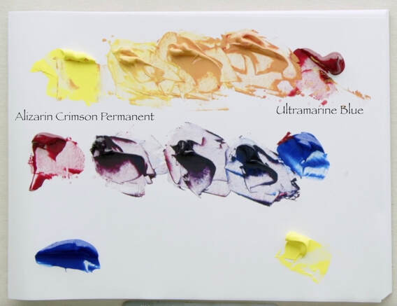 Finally to close the circle we will be mixing the Blue to Yellow. Back to using value when mixing . UB is Value 1, CYL is Value 9 and the mixtures are Value 3, 5 and 7. Easy peasy. 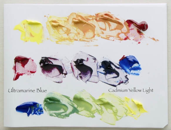 Here is the quick view of building the Flower Tessellation.
The challenge very dark paints and the mixes one makes from them, is that you can't really see what the colour is. Is the purple more red or more blue. To fix that I simply took a bit of the dark mixtures and added white. Below you can see that I painted those lightened values at the tip of the colour. 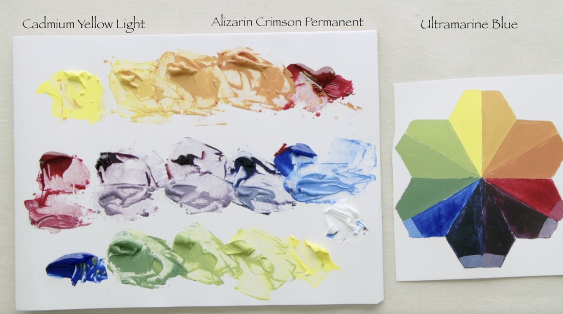
This weeks video I am making a YRMBCG aka "YURMBY" Gurney Colour Wheel. What does YRMBCG work out to you ask? Yellow/Red/Magenta/Blue/Cyan/Green is the answer! This colour wheel is based on a 6 primary colour system of Cyan/Magenta/Yellow (CMY) and Red/Blue/Green (RBG). Photography and printing use the CMYK (K = Black) set of colours in their processes and the RBG colour set is used in computers and lighting as their primaries. I found the idea of working with 6 primary colours fascinating. There is a lot of information as I move forward that I hope to explore and dabble in. I have begun a new playlist on YouTube called "Playing with Colour". My plan this winter to just to play. Playing with different paint combinations where I will have fun with value scales charts, complimentary combination charts and, do a range of colour studies too. In the ten years since I started painting full time I have not done much playing. I have worked hard to understand a limited palette of warm/cool paint colours as quickly as I could. This allowed me to really focus on design, value, chroma, and brushwork. I think I have gained enough skills that it is time to go back to playing for a bit and see how I can expand my skills in new directions. There is great learning in being playful which allows one to learn new things. It turns out if a person is just playing, there is no expectation of success. What a pleasing way to bring old ways and new ways together. I hope you will join me in this delightful exploration. It is going to be a lot of paint mixing which always makes my heart beat faster! With that in mind...let's get going.
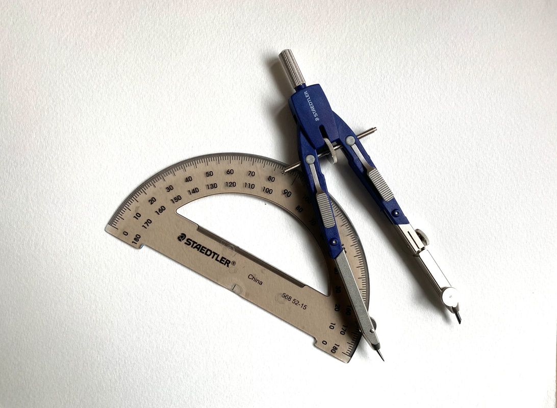
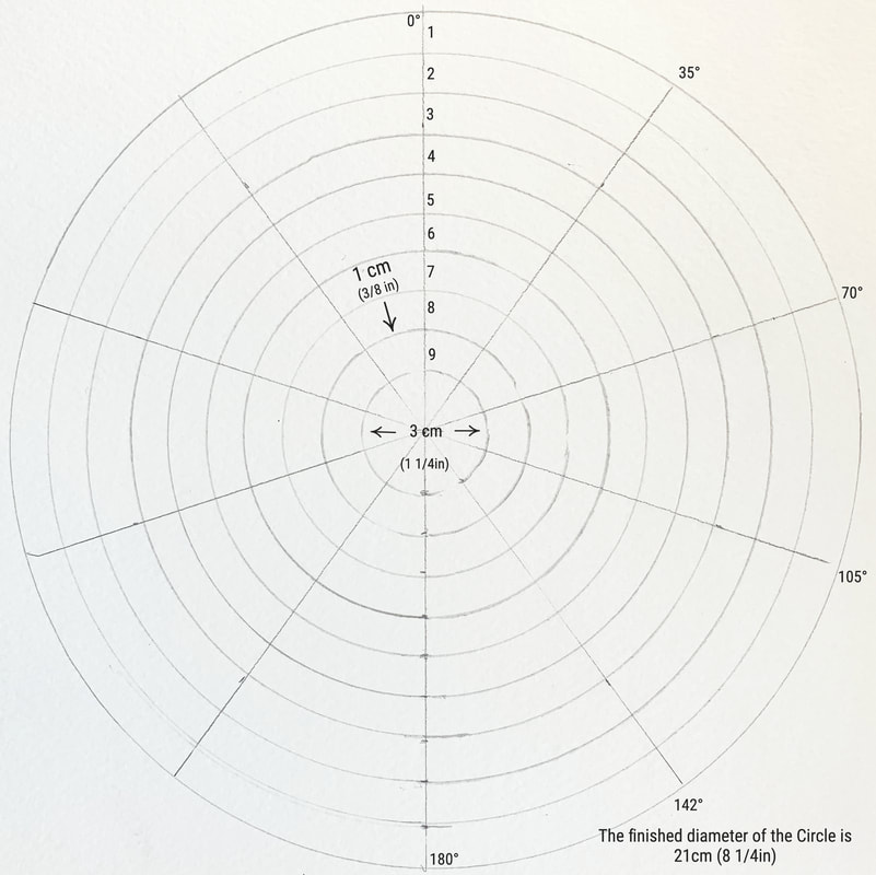
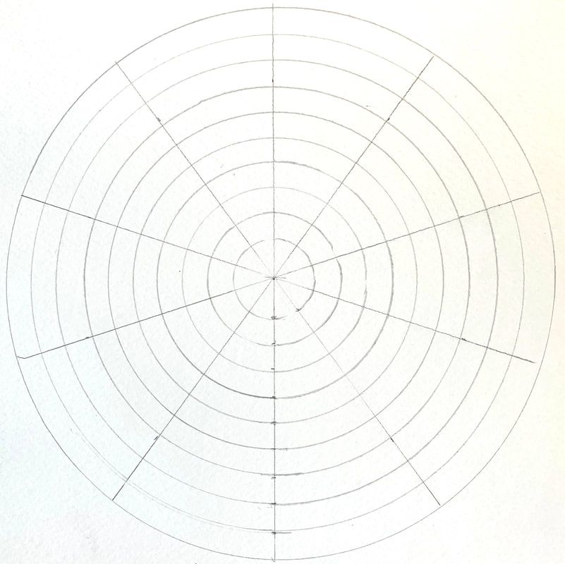
Supplies needed: 23x30cm (9x12in) inexpensive watercolour paper Protractor Compass The first step is to draw the outside diameter of the circle 21cm (8 1/2in), find the centre 10.5cm (4 1/4in). For all the other measurements download the middle image as it has all the dimensions to help create the colour wheel. The far right is the completed Blank Colour Wheel that is ready to start working with. Paint the 3cm centre circle with Neutral Grey Value 5.
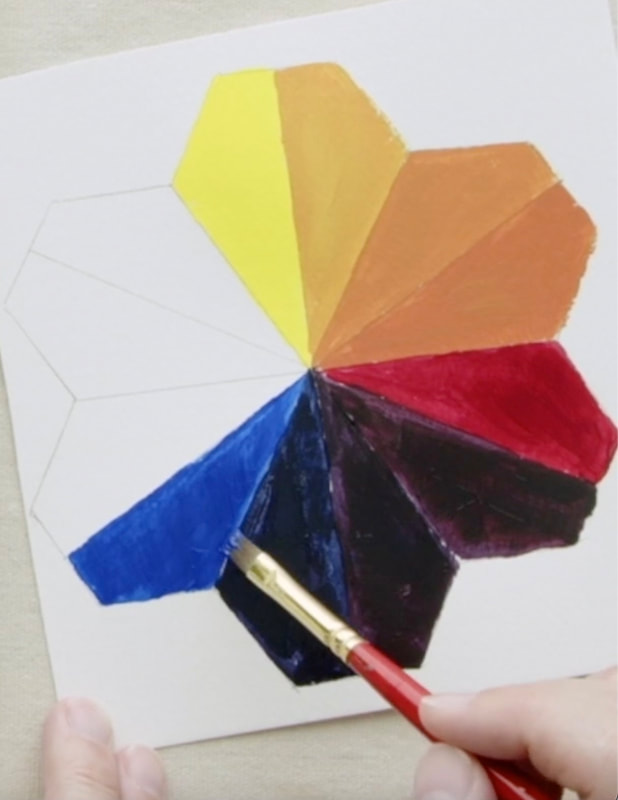
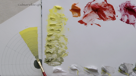
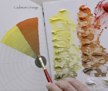
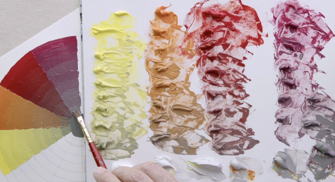
The paint colours I chose to use for this colour wheel are: Cadmium Yellow Light, Cadmium Orange, Cadmium Red Medium, Alizarin Crimson Hue (Liquitex), Quinacridone Magenta, Dioxazine Purple, Ultramarine Blue, Cobalt Teal, Permanent Green Light. Cyan/Magenta/Yellow - Cobalt Teal/Quinacridone Magenta/Cadmium Yellow Light. Red/Blue/Green - Cadmium Red Medium /Ultramarine Blue/Permanent Green Light. The vast majority of the paint I use is Golden Acrylic Heavy Body paint, unless noted. You will notice in the video that I am lowering the chroma of the Cadmium Yellow Light (CYL) with the neutral grey as I have done before, but this time I am stepping down the value in the neutral greys as well as the chroma until the last mixture is close to the middle circle which is nearing Value 5. CYL starts off as Value 9, I use the corresponding value in the first chroma adjustment. There are 9 steps in the after that I use Value 8 twice, Value 7 twice, Value 6 and then to Value 5 which matches the centre of the colour wheel. Cadmium Orange starts at a Value 7, which is also the value that has the highest Chroma. The first few steps are with Neutral Grey Value 7, then on to 6 and the last few are done with Value 5.
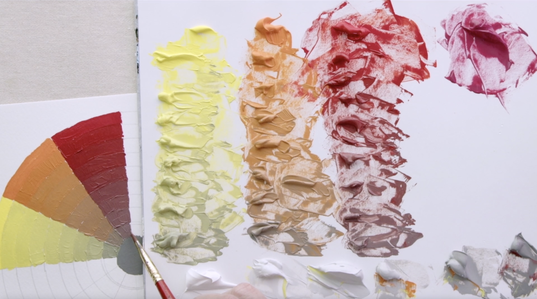
Now we are on two different reds. On the left is Cadmium Red Medium (CRM) which is the one I finally chose, though I did oscillate between Cadmium Red Light and CRM in the video. So if your preference is Cadmium Red Light, you are more than welcome to use it. Cadmium Red Medium starts at a Value 4 and at that value is the highest level of chroma. I used Value 5 Neutral Grey to lower the chroma in both the reds. The second red is Alizarin Crimson Hue (Liquitex). The value right out of the tube is 2, but the most chromatic point is when the Alizarin is at Value 4. Now you will notice that I put too much grey as I was mixing down. I didn't think about the fact that I used white to bring up the paint up value 2 steps and really needed to be more careful with adding the grey in. It turns out that if the pigment is full strength then adding lots of neutral grey make sense. But if the pigment has been softened with white, it requires a much smaller amounts of neutral grey to lower the chroma.
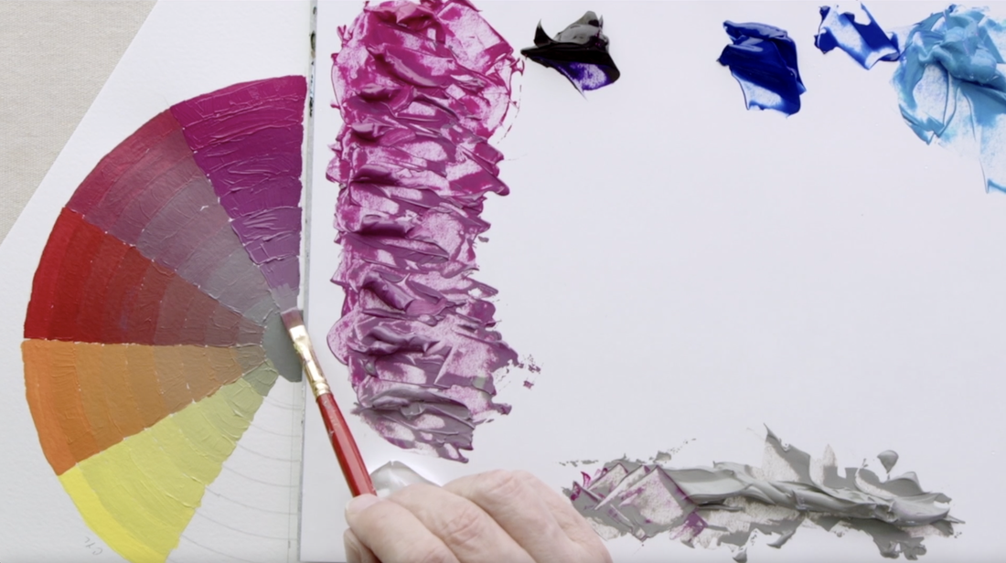
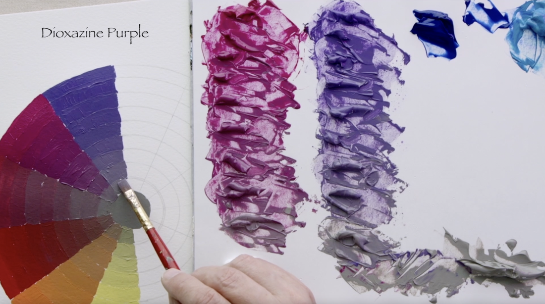
The next two colours are Quinacridone Magenta and Dioxazine Purple. Both these colours need to be brought up to a Value 4 which is the most chromatic point for them. I am still using Value 5 in the Neutral Grey to change the chroma.
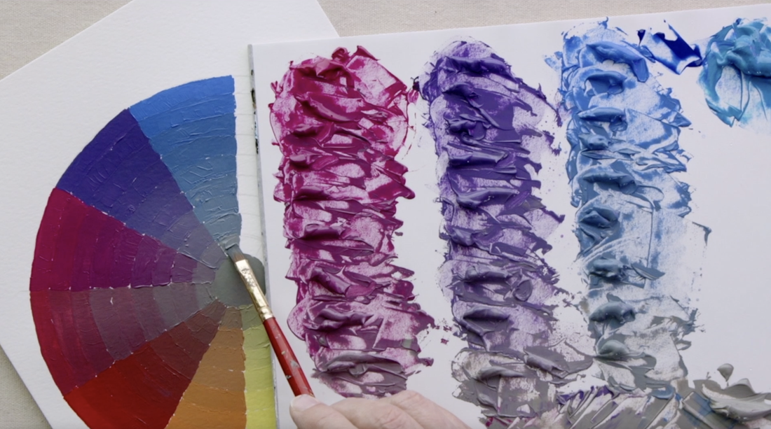
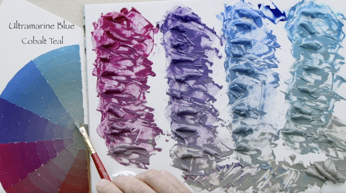
The left side is Ultramarine Blue, using white to bring it up to Value 4 from Value 1. Continuing on with the Value 5 Neutral Grey as we go down the sections towards the centre. The second blue I created is a mixture of Ultramarine Blue (V-1) and Cobalt Teal (V-6) mixed to a value 4 before I began the journey to lower the chroma.
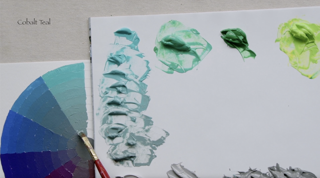
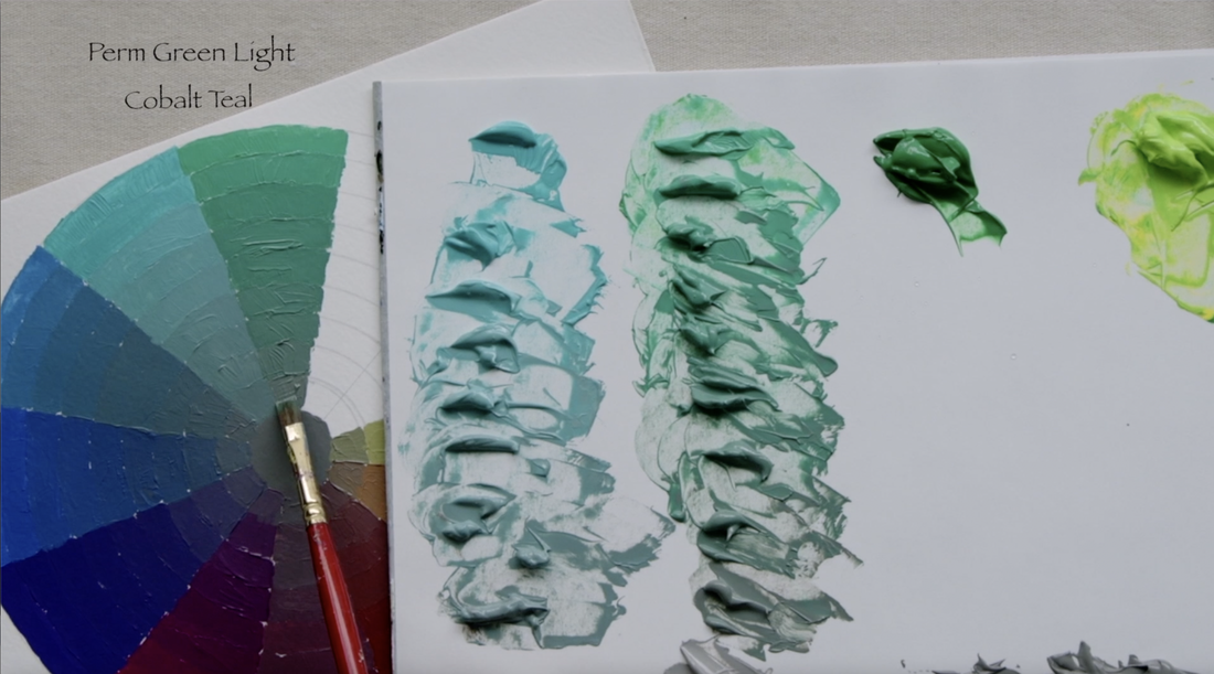
Cobalt Teal is on the left. Straight out of the tube is is Value 6. I used Neutral Grey Value 6 at the start of the string but about the 4th step I moved to the Neutral Grey Value 5 to the centre of the Colour Wheel. Now we mix Permanent Green Light with the Cobalt Teal. Both colours are value 5, which is why I chose the Permanent Green Light over Phthalo Green Blue (V-1), which would have worked perfectly fine. But why do the extra mixing because I would have had to add white to bring the value up to 4. It turns out that if there is another option that gets one to the place they want to be faster, then take it for simplicities sake. One goal is to keep things as simple as possible.
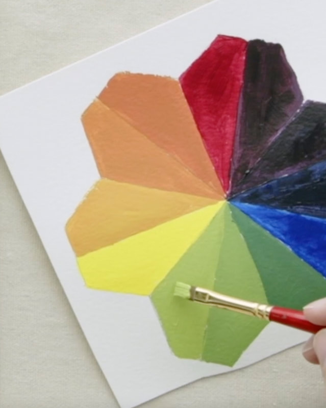
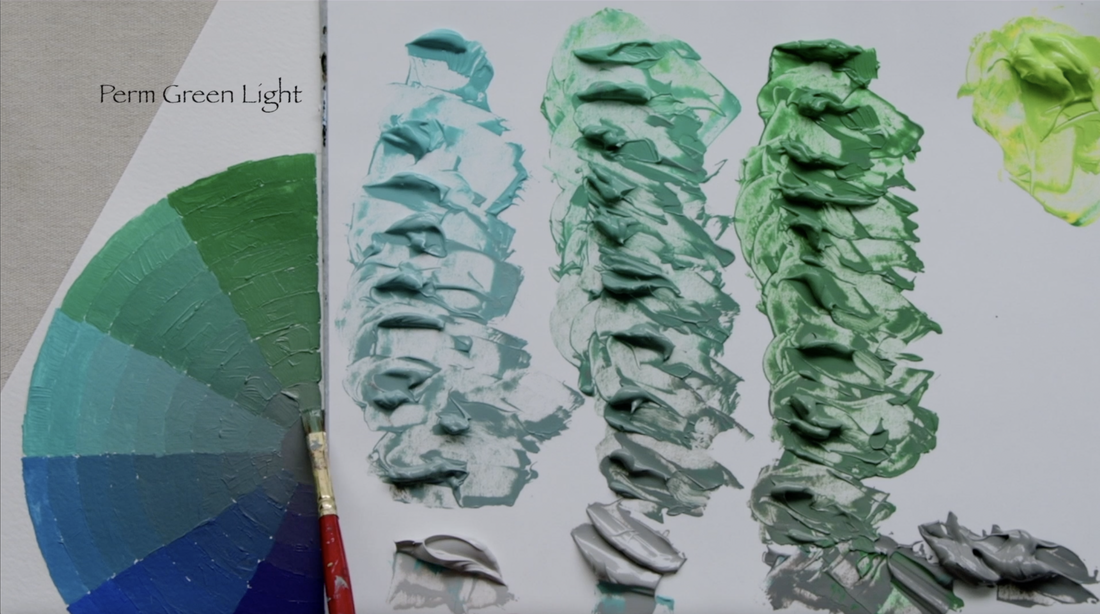
Well here we are at the final two sections of our Gurney Colour Wheel. On the left is Permanent Green Light (V-5) as we step down the chroma. The last segment is a combination of Permanent Green Light (V-5) and Cadmium Yellow Light (V-9). We will mix these two together until the mixture is at Value 7. Now we have to remember that the first two or three will be done with the Neutral Grey Value 7 to change the chroma, then move to Value 6, and finally the last three are with Value 5. And here is the final colour wheel. I do have some plans for using this colour wheel in future videos...watch for it in the spring. 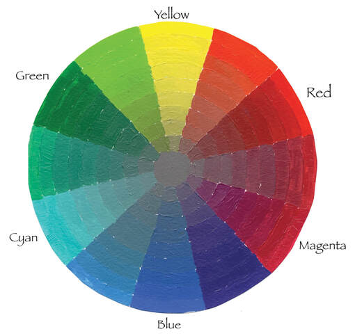
In this video I will be mixing a range of different paint colour combinations to create Black. I have chosen to focus in on using 3 complimentary options: Blue/Orange, Red/Green and Purple/Yellow. Also as a bonus I will be sharing the two paint colours that Robert Bateman shared during his 2019 Master Class in Victoria. :) I wrote down the colours he said but have never mixed the colours until I was making this video. Let's start with Blue and Orange. I chose to do two combinations with the same Blue (Ultramarine Blue - value 1) but different Orange paints. Paints you might not necessarily think of as orange. The first Orange I will be using Burnt Umber. You can see below on the Pigment Colour Wheel that the arrow from the Cadmium Orange to Burnt Umber goes straight towards the centre of the colour wheel. This means that Burnt Umber is indeed a very low chroma orange. The second consideration is that Burnt Umber straight out of the tube is value 2, Chroma 1. It helps to have a very dark value paints when trying to mix for a Black. 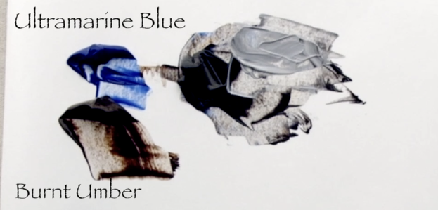 The second mixture is created with the same Ultramarine Blue with Burnt Sienna - (value 3 Chroma 4). Burnt Sienna is way more chromatic (colourful) than Burnt Umber, also its value is 1 step lighter. But it again works wonderfully well for making a very dark colour. 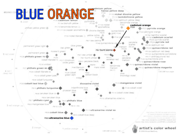  The Alizarin Crimson Permanent paint I use is made of two different pigments. The brand I prefer is Liquitex. My goal always with paint is to have the least amount of pigments in a mixture. Below you can see the two different pigments that went into creating the Alizarin that I use. I put arrows to where on the pigment chart I feel the Alizarin Crimson Permanent would land. It has more blue tendencies, so closer to the quinacridone magenta but with enough of the Quinacridone Maroon to bring the pigment away from the very purple undertones of the quin magenta. 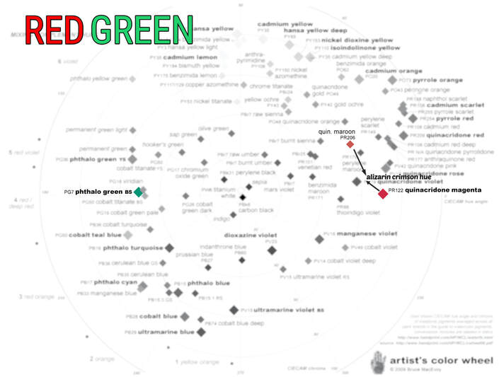 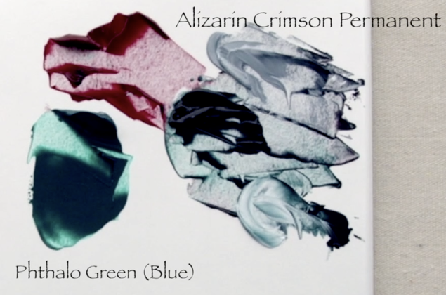 Now on to the Yellow/Purple. This one was the least successful. I got beautiful blacks out of the Blue/Oranges & Red/Greens. I chose to use a Raw Umber, which a low chroma Yellow that is value 2, chroma 1 to mix with the Dioxazine Purple. No matter how much Raw Umber, or how much Dioxazine Purple I mixed in I couldn't get to a grey. Can you see what colour is underrepresented? Below is the answer... 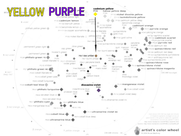 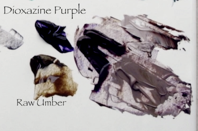 Blue. There is not enough blue. The Red/Green & Blue/Oranges are very well matched for the three primaries of Red/Blue/Yellow. But Dioxazine Purple is surprisingly red dominated. :) There is no way that I could get a proper Black out of the Yellow/Purple combination that I used. In 2019 I was so fortunate to take a Master Class with Robert Bateman. He was on the cusp of turning 89 and he was hard to keep up with. The class started at 9am until 12 noon, 2 to 5pm and 7 to 9:30 pm. Wow Wow Wow. I go back through my notes regularly. He shares his regular paint palette and how he gets the Bateman Blue and Green. And he shared the two colours he uses for creating a value 2 Black. Until now I have never mixed the paints together to see how it would work! 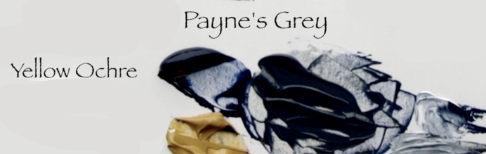 He uses Payne's Grey and Yellow Ochre. What a surprising combination! And best of all, it worked out really well. I guess after over 70 years of painting Robert Bateman knows his paint! 
|
Shawna Lampi-LegareeShawna is capturing moments of beauty from the world around her. Archives
June 2023
Categories
All
Mailing List
To receive an update about new paintings, workshops and other art related news, subscribe to my mailing list below. You can unsubscribe at any time. 
|