|
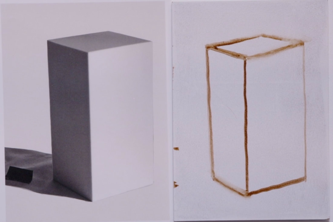
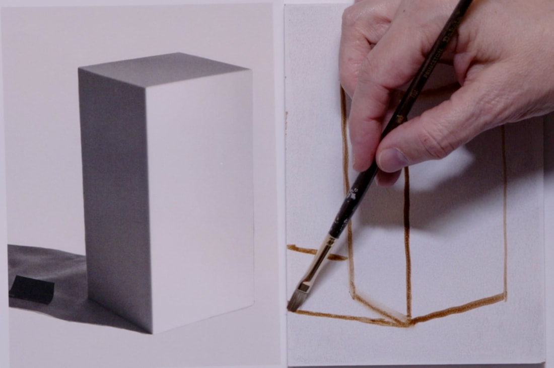
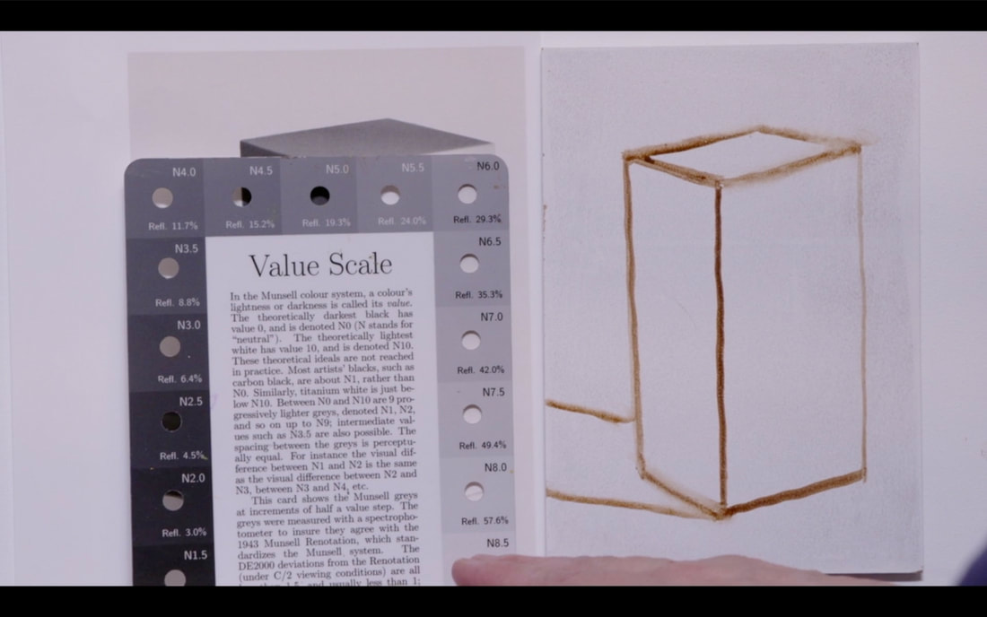
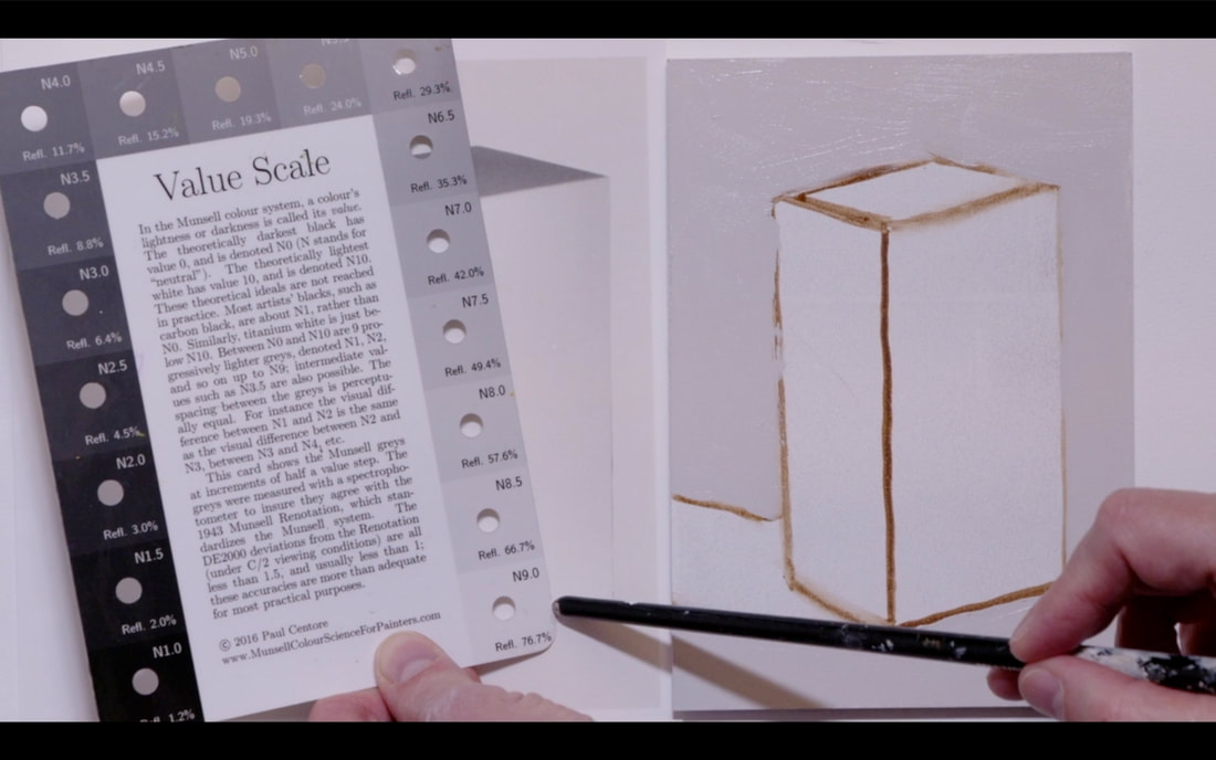
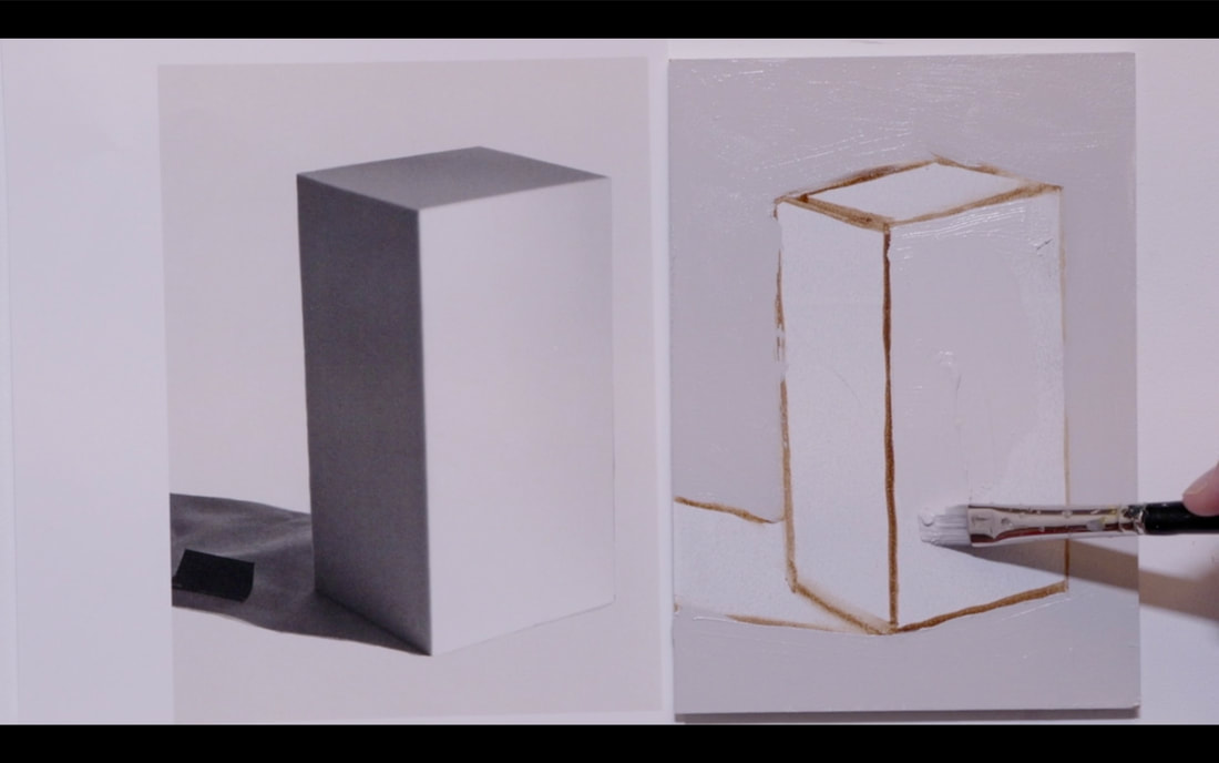
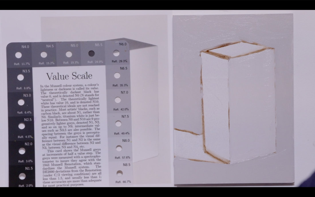
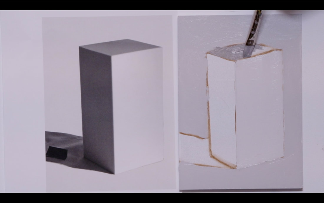
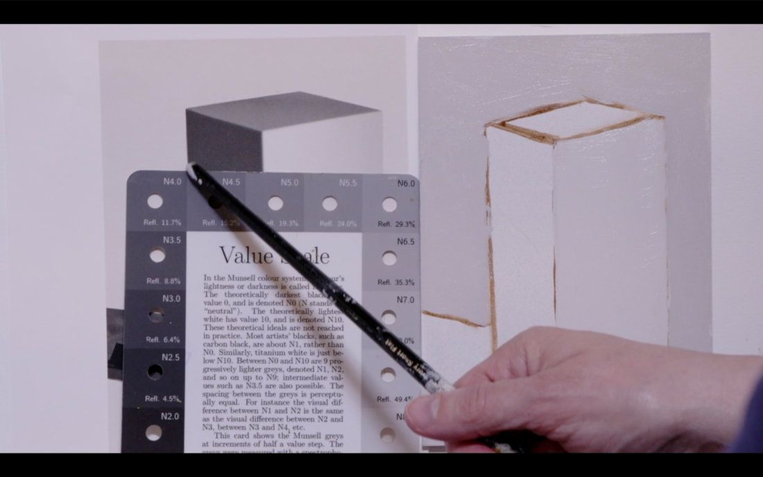
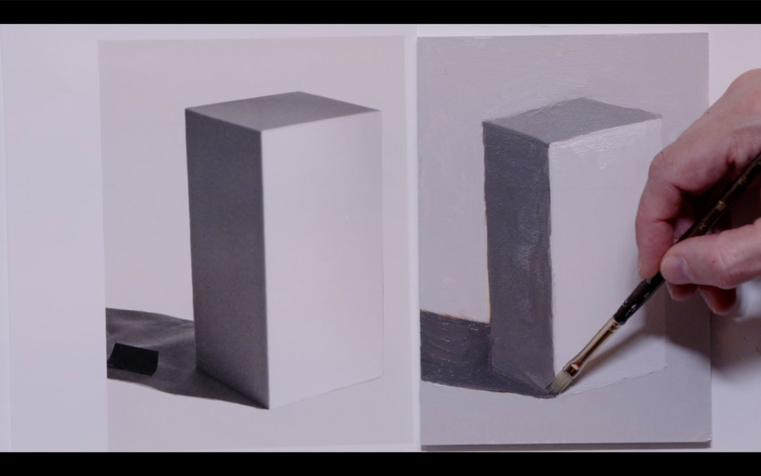
This video is in 3 parts. Part 1 We look at a rectangular object with 90 degree angles and very distinct planes and the descriptive language we will use Part 2 We explore how a change of value on the ground impacts the light reflecting back into the object. We will be using two rectangles with different Local Values. Part 3 is Drawing and painting the rectangle from the image you can download image HERE PART ONE - Light on rectangle object. In this part we are going to learn the terms that we use to describe various planes of the object and how the light interacts or doesn’t interact. Notice we have an object with 4 distinct planes. Only three planes are visible. We see the Front Plane, the Right-Side Plane and the Top Plane. 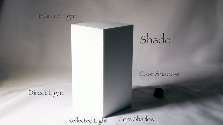 If we were outside, the Direct Light would be from the Sun, the Indirect Light would be the light bouncing back from the sky. Now on to the Right-Side plane which is the Shade area of the object and we have Reflected Light in the right-side plane as the light bounces from the ground back up into the Shade side Next the object is in the way of the light source creating a Cast Shadow. The Cast Shadow can be changed with the direction of the light changing. Longer Cast Shadow if the light is very low, and a much shorter one if the light is much higher or directly overhead. You may well notice that the Shade side is darker at the top and lighter as it goes down into the reflected light area. I took the opportunity to place a black object directly into the cast shadow. I did that so that you will understand that Cast Shadows are rarely fully black. As a new painter I would make my cast shadows far darker than they were. Also, if you use a photograph (as we shall be doing), you will find that the camera makes the shadows much darker than our eyes would see. It is a direct result of the cameras inability to handle both aspects light and shadow correctly at the same time. If you are ever in doubt about the value of the Cast Shadow place something black into the area before you photograph it, using your handy dandy Munsell Accurate Value Scale for Artists to get a correct reading of the Cast Shadow. Remember to write down the value some place so you remember it later. The darkest part of the whole painting is in the core shadow that connects the object to the table on the Shade side. This small area is important to paint because it anchors the object to the ground it is on. PART TWO - Changing of ground and how it impacts reflected light distribution In this part we are going to look at how the reflected light area of the Shade side changes as the values that the object is standing on are changed. The Local Value of the object is Value 8. I will change the ground value from Value 10 (white), to Value 7, to Value 5, then to Value 0 (black). Local Value of the object is Value 8. We are focusing our attention on the reflected light area in As we go through you will notice that the reflected light has become less and less bright until it totally disappears when the ground is Value 0. 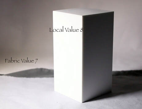 Let’s do this same exercise but now the rectangle object will have Local Value of 5. When I was doing this demonstration, I could see just a touch of Reflected Light happening on the Value 5 ground. Sadly, the camera is not that sensitive, and you are unable to see that. As we move to Value 7 you can see the reflected light really starting to appear on the Shade plane, with the Value 0 ground creating the brightest Reflected Light. 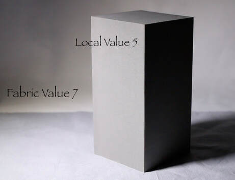 PART THREE - Painting the Rectangle object. Using Raw Umber I begin to draw the rectangle. I spend a lot of time backing up away from the easel to look at both the image and the board from a distance. Then I step forward to put a reference point where I think the corner is. I step away again to confirm that it is correct, then move forward to make changes if I need to. 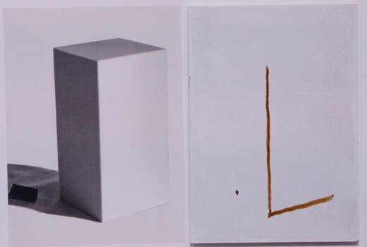 When we go to put the reference point on the top plane it is far too easy to have it tipped up and looking wrong. In our mind we know that the Top Plane is a square shape but in reality we are dealing with perspective. Move forward place a reference point, then step back to confirm that it is in the correct place. It may need to move a little to the right or left or a little down or up. Take your time on this part of the drawing. It is key to having your rectangle look correct 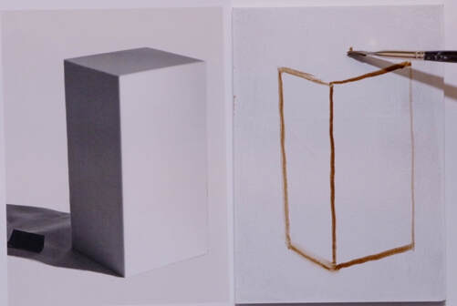 The top is so important. Take your time to get those angles as correct as possible. Then we are on to the Cast Shadow. See that I have put reference points on the side of the board then I draw from those points to the object.
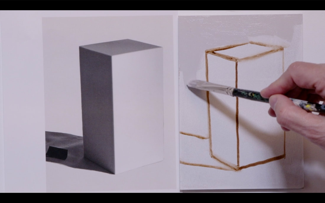
ROTATE THE BOARD AS YOU NEED TO WHEN YOU PAINT. It makes it so much easier to get the edges straight. :) Now to choose the value of the background. I see that it could be an 8.5 but for simplicity I chose Value 8.
On to the Front Plane that is in Direct Light. It is definitely a Value 9!
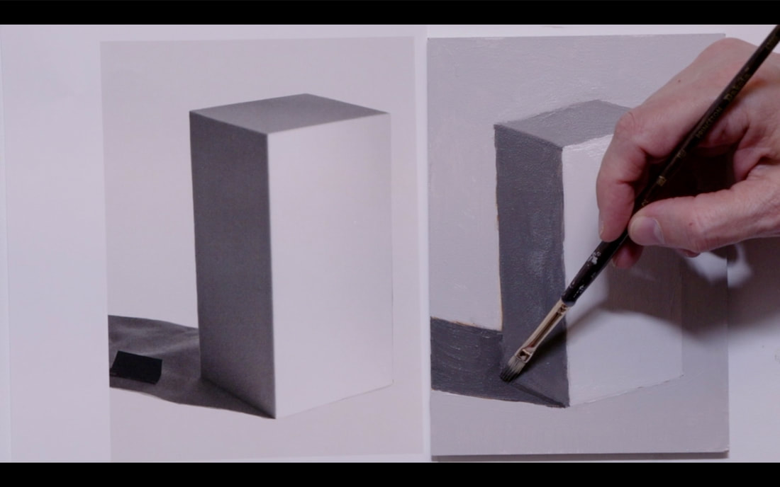
Now we are figuring out the Top Plane value which I saw as Value 6. Photos do darken the values.
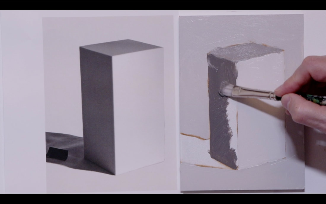
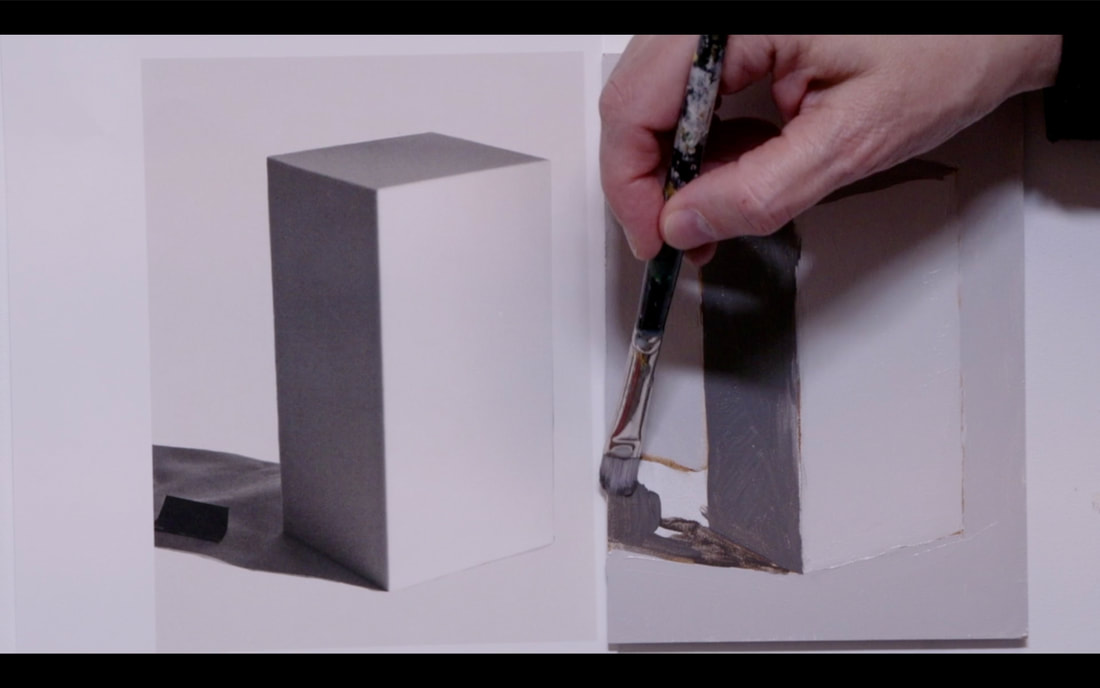
On to the Left Side Plane which is in Shade. I chose a Value 4 for that side.
Place the Cast Shadow in. Value 3 is what I chose. I did a second layer over the whole painting which gets us to the image below on the right side.
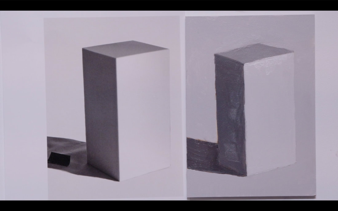
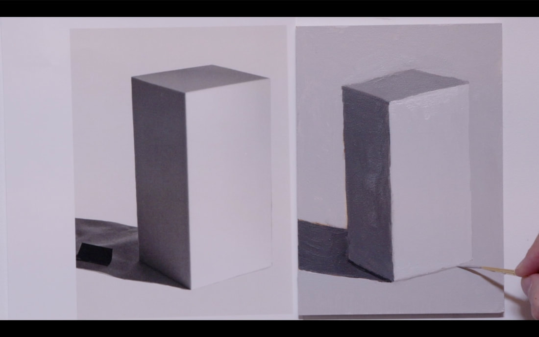
The final parts of the painting: Reflected Light painting into the Left Side Plane Core Shadow under the Left Side Plane to anchor the object to the ground A very thin light under the Front Plane again to give it the illusion that the object is one the ground.
Ta Da...The final painting! 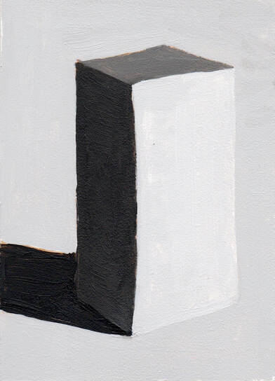 A reminder... YOU CAN ROTATE YOUR PAINTING AS YOU NEED TO. My lines are not straight because I was doing a video and I couldn't rotate the image.
0 Comments
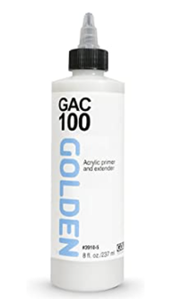
Welcome to Lesson 9 ¾. Make sure that you have your ticket ready as we begin the magical journey of how to prepare your panels. (Sorry I could not resist) You can use either Masonite or Birch cradled panels for this lesson. The first thing to use is a product that Golden makes called GAC 100 or 200. GAC 100 is a universal sealant that is flexible which means it can be used on canvas as well. If using a rigid board, then GAC 200 would be perfectly admissible. The difference between the two GACs is flexibility (100) and rigidness (200). According to Golden GAC 200 will crack if used on a flexible surface. This is a good thing to know. Why use GAC? GAC protects against Support Induced Discolouration happening as the painting ages. Common painting supports such as canvas, linen, masonite, MDF and birch boards contain water extractable materials that can cause discolouration.
Seal the front, back and edges of the board with two coats of GAC before we move on to finalizing with Gesso. There are boards that can be purchased that are already primed on the front. These boards will still need to be sealed on the sides and back. Moisture penetrating into the back of boards can cause damage as time goes forward. Now let’s create a sampler of different Gessoes by Liquitex and Golden. I am certain that other companies create Gesso but these are the two brands that are readily available in my studio. Using a 15x15cm (6x6in) board draw a grid to make 9 squares on it. Each of these squares will be a different Gesso. It is surprising how many kinds of Gesso are on the market. 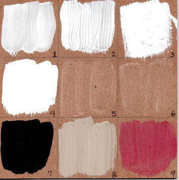 I used the following brands and types of Gesso: 1.Liquitex Gesso (Regular and Flexible) 2.Golden Gesso (Regular and Flexible) 3.Liquitex Super Heavy Gesso (Holds it shape is Flexible) 4.Golden Sandable Hard Gesso (Inflexible) 5.Liquitex Clear Gesso (Dries translucent and is Flexible) 6.Golden Clear Gesso (Dries translucent and is Flexible) 7.Golden Black Gesso (Flexible – can be thinned ulp to 25% with water) 8.Gesso Sandable Hard Gesso mixed with Raw Umber Paint 9.Clear Gesso mixed with transparent Quinacridone Magenta Why would Clear Gesso be used? If you have drawn on your painting surface and want to keep the paint from picking up graphite or charcoal, Clear Gesso will secure the drawing in place. If you are a texture person, then using the Liquitex Super Heavy Gesso might be the perfect way to add subtle textures to the painting. There are several other products that allow one to really create big textures for painting on top of. When the sampler is done, feel each one of the different Gessoes. This will help you to understand which one that will become your favourite go-to Gesso. There are a few ways to put Gesso on a board. I choose to use a roller but, you are certainly able to use a brush. If using a brush, choose a larger one that can be obtained from the hardware store which will certainly make doing larger boards easier. 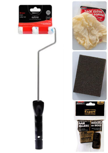 Above are the tools I use for painting Gesso on the boards. Handle of Paint brush, Foam Rollers, Sanding block & Tack cloth to clean up the dust from sanding. Starting with the edges, roll the gesso all around 4 sides, then elevate the board on wooden blocks and do the front (back) side. After 16 hours, lightly sand, use tack cloth to remove excess dust, add a new later of gesso and let dry again for 16 hours. I repeat that three times, then on to the other side of the board. Let the boards dry for a few days before working with them. I do a lot a the same time to maximize efficiencies. Happy Painting!
I got to do something on Friday afternoon that I haven’t done in two full years, though the last time I did it this way was in the winter of 2016. What did I do, you ask!?! I started to teach my Drawing 1 class in Ms. Townsend’s grade 7 class at Range Lake North School. The last time I was in RLN I was teaching drawing and painting to a grade 8 class. I completely forgot how FUN teaching art is. The giggles when I did the blind contour drawing of scissors was great. It is lovely to take the pressure off because they saw how mine turned out. 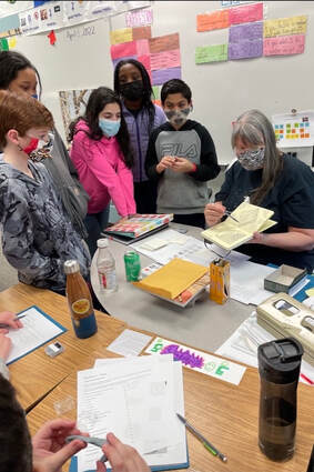 I teach in a very systematic, step by step approach. Each step of the way comes with a handout that becomes a future reference for the students. With each lesson I am developing skills that build one on top of another, which then allows to student to with greater confidence in their ability to draw. With the advent of computers young people don’t spend much time with a pencil/pen in their hand. This generally means that though they do print, they don’t do it often enough to not hold the pencil too tightly. This leads to two problems: 1. Their hand gets tired really quickly, and 2. They draw like they are carving marble. As a result, I spent a fair amount of time during the first few classes walking around helping them to draw lighter which in turns has them holding their pencil lighter. The one thing that dawned on me the evening before I went in, is that the masking mandate has been removed. Like so many, I have been in isolation and haven’t really done large group get togethers. I am happy to report that everyone in the class wore their mask…including me. 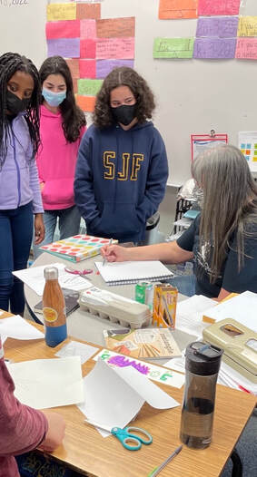 I am totally excited to do session two in 2 weeks and start their after school program then as well. So much fun!
In this lesson we are exploring the idea of Chroma with the focus of the third aspect of colour. The three elements of colour are: Hue, Value & Chroma. Head over to this Video ( Click HERE) for a visual representation of these 3 elements. This is the first of several videos that we will be using the Neutral Grey Value paint mixes that we created in Lesson 8 (Click here) to change the Chroma of the Yellow Hue of Cadmium Yellow Medium (CYM). Draw a Chroma chart out. Image is below and if you head over to the class handouts you will be able to download a proper sized pdf with the measurements on it. 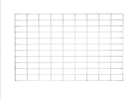 First, we need to create a Value string of the CYM. Straight out of the tube Cadmium Yellow Medium paint starts off at Value 8. The value mixes will be from Value 9 to Value 1. To get to Value 9, add Titanium White. To create Values 7 to 2 use a 50/50 mix of Raw Umber (low chroma Yellow) and Burnt Umber (low Chroma Orange). Why do we use this mixture? Cadmium Yellow Medium lands halfway between Yellow and Orange. If we brought down the value with either Raw Umber or Burnt Umber it would change the Hue as well as the value. But the 50/50 combo of those two paints will only adjust the Value not the Hue. The 50/50 mix of Raw Umber and Burnt Umber is Value 2. To get to Value 1 add the Black you are using. In my case, that is Bone Black by Golden. Across the top we have the Value mixes of the CYM. Now across the bottom add the corresponding Neutral Value paints. 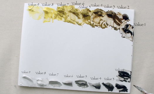 The goal of this chart is to change the Chroma. We do this by adding the same value of Neutral Grey paint into the identical value of the Cadmium Yellow Medium. The Neutral Grey value string is a Chroma 0. Cadmium Yellow Medium straight out of the tube, on the other hand, is a Value 8 / Chroma 16 on the chart. The very high Chroma rating is why Yellow tends to be a difficult colour to use. For this reason, I thought it was a great place to learn how to manage working with highly chromatic colours. As the value of CYM drops, so does the Chroma naturally. Each value seems to be 1 Chroma drop. This means that Value 7 is Chroma 14, Value 6 is Chroma 12, Value 5 is Chroma 10, ect. If you are really wanted to go down the rabbit hole with Munsell with the focus on Chroma. Head on over to Nielson Carlin and follow his videos on Chroma Charts.
|
Shawna Lampi-LegareeShawna is capturing moments of beauty from the world around her. Archives
June 2023
Categories
All
Mailing List
To receive an update about new paintings, workshops and other art related news, subscribe to my mailing list below. You can unsubscribe at any time. 
|