|
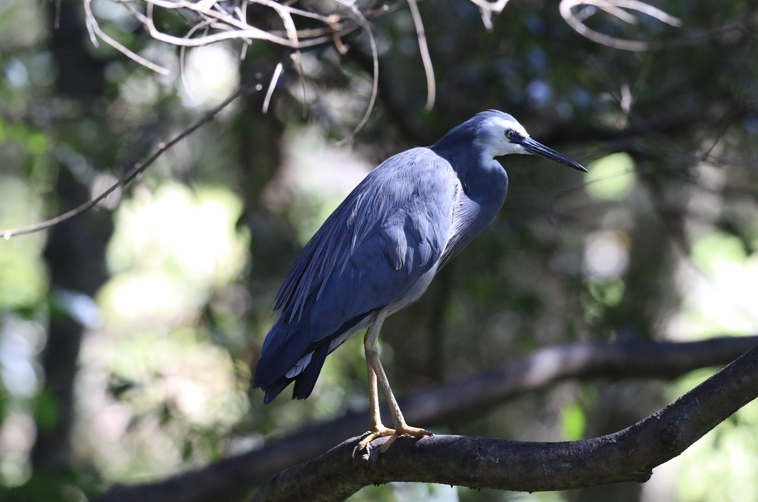
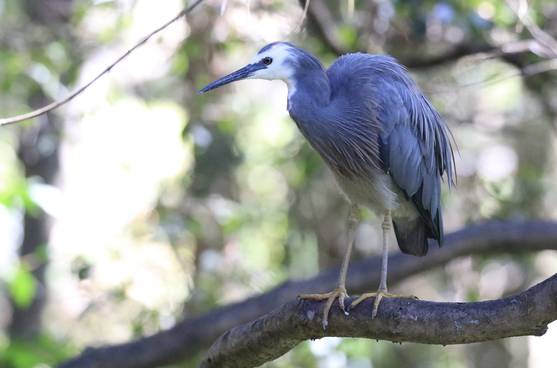
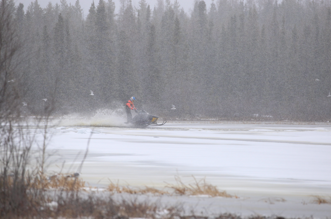
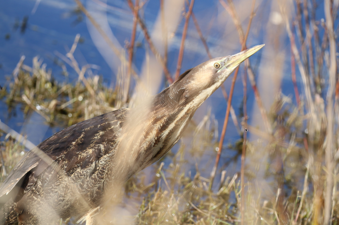
Just a few days after we arrived in Sydney, Donna was out walking with little Isobel when she came to the door to catch my attention. Oh my goodness, it was this White-faced Heron. I was so excited but worried that the bird would be gone before I could get my camera and get out of the house to see it. Thankfully it didn’t flit away. This allowed me to even take a short video with my phone which I will share on my blog. But as soon as it started to move the phone was down and I was out taking amazing photos. The Heron was so hyper focused on Skink Lizard hunting that it never even seems to noticed me. I do have a 100x400mm lens that gives me the ability to keep my distance. It is good not to get too close. Find below the short 4 second video I took before I grabbed my big camera to go and take photos, some of which I am sharing below. 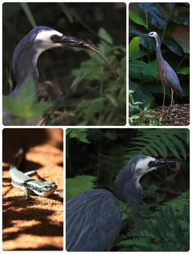
0 Comments
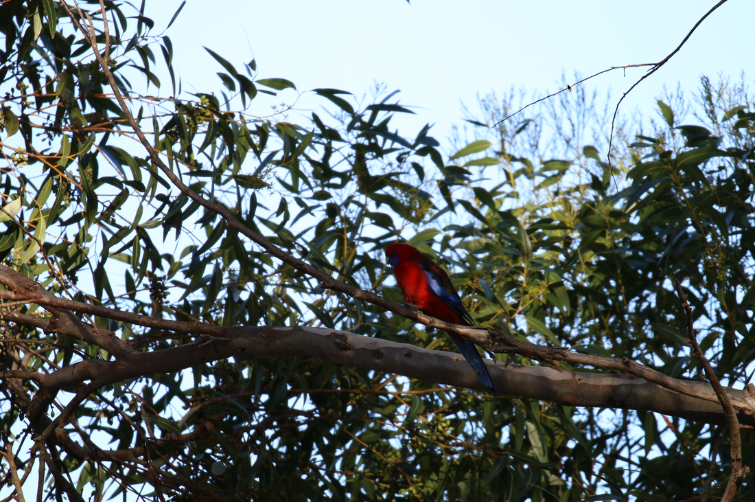
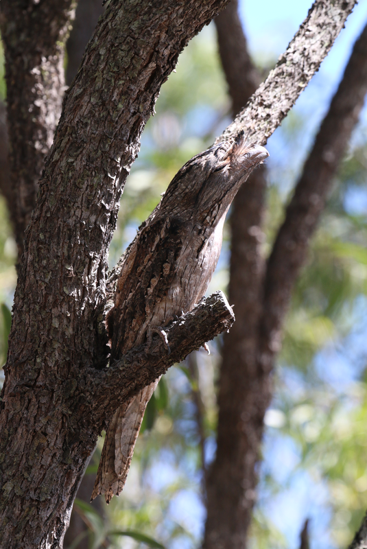
Southern Cassowaries are such interesting birds. I had so much fun painting them. Cassowaries are native to Northern Australia, New Guinea, and surrounding islands. They are flightless birds, that still have remnants of their flight feathers…I have photos of what remains of their flight feathers. They are like emus and ostriches but not a big. They are the third largest bird, but the second heaviest bird on our planet, Ostriches are heaver. The largest cassowaries can stand as high as 180 cm tall and weigh up to 70 kilograms. Though Cassowaries can’t fly, they do have extremely powerful legs that can propel them at great speeds. Surprisingly they are strong swimmers. Cassowaries can run as as fast as 50 km per hour through the rain forest. Now that must be quite the thing to witness. Their powerful legs also help them jump high, up to 2 metres straight into the air. Their legs are also used for delivering strong kicks. They have a sharp dagger-like claw, up to 10 to 12 cm long, that can slice and puncture any animal that is a threat, including humans. My Great Australian Bird Adventure is now in the painting phase of the process. I am back in Yellowknife, going through photos and sorting out how many birds I have seen. So far 140 different ones in Australia and I still have the photos from the whole month of April to go through. 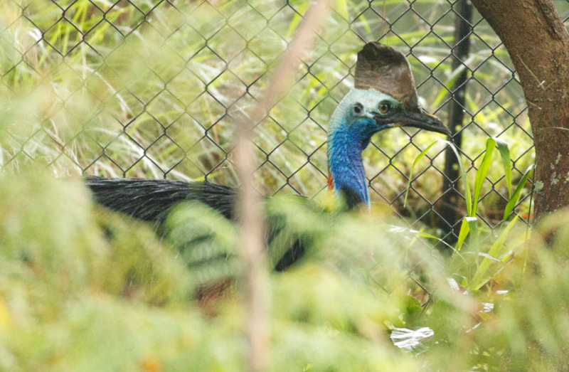 Welcome to the vixen colour study. When I’m doing a colour study it's kind of like doing a scientific experiment that in the end will save me a whole lot of time and effort when I move on to the final piece. I have a hypothesis of what colours will work. I mix them up, then I need to get them up on the board. This really is the only way that will help me to figure out whether or not the colours will actually work for the much larger painting. I started with a raw umber as the underpainting. Raw Umber is a low chroma Yellow. I chose to make the background a lighter value than I usually work with. I tend to work more quickly as I am trying not to put too much detail into this colour study. The goal is to get the information on the board so I can see what is working and what isn’t working. I took an hour to do this colour study. As I lay down the values on the rocks I begin to have doubts about the success of this first attempt. I had to lighten up the snow. My plan is to work from lighter to slightly darker as the snow goes back on the picture plane. I realize that I went too dark too fast. In the end I need to lighten up the snow quite a bit. I get a larger brush to get the paint up faster. There is a couple of days between the first and second colour studies. When I woke up the next morning, I looked with a fresh critical eye at the results of the first colour study. I realized that I needed to address the blahness of the fox. I had brought the chroma down too far and as a result she just wasn’t colourful enough. It is totally worth taking the time to do a second attempt to see if the tweaks that I have decided to do will actually work. As I launch into this new painting I know that I've done already once, which means the second time is much easier because a lot of thinking has been done already. The decisions made the first time through, now gives me a stronger sense of where I want to go and how it's going to work out. The first thing I changed is that I used burnt Sienna for the underpainting. I also made the underpainting a darker value, though I didn’t end up using an underpainting in my final piece. I shall explain that in the next video. The tweaks I made to the colour mixtures was to add more chroma, more colour to each of the paint mixtures. I am careful not to add too much more colour. I find that most of my nature paintings the chroma maybe 1 or 2, but for this I moved up to a 3 or 4. For a reference Zero is a grey (no chroma) in the Munsell colour process. I felt that the initial mixtures were too greyed out, another way of saying it is that the chroma was too low. The snow seems lighter now, though that could just be the result of the underpainting being a darker value. But I know that the snow is lighter because I went from a value 9 to a value 9.5 which is white with just a small amount of black (low chroma blue). I chose to darken legs of this cross vixen more. Another tweak that helps the painting look stronger. The out of focus branches in the background really held up the start of the larger painting until I could resolve how to paint what I was seeing. This fox this is what is called a crossfox. She has dark around her eyes that gives her a very dramatic unusual look. As a kit, she would have been black, not the typical red fox. It is a genetic variance. Below are the two completed colour studies side by side. Yup #2 is much better... As soon as I got the colour study done I began to work on the huge painting. 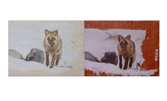 Here is my first painting in my “Great Australian Bird Adventure” sketchbook that I brought with me to Australia. I decided to do the Australian iconic bird - the laughing kookaburra. Somehow this bird seemed to be the perfect choice. If you missed my last video where I painted the intention for this sketchbook. HERE After I arrived in Australia last month I went out to photograph birds, the very first bird I saw and photographed was a Kookaburra. It seems to me that when I go out to photograph birds it doesn’t seem like a perfect session if I don’t see a Kookaburra. Most of the time I am lucky to see at least one. We are staying at our oldest son’s place which is right next to a ravine. There are Laughing Kookaburras that hang around here. Where they are hunting lizards and calling to each other. When I first arrived, I kept hearing something regularly in the mornings and in the evenings and sometimes during the day. I finally asked my son if there were monkeys around here. Turns out the kookaburra laugh kind of sounds like monkeys to me. I am at the beginning stages of learning to use gouache. This paint doesn't act like acrylic or watercolor paint, which means all the techniques that I have taught myself over the years are not working the way that I expected them to do. There's a bunch of learning happening here and I have to remember to remain really patient with myself. It is interesting how as humans we tend towards habits that are comfortable and struggle with impatience and frustration when we move into new learning situations. I guess I want perfection immediately and that is not going to happen! I always start back to front when I am doing a painting. I start working on the background just building up different colours of green with the pale blue- grey sky peeking through. Here is something that I realized about some Australian foliage…some of it (gum trees and so forth) have a very different colours than the birch and willow trees from Yellowknife. I am doing the greens I am comfortable with on the background. They are not the grey blue greens that I was actually seeing on the image. I just couldn’t get my brain to switch over. Sometimes following what you see compared to what you “think” you see can get in the way. My memory understanding of what green trees are definitely got in the way on this painting. I need to grab some leaves and see if I can match them in and out of the sunshine. 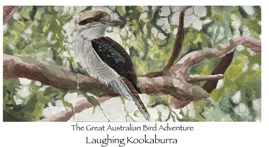 My most recent birding experience was with a White-faced Heron. I was editing this video sitting at the dining room table when I looked up to see the Heron on a branch at the edge of the ravine next to my son’s place. I was able to sit in the house and photograph it through the open window. I got some amazing photos of it preening before it started to hunt. I have sent out a newsletter that includes a range of bird photos that I have captured. Head over to dancing raven studio dot ca to sign up for my newsletter. Also there is a link below for my blog where I have put some photos of the White faced Heron. I have seen all kinds of different birds, a few I have shared in my newsletter. And I'm excited about continuing with my sketchbook.
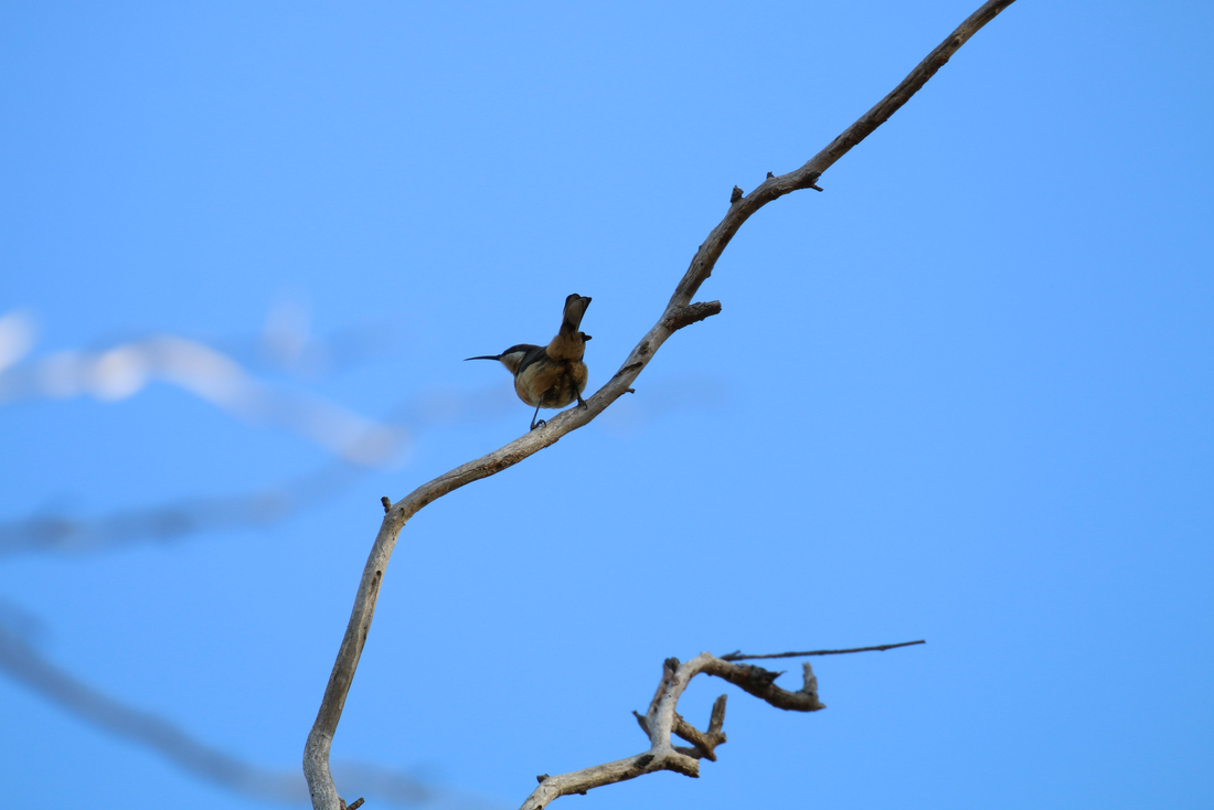
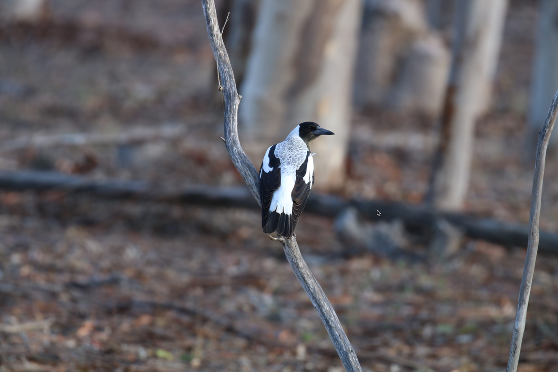
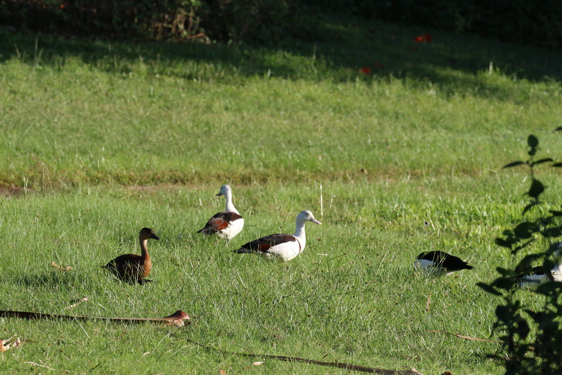
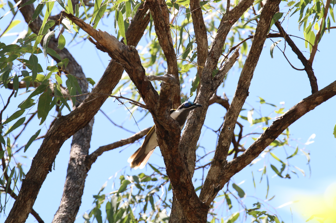
I just wanted to say that these birds are actually grey, but for some reason my camera sees them a very blue. It is one of the many differences between how our eyes see and how a camera records the world.
As I confessed in the intro I haven't done a lot of sketching as a daily practice or even a slightly regular practice. Now I do seem to love the idea of sketching regularly in sketchbooks. I always seem to be buying new sketchbooks. I start them with great intentions, but I do a few sessions and then quickly seem to get derailed as I dive deep into a new painting project. It is tough to add a new practice in ones already busy life.
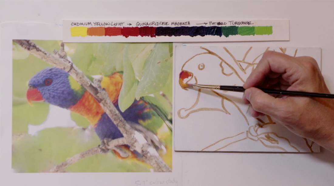
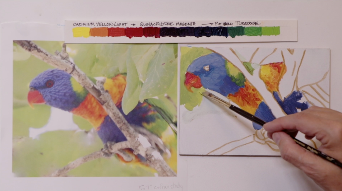
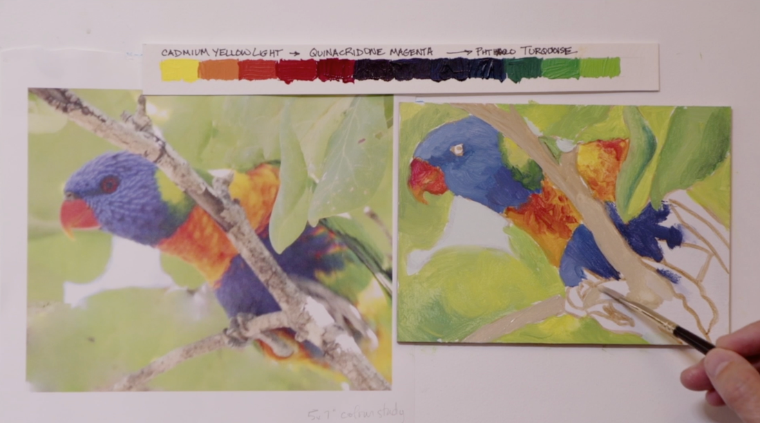
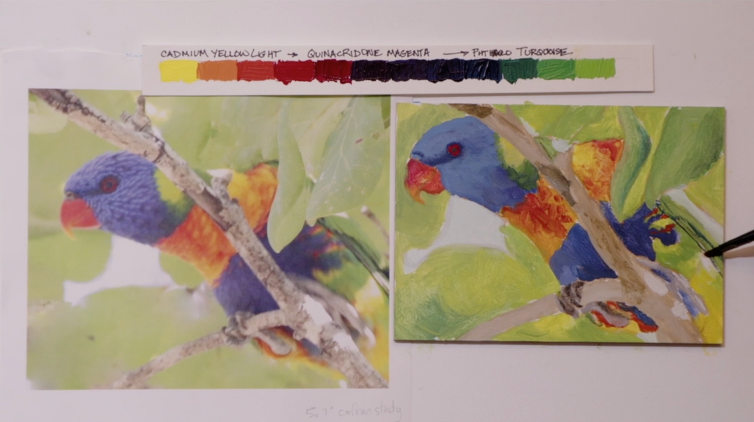
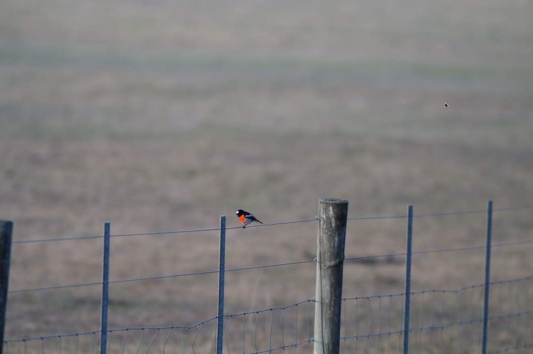
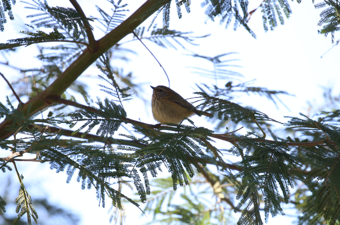
But when I was coming to Australia, I was looking for a way to keep on painting. I had new sketchbooks at home, so I brought them with me, as well as gouache paint. I came with the idea that I would do 1 or 2 larger paintings that would about 40x50cm (16x20) in size. But I very quickly discovered with the touring we are doing and spending time with our son, (which is the reason that we are here) I needed to take a look at my unrealistic expectations. I have thought about the time that is available to me each week while Alexander is working from Monday through to Thursday. With that in mind, it seems to me that it is far more practical to create smaller paintings in a sketchbook. It is a nice small convenient place to work in. I am excited about doing a bunch of different paintings from my birding adventures here. I often take a lot of reference images of a wide range of birds which I never paint from. Working in a painting sketchbook I could do birds that I would generally not paint in a larger format. This sketchbook has 27 spreads. This simply means that when a sketchbook is opened up fully the two pages that you see are called a spread. Now the goal is to see and photograph as many different species of birds as I can. I want to have far more than 27 different birds to choose to work from! After being here for 3 weeks I have already captured images of 27 different types of birds. I'm still waiting to see other parrots, gallahs, cockatoos and rosellas. All of which are very colourful and totally cool birds. Wish me luck on my hunt for these amazing birds. I have been out doing lots of birding since I have arrived. I have met some new friends and really enjoyed their company. I went to a Birding NSW (New South Wales) meeting in the first week we were here. I have joined that group on a birding day in the Royal National Park. Thanks to Elisabeth for picking me up. Unfortunately, it had rained heavily the night before and was very windy. The birds were rather quiet that day. The other adventure I had was into Sydney’s Centennial Park with an avid birder named Steve. It was a hot sunny day. I was able to get some really great photos from both the trips. I am excited about some of the reference images that I have been able to get. Luckly I have seen birds that are new to me. When I was here in 2018, I went on a couple of birding day trips and got photos of amazing range birds. So it is exciting to see ones I hadn’t seen before. I'm working in a new medium – gouache. I have worked with Watercolour for years and though they both are activated with water that is where the comparison ends. Gouache is opaque and the first thing I'm discovering is it dries way darker than what it looks like mixed on the palate or when it's wet. Interesting. I guess I will figure it out by the end of this sketchbook and I will have a much better understanding of gouache as a result. Just days after arriving in Australia we went to Wollongong for a day trip. When we were there, we stopped at a winery. While taste testing a range of wines, I noticed a rainbow lorikeet had landed on the wires holding up the grapevines. The winery must completely cover the grapes as they get close to ripening, or the lorikeets come and eat them all. As I was photographing it, the bird flipped upside down, used its beak to grab the lower wire, then brought its feet down to it. It made me laugh. A small bird would just hop down, but not a lorikeet. It was such a fun reference image that I just had to add it to this title page. It just seem to fit the idea of a Great Australian Bird Adventure. So far I have some fabulous pictures of kookaburras, fairy wrens, swamphens, Yellow-tailed Black Cockatoos, Noisy Miners, and a White faced Heron that was hunting Skink Lizards right next to my son’s place. So amazing! Just a few days ago I was out on an evening walk with the guys when I discovered Rainbow Lorikeets on a lime tree! I could have stayed there until the birds left but I did think that everyone was being ultra-patient with me, so best not push it too far. If you have been following me, for any period of time, you know that I like to work rather large. Check out facebook or Instagram (linked below) to see images. So, working small will be a huge challenge for me. I need figure out which brushes work best and how to manage them as well. It will come in time. As I started to work on the tail of the of the rainbow lorikeet, I kept thinking that I don’t have the colours right. It seemed to be fighting me. I decided to take a break, to continue on later. The sun was shining. It is February and it is so deliciously warm here! I went outside into the glorious heat with my camera right next to me, just in case a bird comes close by. It wasn’t long before there was squawking above me in a very tall tree next to my son’s place. I got my camera trained onto the pair of lorikeets sort of goofing off and being a bit argumentative (one had the others foot in its beak while they were both hanging upside down). It was quite comical to watch. When I downloaded the photos, I discovered that the underneath of the rainbow lorikeets tails is yellow. I didn’t know that. I thought that it was the same green that was on the back of the bird so I had been using a green which meant I was completely using the wrong colours. With that discovery I realized that I needed to make a low chroma yellow mixture. I pulled out the raw umber to go with the Cadmium Yellow Light, then I mixed a neutralized grey in several values. From there it was easy to create the correct colour for the underside of the tail. I thought it would be fun to put some bubbles drifting across the spread. I feel like I have a great start to my Great Australian Bird Adventure.
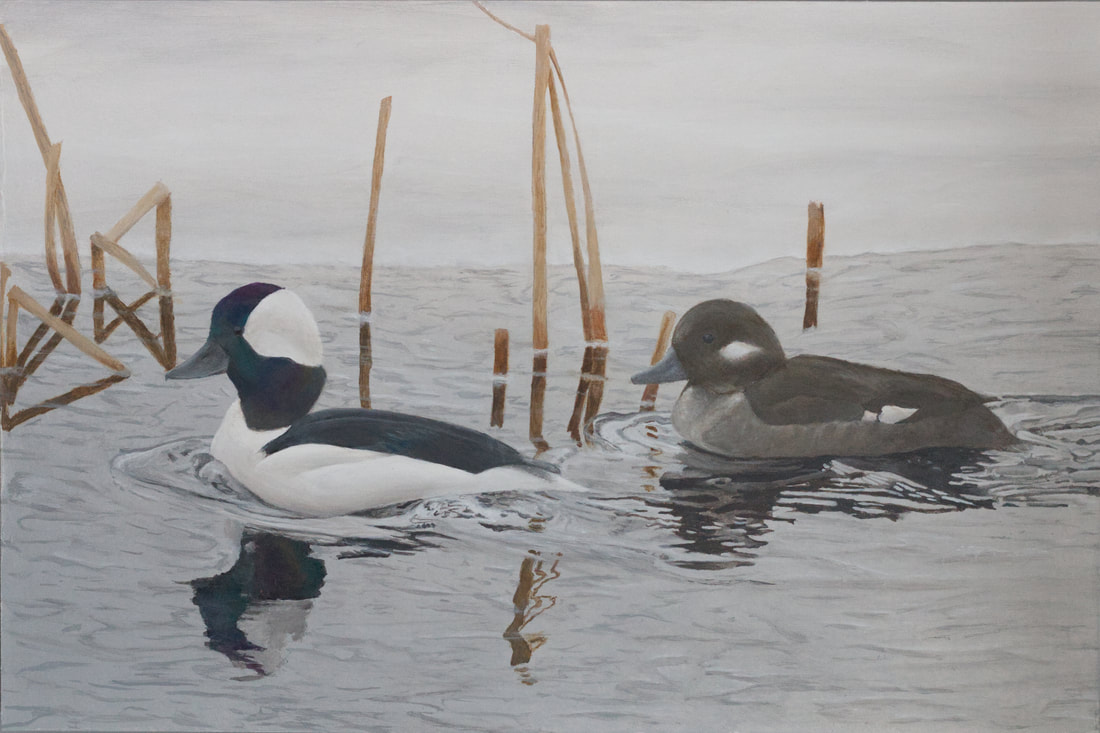
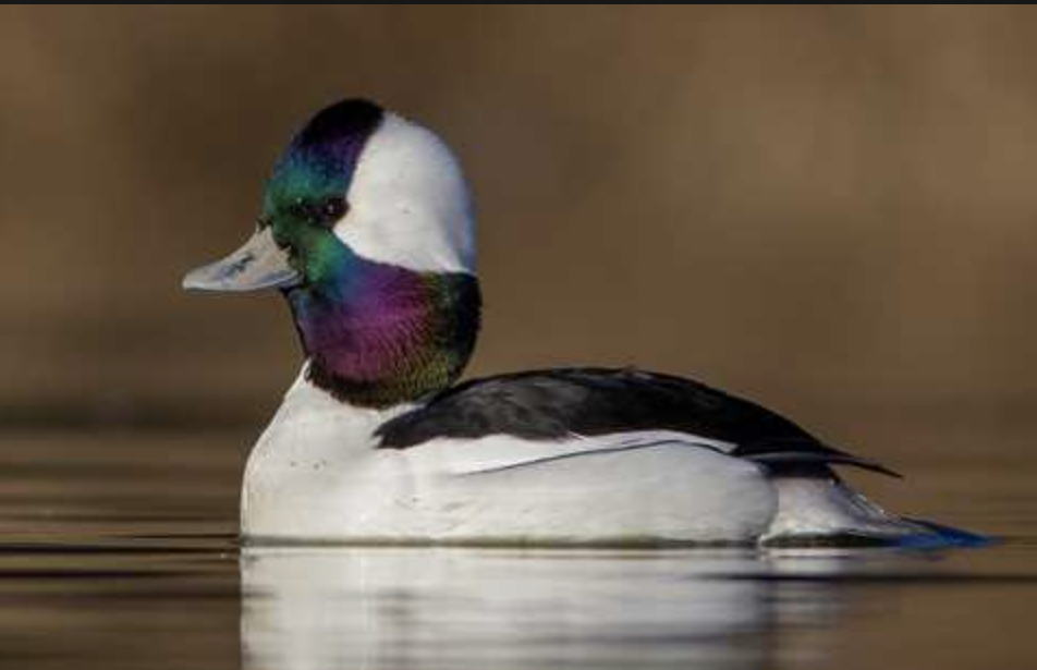
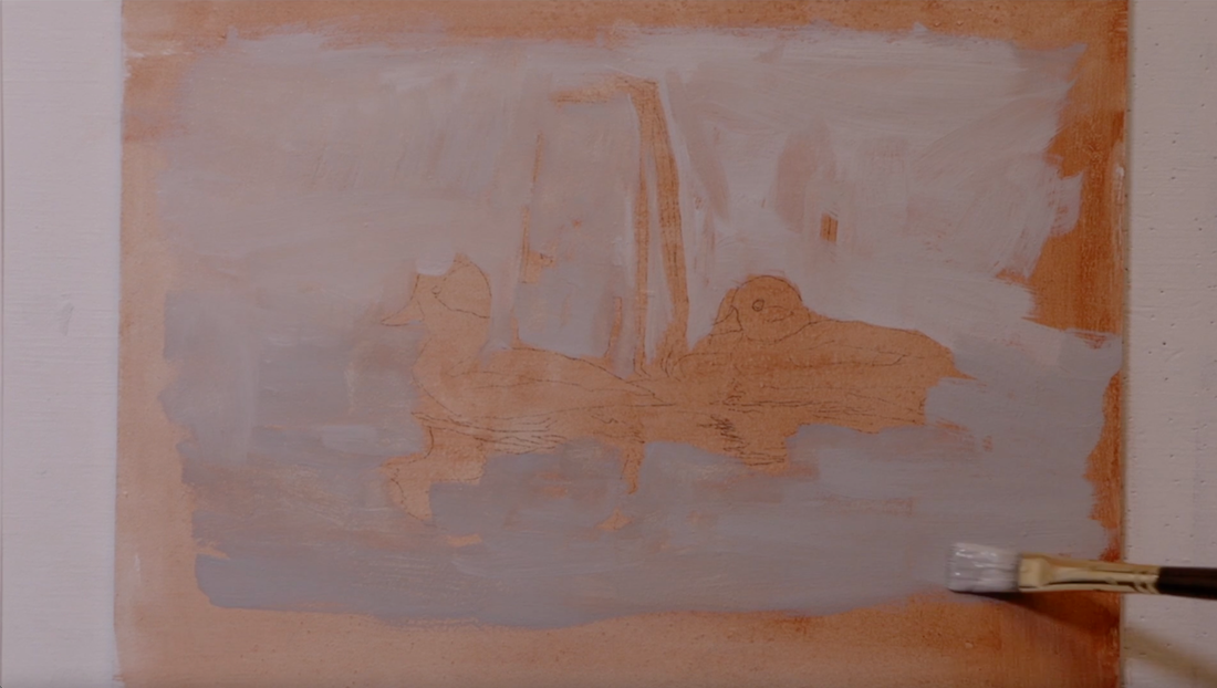
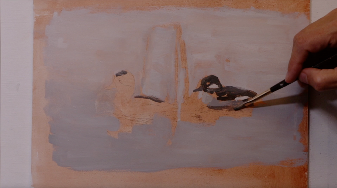
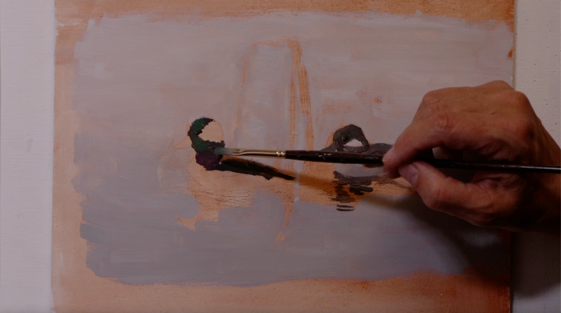
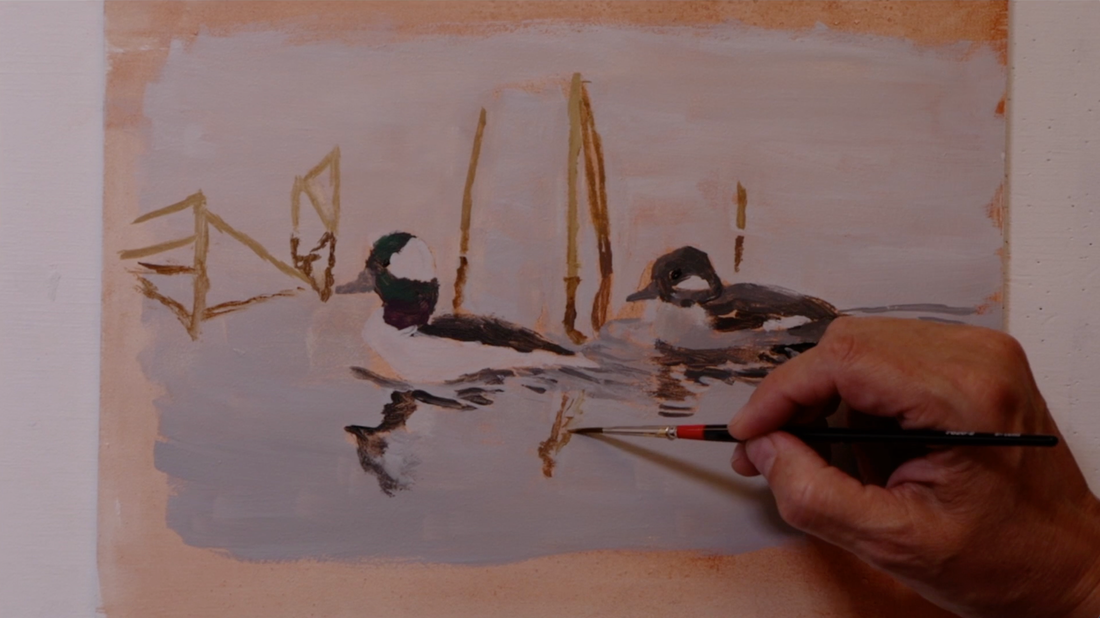
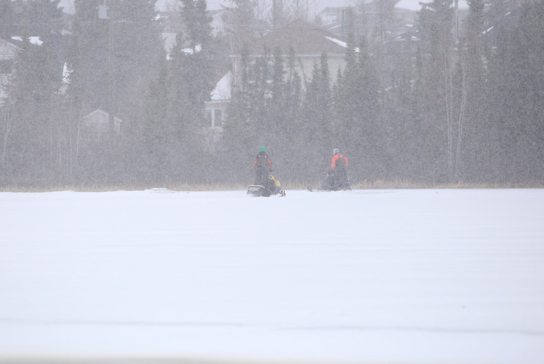
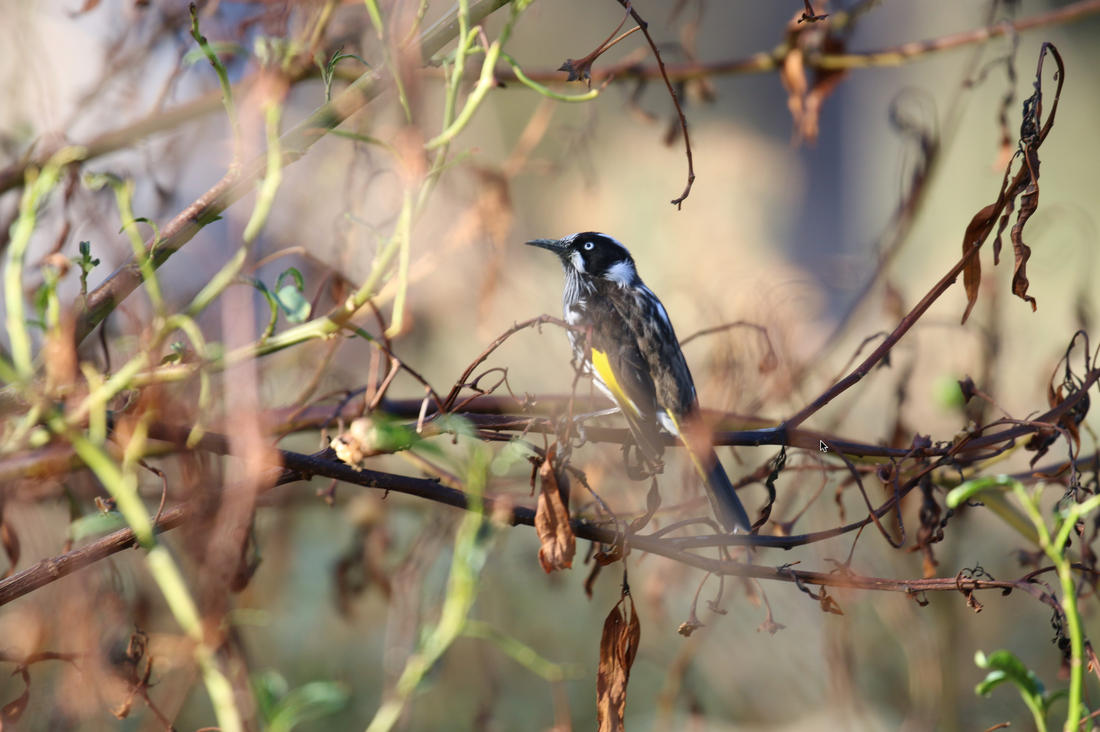
I am starting build up the background, layer by layer, using a method called “BSM” which is the BATEMAN SPONGE METHOD. I learned this technique from Robert Bateman himself in 2019 when I took a master class with him. He developed this method as a way to be able to create a very smooth background that gradates, shifting values along the way. The gradation can go from top to bottom or Left to Right, just as long as the values step from dark to light. I created a mixture in which I use 50% water, 50% Airbrush medium to thin the paint. As a result each layer of paint is fairly transparent. It will take 5 to 7 layers to get the background covering to where I am satisfied with it. I use the sponge to blend the paint. I carefully move from the dark to the light, tapping very gently, then continue back from the light to the dark. It is important to do the back and forth directions with the sponge. If you mistakenly go from dark to light and then start again from the dark the light paint on the sponge will be transferred to the dark side. That will be a problem. No going to the Dark SIDE! LOL I take a few moments in between each later to dry using my hair-blower, so I can get on to the next layer. Once I like the background, I let it dry for at least a day. With the combination of water/airbrush medium I feel it is important to let the paint solidly dry through. I know that it is acrylic and that it does dry fast, but I still like to make sure that I'm not transferring the drawing too quickly on to the freshly painted background. This painting was created as an entry into the WILDLIFE HABITAT CANADA duck Stamp Competition. In 1985 Robert Bateman was the first Canadian artist who’s work was chosen to be on the inaugural duck stamp. The painting that I am working on is actually for the 2024 stamp competition even though I was painting it in 2022. The announcement of the painting that will be on the 2024 stamp will be on April 1, 2024. But this April (2023) they will be announcing the winner from the 2021 competition. They are always a couple of years ahead. Creating stamps takes significant amount of time and preparations. We happen to be traveling in southern Canada when I had this thought pop into my head about the competition. Due to a very busy summer, I had forgotten to look for the competition for the 2024 duck stamp. When I got on-line I discovered that the deadline to indicate interest in participating was only 2 hours away from closing. I quickly filled out the documents and entered my Intent to Participate. I did a separate e-mail as well…just to ensure that it wasn’t missed. I knew I had pictures of bufflehead ducks back at home, but I couldn’t remember what they looked like. Even though I wasn’t sure about the reference images that I had, I still wanted to participate. I knew that this year's competition for me would be more like a trial run. My goals were several, 1. I was going to make the October 28th deadline. 2. I knew that I was going to be doing a lot of learning through this process. So I wanted to give myself a little more leeway than I usually would. 3. And I was trying not to put too much pressure on myself, which isn’t always as easy for me to do. There are very clear requirements for a Duck Stamp competition. There has to be the Female and Male duck in breeding season. The artist needs to ensure that their painting includes the breeding habitat of the particular kind of waterfowl. The Canadian stamp competition only has one option for painting this time was Bufflehead Ducks. Once I got home I realized fairly quickly that I didn't have very many pictures of actual habitat. When I am out I mostly focus in on the bird I am photographing with a bit of habitat for context. From my research I knew that Bufflehead ducks nest in old woodpeckers holes high up in trees. I really didn't have any pictures that included trees in the spring. And as it was already August when I put my name forward and I really couldn’t go back in time to take the relevant reference images. As I went through my photos, I figured out that I needed to amalgamate two different images so that I could get the Bufflehead Duck pair together. Thankfully the light was similar in both images. I am still a beginner in using a program called affinity while designing my paintings. I am carefully painting in the reflection information during this first pass. As this painting is for a competition, this means that I am being very particular and working very slowly. Building up that first layer is not about being perfect. It is the second and third pass that will allow me to correct and add those very subtle value shifts. The first pass is about getting values as close to correct as possible. When I prepared the background paint mixtures, I made larger amounts this means I have extra, which will allow me to clean up edges if I need to. Notice that the reflection is distorted because as water shifts and changes there are different values being reflected. I really enjoy painting water as it is so complex and if I do it well, it looks very cool. Water is such an amazing subject matter to paint. It is never the same twice. Sometimes it is silvery, other times it can be pale blue, or it can be deep blue with clouds and nearby trees being reflected on it. I could spend a lifetime just painting water and maybe have more of an understanding of it. It's very helpful to have good reference images to work from when painting water. Generally, I can't make it up out of my head because the water just won’t look real. There are other artists who have done so many paintings of water that they have a visual memory that they can work from, that is a really deep understanding of water. Painting water is all about abstract interconnected shapes. I'm continue to build those abstract shapes knowing that in the end they will correctly represent the water. I was finding it hard retain the information of what I was seeing between the time my eyes looked at the reference and back to the painting. The distance my eyes had to flit back and forth was too great. To deal with that at some point I will be adding part of the reference image that has been cut out on to the painting surface. There is a little wave being pushed forward in front of the ducks. As I paint that area in front of the female duck, I'm not worried about the value being exactly correct. I focus on getting the shapes correct in this first pass. I did attempt to create a more complex set up with one habitat image that I had, but I was wholly dissatisfied with the results. That distinct lack of proper habitat reference images was a hinderance for this painting. As I only work from my own images, I had to keep with a very simple design this year. That way I could do the very best work possible given the constraints that I was working under. There were definite requirements for entry. Invited artists must submit only one original entry. Entries must be an original multi coloured painting in the artist choice of medium. With no reproductions. And they had specific sizes to work from so that the painting will lend itself to fitting onto a stamp, this also means the final painting needs to be horizontal. I ended up working with a 12 inch to 18 inch board, though I did buy the 12 by 16, 11 by 14, and a 6 by 8 inch boards just to be on the safe side. I live 1700 km away from the nearest art store. The painting is to portray the eligible waterfowl species/ migratory game bird in its breeding plumage and its natural habitat during breeding season. The habitat of the species had to be clearly defined . I think that means a landscape design must be incorporated into the painting along with the traditional part of painting a waterfowl. Another big consideration is how the winning painting will be cropped and to include an area for the text that will be on the stamps. I generally find it a real challenge to work to a limited theme. I'm very particular about only working from my own images. One major reason is that I have a story about my experience around seeing and photographing the bird, which then connects fully to the final painting. Every one of my paintings has a story. It takes quite a while to get the water reflections in place this painting because it is such a complex area. This painting is of a pair bufflehead ducks just gliding along on a small patch of open water with ice close by on a very cloudy day. If there had been any amount of sunshine on the male then I could have painted the amazing iridescent colours on his head. I did get some iridescence painted in but later on during the painting process. The reeds are very simple. I did need add in more reads on the left-hand side. I'm not exactly sure I was completely successful with them. But it's all learning and I am happy that I did the painting and made the deadline. Here I come to work underneath the water on the bufflehead male. I love how much white is being reflected into the water because the body of the male is so white. With using a third image to get the reeds in, I only realize later as I was painting that that the water had been moving differently which caused the reflections to be more squiggly. I needed to make the reflections look like the other ones. Now on to working on the water in front of the male duck. Water takes an extraordinarily long period of time to work out. When thinking on the male duck, I plan the values that I will work with. The reflection value needs to be the darkest value. I paint the darkest part with value 2. I never use pure black in any of my paintings. Then I know that the duck needs to be slightly lighter, so the darkest value I will work with on the duck is value 3, just one step lighter than the reflection. Though the duck has lots of white I'm not actually using pure white at all. I use a value 9, maybe a bit of value 9.5, which is very close to being pure white. At the very end of the process, I might use a bit of the pure white in very tiny amounts that I will blend out in small areas. These are really cute little ducks. Being quite small is helpful when nesting up in a tree. I think it would be pretty cool to see the little ones come out of their woodpecker hole and start their journey to the water. I am thinking that I might need to switch out my focus for a time to practiced doing landscape paintings with birds being a small part of the final image. I do adore painting birds. There are so many different kinds, and I regularly head out to take reference images. Right now, I'm in Australia. Since arriving my reference images include kookaburras, noisy miners, rainbow lorikeets, and Australian White Ibis (funnily knowns as Bin Chickens here). That is only with one day out birding. There is more to come! See that I have placed the male duck head right next to the one I am painting. I needed to see it closer. I was struggling with the distance between the reference image, then turning my head back to the painting and trying to retain what angle I needed to paint. Here is the reflection of the water underneath so that I can lean back in my chair to compare the reflection that I am painting to the actual image. Working on the reeds. You can see I kind of flit back and forth when each painting session comes to an end I start again in a new place. Now I'm creating the edge of the ice near the water. Add some of the highlights that I'm seeing on the ice that hasn't started to melt yet. This particular year that I took these images it was still very cold outside. The date was May 15th. I actually have photos of snow machines running the gauntlet over a little bit of water then onto the still solid ice on a smaller lake in Yellowknife. AND to add insult to injury IT WAS STILL SNOWING! I have to say…it was more than a bit disheartening to have such a late spring. I don't mind winter at all BUT when it is May then spring really needs to be there. There are a few things I would change with this design now that I am editing the video. But that is with hindsight and really the painting is done! So, I just move on! This painting is really subdued and grey. It was the light that I had on that particular day, but then there is the complete lack of spring growth, and the abundant ice still around which makes for very little colour to reflect into the water. As I paint, I go from the little blue liner brush putting a small dab of paint in place, then with the white brush I soften the paint. Acrylic paint dries so quickly this is the only way that I can create those subtle shifts that I'm seeing. I am on my second pass of the reflections in the water. I add in the dramatic lighter value 9.5 that I'm seeing in different places. Then on to the darker areas. Here I am putting on the very subtle iridescence the male. To see it with it’s brilliant iridescence head over to search for the male bufflehead duck Here is an image I found in a search that shows how iridescent a Bufflehead male can be during breeding season. Photo by Chris Montano Jr.
The focus in the beginning is to start with the background of the water and snow that is around and behind the ducks. Slowly building up until the shapes of the bufflehead ducks showing up in the negative space. I used a very thin layer of burnt sienna as underpainting. I don’t do an underpainting for my big paintings very often, but I do for all my colour studies. It helps me to see the light and dark values easier. It gives me a comparison to work from. It just works for me. I just keep adding layers and layers until I get the background to where I want it to be. I am not in a rush.
The water was fairly calm that day as they paddled back and forth. Actually, the pair were in a ditch, as I mentioned earlier there had been very little melting happening around the lakes even though it was the middle of May. As the ducks’ paddle past they are creating some rippling in the water behind them. Focusing in on these small details makes the water seem more real. I have changed to a smaller brush to paint in the smaller areas. I have done a number of paintings with water and each one is so different from the other. I marvel at the very living nature of water and how diverse it can be from even one hour to the next. I notice that water also reflects darker values. As the ripples fan out, they may crossing paths and creating very distinct forms. Water is always changing. The variation makes water a very rewarding subject matter to explore with paint.
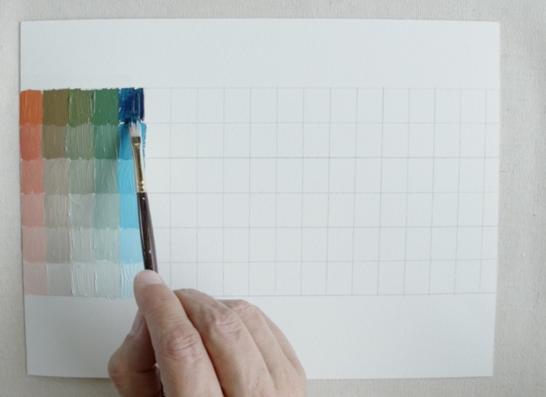
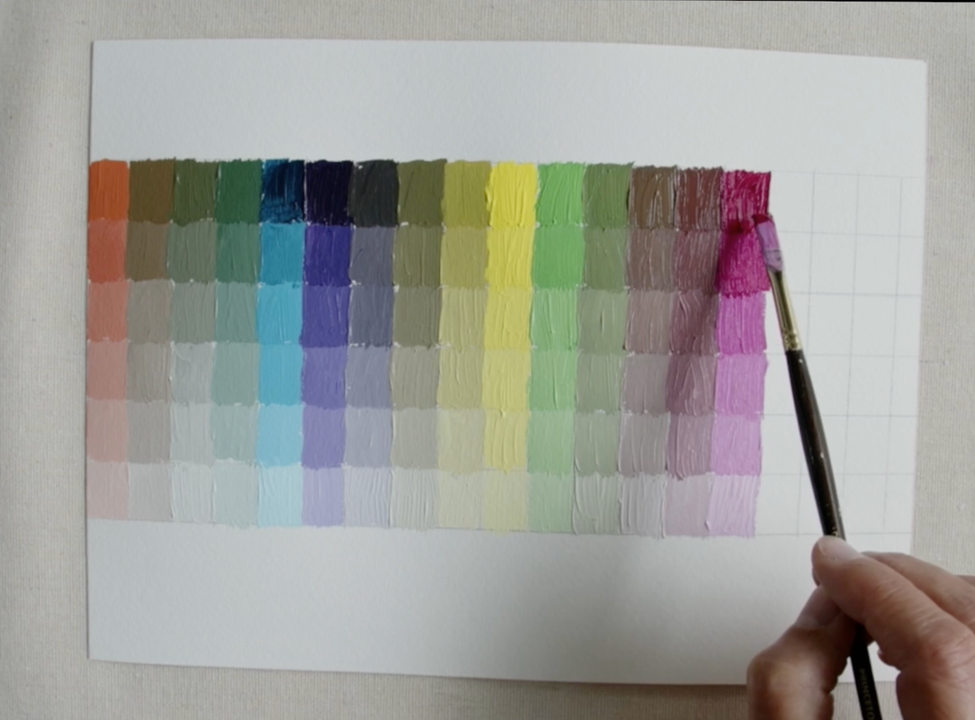
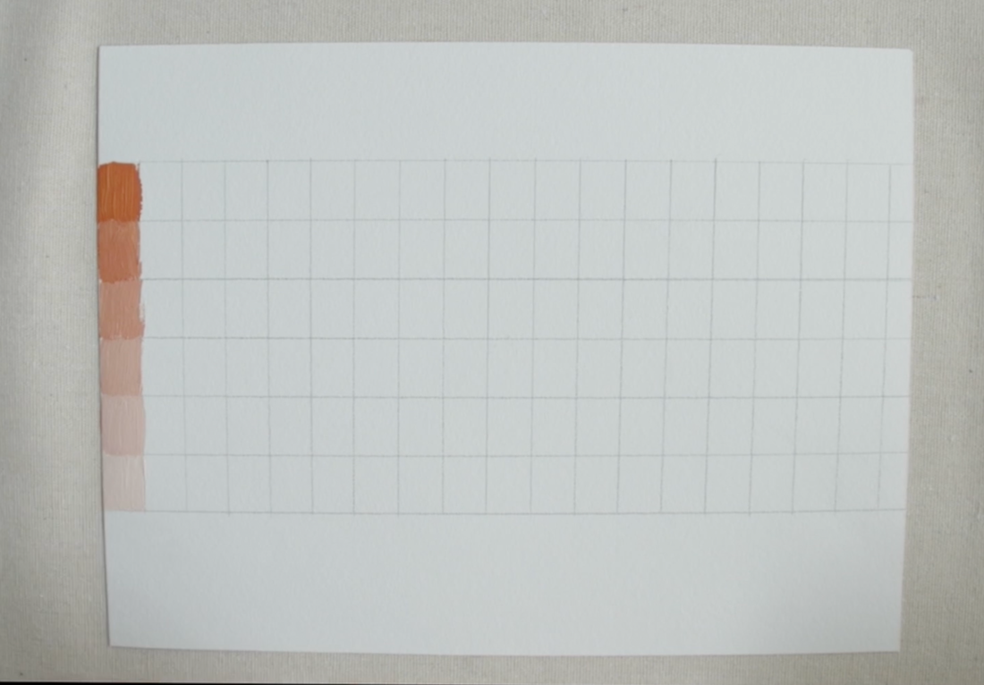
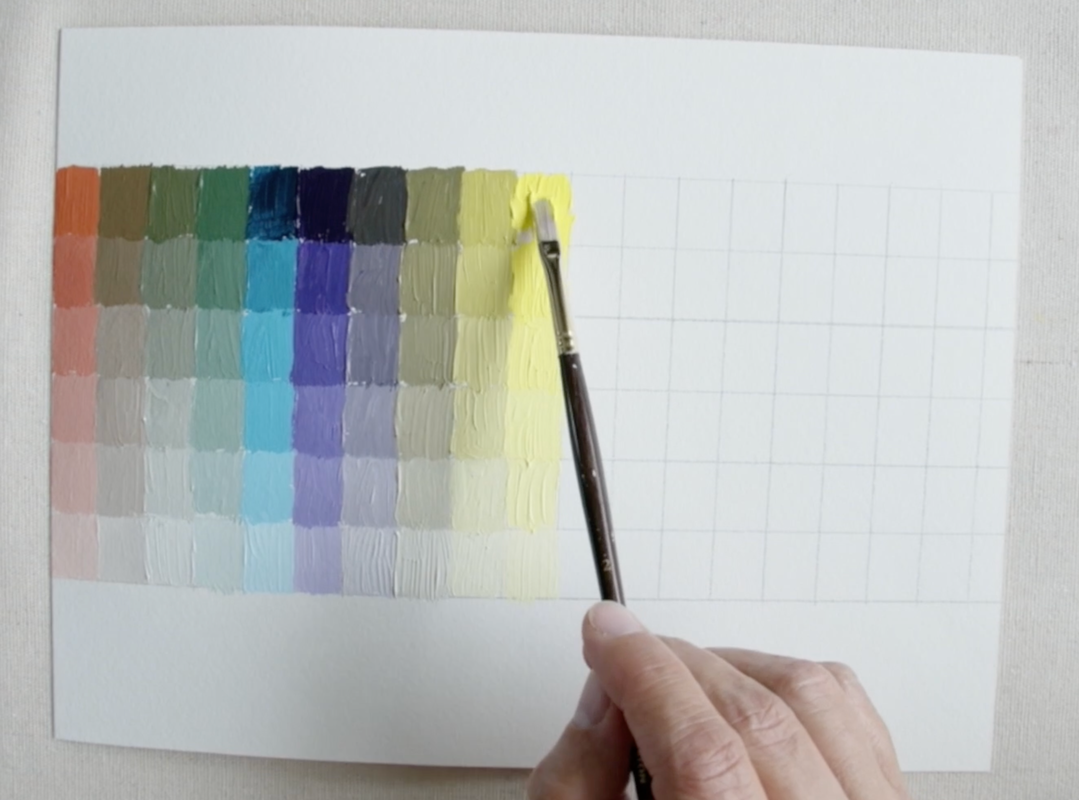
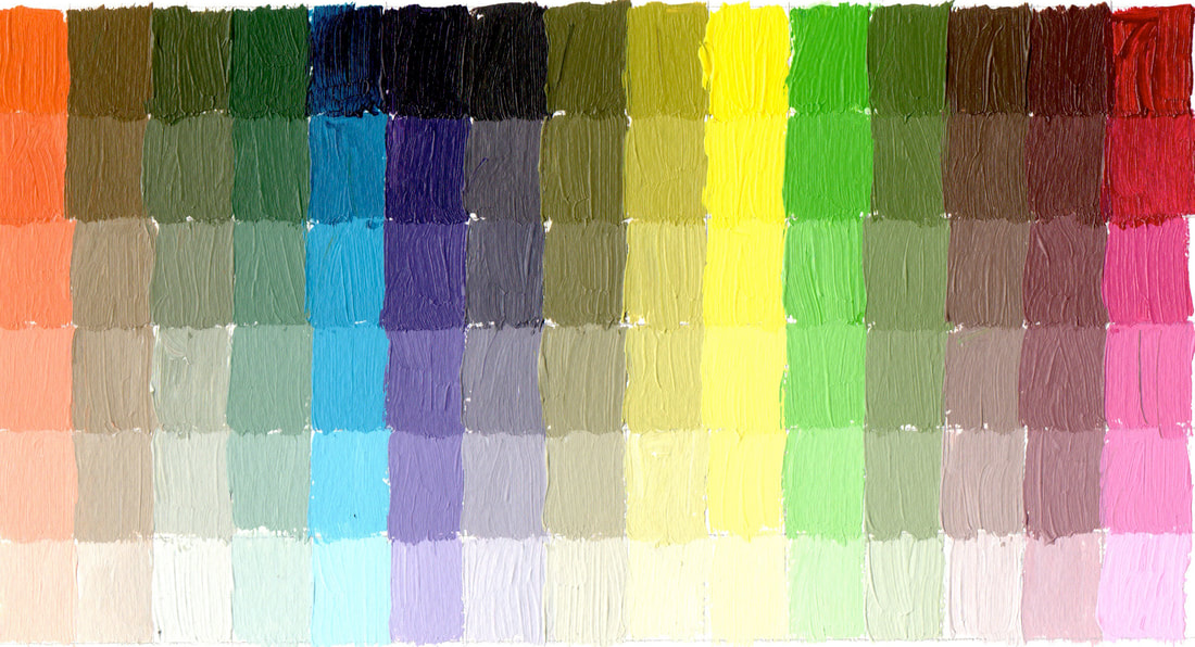
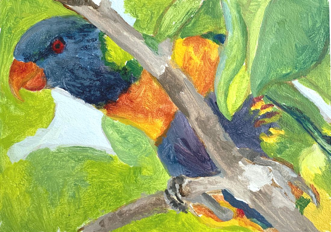
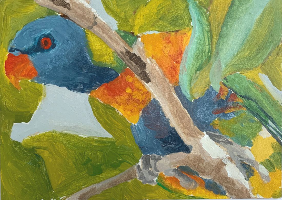
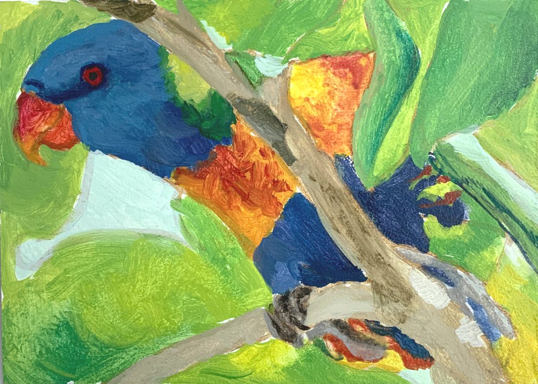
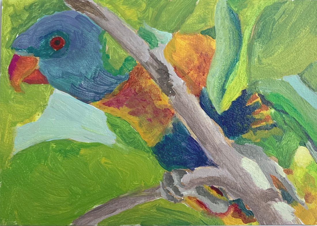
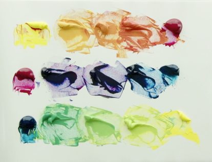
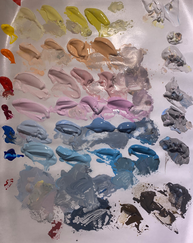
Complimentary Colour Chart, Colour Study of Rainbow Lorikeet & 4 Colour Studies compared.This video has three parts: Part 1 - creating a Complimentary Colour Chart Part 2 - doing a colour study using all the colour mixing information that we have done Part 3 - Comparing 4 different colour studies of the Rainbow Lorikeet with different Red/Blue/Yellows. Below is the Complimentary Colour Chart that I created. This time around I did 3 steps between the Orange and Blue, Purple to Yellow and Green to Red. Only as I was completing it did I realize that I should have done 4 steps between. Oh dear. The measurements for the chart are below. 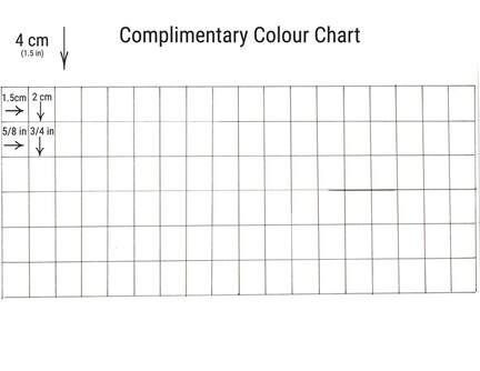
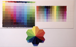 Here we have the whole range of colours we have mixed mainly from 3 tubes of paint. The Colour Value Scale always requires a range of other pigments to ensure the value changes that are made are in the same hue family. Now we are on to our colour study of the Rainbow Lorikeet!
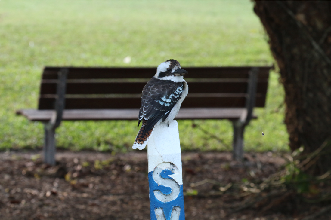
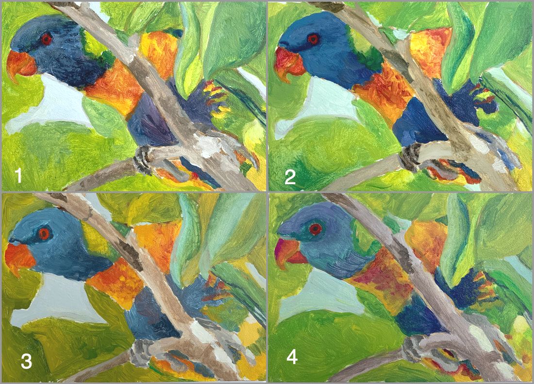 Here are all 4 together on the screen. Seeing them all side-by-side, you really get a sense of what works and what doesn't work. Personally, I really like the beak colours in #3 which is Cadmium Yellow Medium and Cadmium Red Light. But I would still need to use some Cadmium yellow light on the bird’s body. I like the Blues on the bird in the first colour study. I think that Ultramarine Blue is more representative of the blue on the bird. Looking at the greens now. I would say that I am not a fan of either version 3 or 4. In the first two colour studies I prefer these greens. I think I would use both blues with Cadmium Yellow Light to create a variety greens When looking at the branches I prefer colour study 3. Doing these colour charts and studies took some time but the helpful information that they provide is invaluable. Each of the colour studies took about 1 ½ to 2 hours when I include the pre-mixing of paint. These kinds of challenges it helps to get a sense of the potential of the various pigments that we work with. Below are photos of birds around Melbourne. I toured with the late Paul Hackett in 2018. Look at the very last photo...these are Orange Bellied Parrots. When I was there Paul said that there were only 18 left in the wild. These were two of the 18. They were trying to breed them and release the young but I don't know what kind of success they have had with that program. The second day I spent on a bird tour was up in north Queensland with Doug Harrington of Birdwatching Tropical Australia. The very first bird we saw was only 200 metres from where Doug picked me up...just hanging around on a post... a Kookaburra! I bet you know what song popped into my head when I saw it! Are you singing it? This is the second in installment of the Limited 3 colour Palette exploration that I have been doing. Links for the play list KICKSTART YOUR COLOUR MIXING is below. We are making 12 colours out of these three paints. This video has two parts: the first part I'm going to make the 12 colours quickly and then we will dive into making a colour value scale with each of the colours that we have created. The three colours that we're going to use is cadmium yellow light, quinacridone magenta and phthalo turquoise. This is a set of colours that would be considered CMY which stands for Cyan/Magenta/Yellow. Phthalo turquoise is kind of close towards Cyan.
Now when I get to mixing the purples I start with two parts of magenta and one part of the phthalo turquoise, then one to one, and lastly one part magenta and two parts phthalo Turquoise. The value of each of the paints is so dark this is the only way to ensure the purples shift from red to blue. With the Cadmium Yellow Light and the other two colours I’m actually matching a value and every once in a while, you can see my value checker. This Yellow is a value 9 and the other two colours are sitting at Value 3 or 1. For the Quin Magenta (Value 3) I make value mixtures of 7, 6 and 5 to keep it simple. Then with Phthalo Turquoise it is easy to make three steps across at Value 7, 5 and 3. This gets us around the whole 12 segments of our tessellation. I always start with the yellow when I do these kinds of things. Here we can see the oranges, from yellow to red, that we create from Quinacridone Magenta. 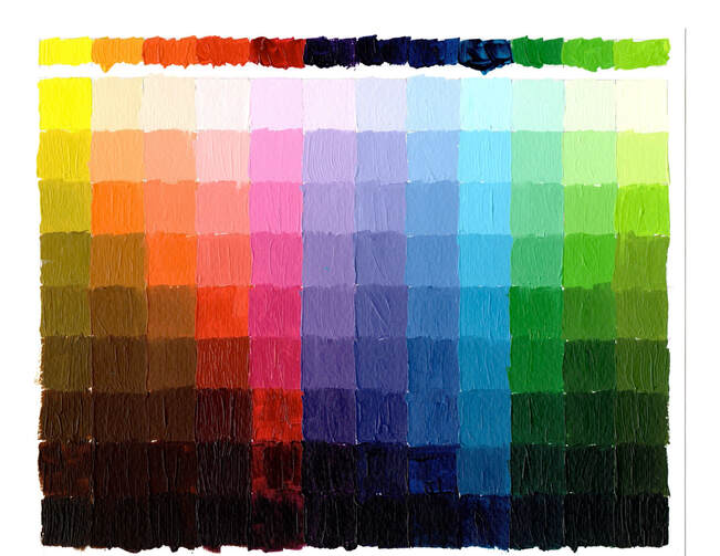 Learning how to change a colour and still be in the same colour way is really important.
Starting with Cadmium Yellow Light which is at Value 9. Using Raw Umber to darken from Value 8 to Value 2. For Value 1 we will add a bit of black. Adding Quinacridone Magenta to create an orange that is Value 7. Add white to create Value 8 & 9, then add equal amounts of Raw Umber (low Chroma Yellow) and Burnt Umber (Low Chroma Orange) for this particular orange. This will bring us to Value 2, add black to get to Value 1. As we step to the middle orange, which is mixed to a Value 6, then using Burnt Umber to darken from Value 5 to Value 2. Again add black right at the end to get it to value 1. Create the third step of orange to a Value 5 which is noticeably more red. Take 2 parts Burnt Umber and 1 part Alizarin Crimson Hue Permanent to create Values 4 to 2, then add black to create Value 1. On to Quinacridone Magenta, add white to create Values 9 to 4, the pure paint is Value3, add black to get to value 2 and 1. As we move from Quinacridone Magenta to Phthalo Turquoise we are entering into our delicious purple range. The first combination is 2 parts Quinacridone magenta to 1 part Phthalo Turquoise. This value string is simple in that the darkest value of the two paints is Value 1. Using white to create from Value 9 to Value 2, pure mixture for the last square. Step two of the purples is equal parts Quin Magenta to Phthalo Turquoise. This purple very pretty. To create step three use 1 part Quin Magenta to 2 parts Phthalo Turquoise. Notice how the purples go from being more red to being more blue as we move across this colour value chart. The Phthalo Turquoise string is as simple to create as just adding white to make Value 9 to Value 2, pure paint for Value 1. On to the last three colours for our Colour Value Chart. On to the Greens. The first string the green we mixed is as Value 3, it is very blue. Adding white to create Values 4 to 9. To create Value 2 and 1, we will use 3 parts Phthalo Green (Blue shade) to 1 part Raw Umber. Section 2 our green is at Value 5, we will create a mixture of equal parts Phthalo Green (Blue Shade) & Raw Umber to create from Value 4 to Value 1. Here we are at the last value String! We created a green that has more yellow as it is now at Value 7. Use white to create Value 8 & 9. Then to darken this last mixture we will use 1 part Phthalo Green (Blue shade) to 5 parts Raw Umber ( Low Chroma Yellow) to make Value 6 to Value 1. I place the pure tones right across the top and there's a rainbow of beautiful colours. Join me for the next video as we will do the complimentary mixtures using these three colours and the final colour study. The first colour study that I started, after an hour I abandoned it. Right away I could see that the Light values were too dark, and all the colours were far too chromatic.
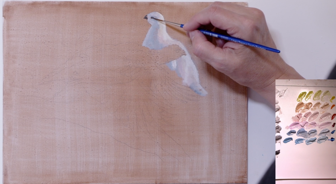
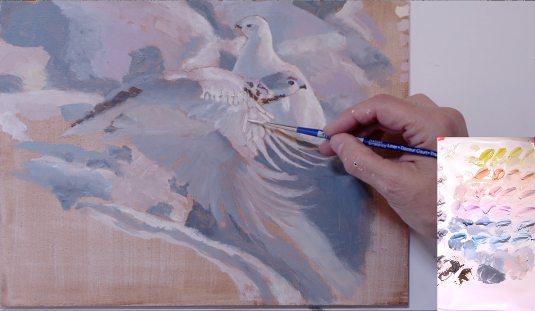
Watching the video on painting a sphere will help in rendering these Ptarmigans. I did a full blog post about the sphere, click HERE. These birds are rounded objects and the light moves across them in a similar fashion.
Below is the final painting that I critique at the 18 minute point of the video. 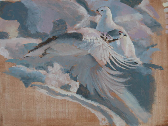 Below are the three adjustment options: 1. lighten the snow in the background 2. darken the snow in the background 3. blur the snow in the background which creates a lot of little bokeh. 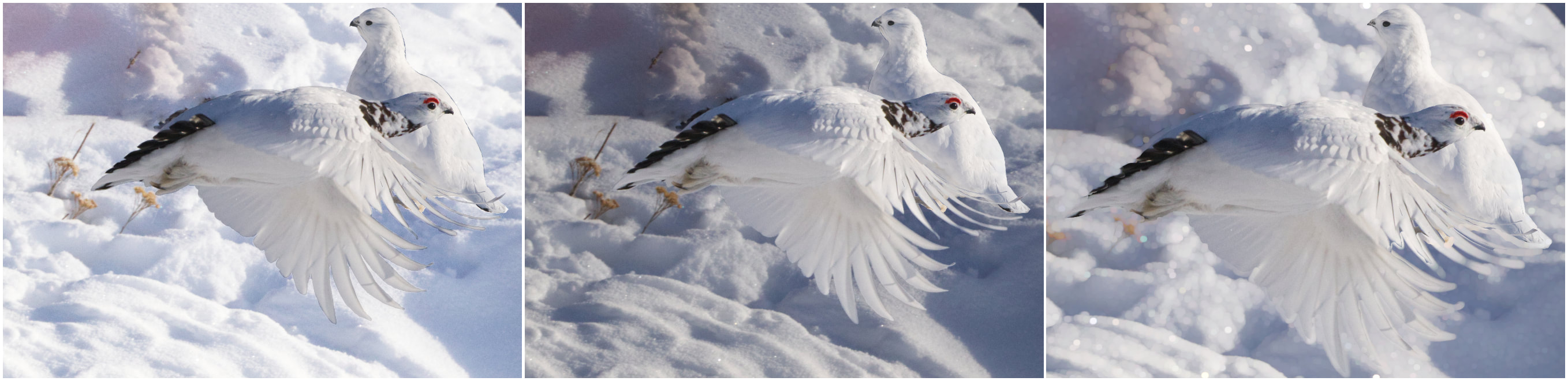 Which one would you choose? Leave a comment below.
|
Shawna Lampi-LegareeShawna is capturing moments of beauty from the world around her. Archives
June 2023
Categories
All
Mailing List
To receive an update about new paintings, workshops and other art related news, subscribe to my mailing list below. You can unsubscribe at any time. 
|