|
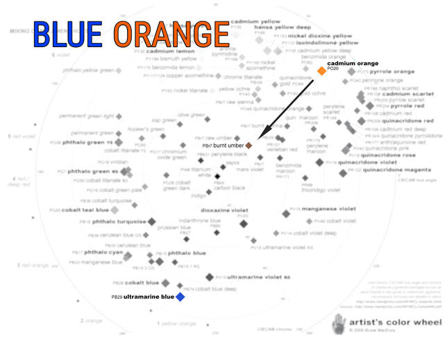
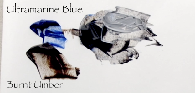
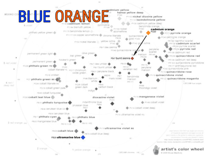
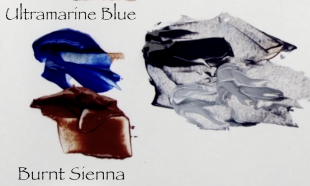
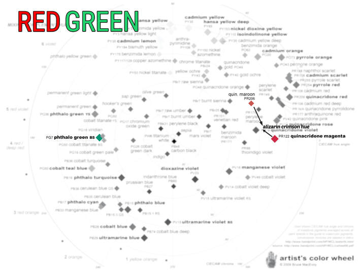
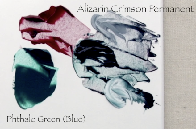
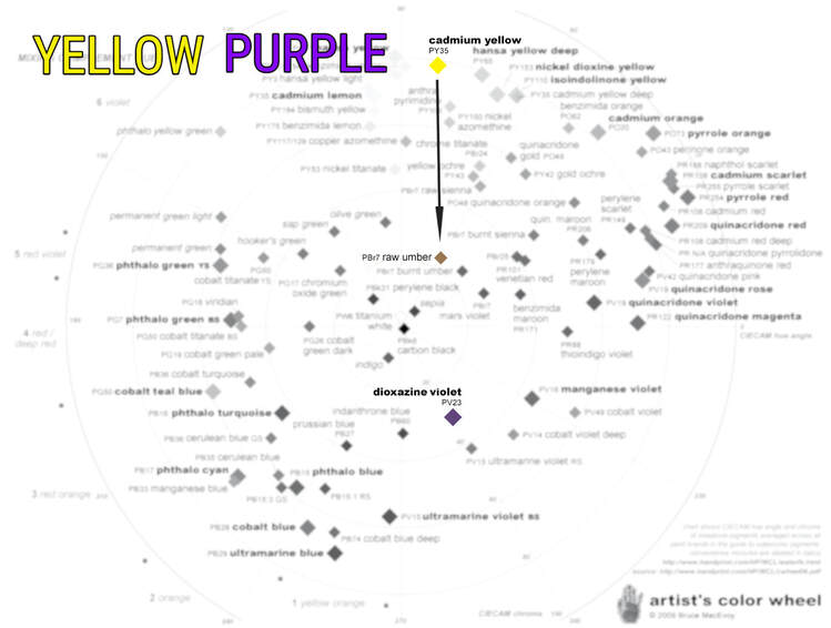
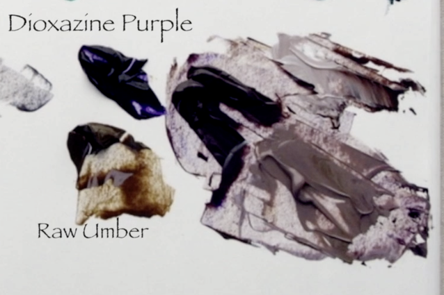
In this video I will be mixing a range of different paint colour combinations to create Black. I have chosen to focus in on using 3 complimentary options: Blue/Orange, Red/Green and Purple/Yellow. Also as a bonus I will be sharing the two paint colours that Robert Bateman shared during his 2019 Master Class in Victoria. :) I wrote down the colours he said but have never mixed the colours until I was making this video. Let's start with Blue and Orange. I chose to do two combinations with the same Blue (Ultramarine Blue - value 1) but different Orange paints. Paints you might not necessarily think of as orange. The first Orange I will be using Burnt Umber. You can see below on the Pigment Colour Wheel that the arrow from the Cadmium Orange to Burnt Umber goes straight towards the centre of the colour wheel. This means that Burnt Umber is indeed a very low chroma orange. The second consideration is that Burnt Umber straight out of the tube is value 2, Chroma 1. It helps to have a very dark value paints when trying to mix for a Black. The second mixture is created with the same Ultramarine Blue with Burnt Sienna - (value 3 Chroma 4). Burnt Sienna is way more chromatic (colourful) than Burnt Umber, also its value is 1 step lighter. But it again works wonderfully well for making a very dark colour. The Alizarin Crimson Permanent paint I use is made of two different pigments. The brand I prefer is Liquitex. My goal always with paint is to have the least amount of pigments in a mixture. Below you can see the two different pigments that went into creating the Alizarin that I use. I put arrows to where on the pigment chart I feel the Alizarin Crimson Permanent would land. It has more blue tendencies, so closer to the quinacridone magenta but with enough of the Quinacridone Maroon to bring the pigment away from the very purple undertones of the quin magenta. Now on to the Yellow/Purple. This one was the least successful. I got beautiful blacks out of the Blue/Oranges & Red/Greens. I chose to use a Raw Umber, which a low chroma Yellow that is value 2, chroma 1 to mix with the Dioxazine Purple. No matter how much Raw Umber, or how much Dioxazine Purple I mixed in I couldn't get to a grey. Can you see what colour is underrepresented? Below is the answer... Blue. There is not enough blue. The Red/Green & Blue/Oranges are very well matched for the three primaries of Red/Blue/Yellow. But Dioxazine Purple is surprisingly red dominated. :) There is no way that I could get a proper Black out of the Yellow/Purple combination that I used. In 2019 I was so fortunate to take a Master Class with Robert Bateman. He was on the cusp of turning 89 and he was hard to keep up with. The class started at 9am until 12 noon, 2 to 5pm and 7 to 9:30 pm. Wow Wow Wow. I go back through my notes regularly. He shares his regular paint palette and how he gets the Bateman Blue and Green. And he shared the two colours he uses for creating a value 2 Black. Until now I have never mixed the paints together to see how it would work! He uses Payne's Grey and Yellow Ochre. What a surprising combination! And best of all, it worked out really well. I guess after over 70 years of painting Robert Bateman knows his paint!
1 Comment
8/27/2023 09:18:57 am
I wanted to express my gratitude for your insightful and engaging article. Your writing is clear and easy to follow, and I appreciated the way you presented your ideas in a thoughtful and organized manner. Your analysis was both thought-provoking and well-researched, and I enjoyed the real-life examples you used to illustrate your points. Your article has provided me with a fresh perspective on the subject matter and has inspired me to think more deeply about this topic.
Reply
Your comment will be posted after it is approved.
Leave a Reply. |
Shawna Lampi-LegareeShawna is capturing moments of beauty from the world around her. Archives
June 2023
Categories
All
Mailing List
To receive an update about new paintings, workshops and other art related news, subscribe to my mailing list below. You can unsubscribe at any time. |
