|
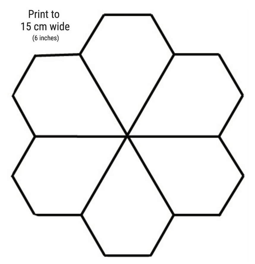
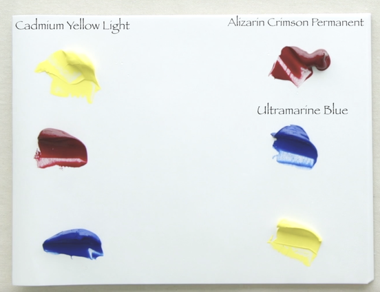
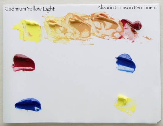
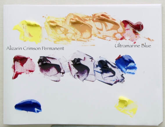
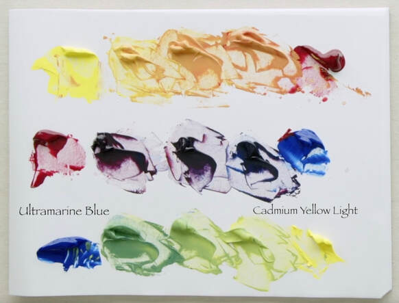
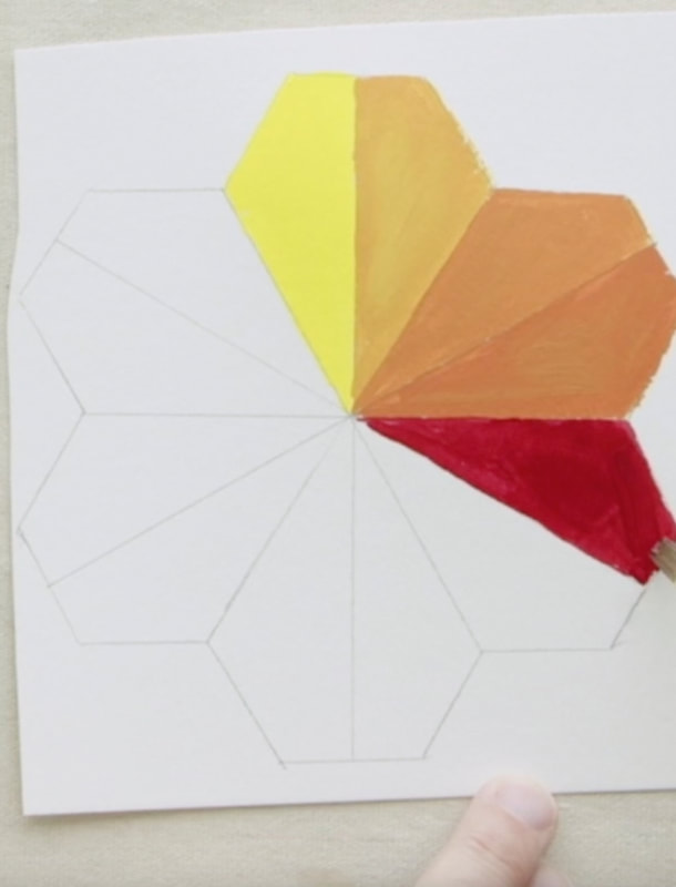
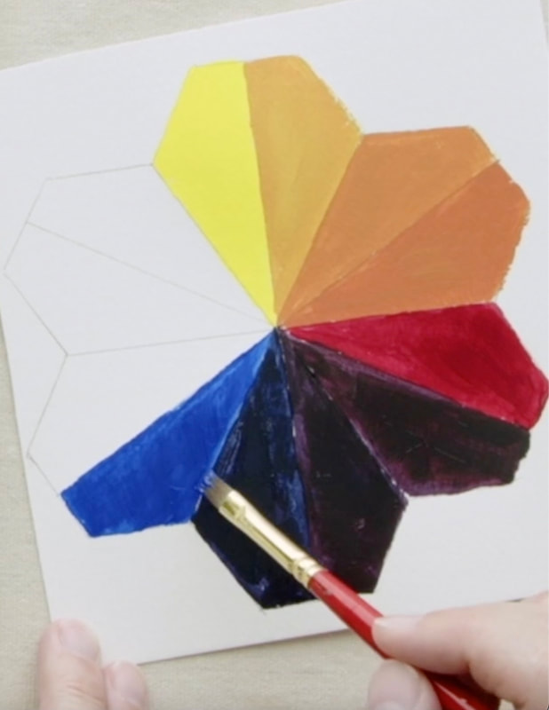
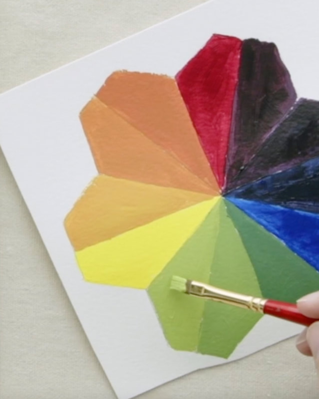
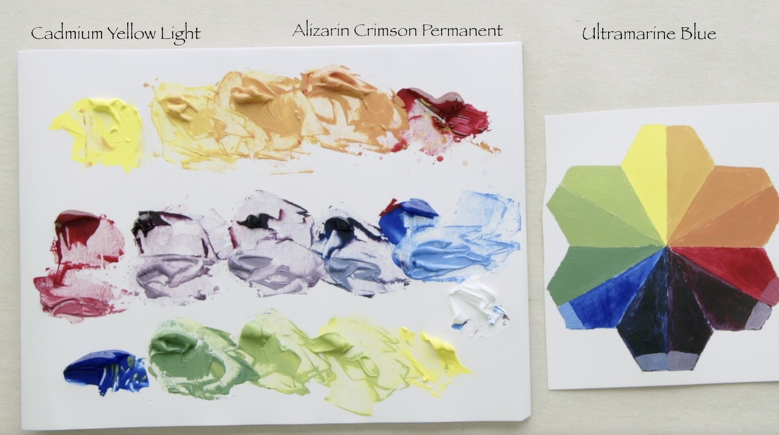
I am so excited to start this next series of videos. I will be working with a very limited palette of just 3 colours. We have all heard that you can make every colour you need with literally one Red, one Blue and one Yellow . But alas that doesn't always seem to work out well. My plan for the first part of the fall/winter is to explore this notion. This is the first video in a mini-series of 4 videos. The Colours: Alizarin Crimson Hue (Liquitex), then Ultramarine Blue (Golden) and the last Cadmium Yellow Light (Golden). All the paints I use are heavy body. Today I am working solely on mixing between the primaries to create secondary colours of Orange, Purple and Green. Make your own pretty rainbow tessellation! Download the image below, print it and transfer to the super inexpensive watercolour paper. The measurements are on the image. Remember to draw a line through the centre to create 12 sections. :) Let's get going! Here is the set up as I prepare to start mixing! Yellow to Red, Red to Blue, Blue to Yellow. Cadmium Yellow Light (CYL) squeezes out of the tube at Value 9, but Alizarin Crimson Permanent Hue (AC) is a Value 2. To keep to the 12 segments I needed to do 3 mixtures between each of the primaries. With the Yellow to Red I chose to focus on mixing to actual values. I mixed to Value 7, Value 5.5 and Value 4. We are now on to Red to Blue. Here I had to adopt a different way of mixing the colours. As we know AC is at Value 2, but Ultramarine Blue (UB) starts off at Value 1. Trying to match a value isn't going to work when both paints start off so dark. The first mixture I chose to do 2 parts AC + 1 part UB, the middle mixture were equal parts AC + UB, and the third mixture was 1 part AC + 2 parts UB. Keep it simple! Finally to close the circle we will be mixing the Blue to Yellow. Back to using value when mixing . UB is Value 1, CYL is Value 9 and the mixtures are Value 3, 5 and 7. Easy peasy. Here is the quick view of building the Flower Tessellation. The challenge very dark paints and the mixes one makes from them, is that you can't really see what the colour is. Is the purple more red or more blue. To fix that I simply took a bit of the dark mixtures and added white. Below you can see that I painted those lightened values at the tip of the colour.
0 Comments
Your comment will be posted after it is approved.
Leave a Reply. |
Shawna Lampi-LegareeShawna is capturing moments of beauty from the world around her. Archives
June 2023
Categories
All
Mailing List
To receive an update about new paintings, workshops and other art related news, subscribe to my mailing list below. You can unsubscribe at any time. |
