|
Each pigment that we use has a range of attributes that have an impact while mixing the paints together. We use language to explain one of the key properties when we use the term ‘bias’ of the paint. We say that the paint is either ‘cool’ or ‘warm’. This way of expressing does help us to visualize this particular trait of the pigment. We will use one new paint colours in this lesson. The first modification is that I have exchanged the low chroma Yellow Ochre for the much higher chroma Cadmium Yellow Medium. The higher chroma Yellow will be helpful in this lesson. When I say that a “red is cool”, that means that the pigment has a blue bias to the colour. An example is Alizarin Crimson and Quinacridone Crimson, both reds have a very definite blue bias. We would categorise these paints as being a Red Purple. Both these pigments are moving away from Red towards Purple on the colour spectrum. But a warm Red is leaning more towards Yellow which means we see more Orange in the Red as we do in Cadmium Red Medium. How would this cool/warm factor impact mixing between the primary colours trying to create the perfect orange or purple or green? This is what we shall explore in this video and blog post. 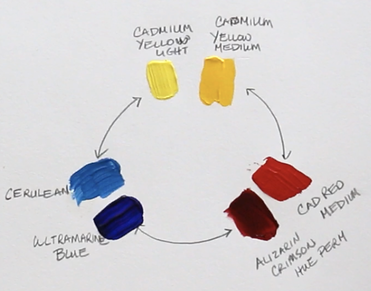 Cadmium Yellow Light (has a touch of blue in it – Cool) Cadmium Yellow Medium (has definite tones of red – Warm) Cadmium Red Medium (tones of yellow – Warm) Alizarin Crimson Hue (tones of blue – Cool) Ultramarine Blue (tones of red which makes it look purple – Cool) Cerulean Blue (tones of yellow – Warm) We will experiment with mixing Cadmium Yellow Medium (warm) with Cadmium Red Medium (warm) to see the resulting colour that we create. The colour that we get is Orange and it is the most chromatic orange that we will be able to create with the paints we are working with. Why is this? Well, there is no hint of blue in either of those two colours. All we have is Yellow and Red being mixed together. But when we work with Cadmium Yellow Light (cool) and Alizarin Crimson Hue (cool) both these colours have blue in them. Now we have mixed Yellow, Red and tiny bit of Blue which means the resulting orange is duller and has a lower chroma. 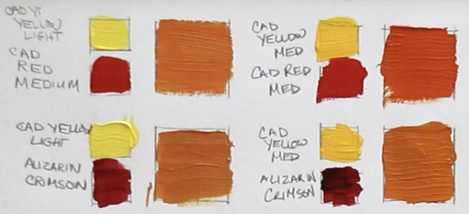 As we explore creating purples with the reds and blues we are using, what do we notice? The purple made with the Alizarin Crimson Hue (cool) and Ultramarine Blue (cool) is very dark, but when we add white it is the purer purple. This is because we are only mixing colours that have Red and Blue. Once we mix Cadmium Red Medium (warm) and Cerulean Blue (warm) and the purple is very low chroma which looks greyed out. We have now mixed Red, Blue and a fair amount of Yellow to get this particular purple. 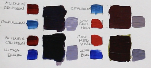 The same result happens when we mix the greens from Yellow and Blue. Cadmium Yellow Light (cool) and Cerulean Blue (warm) create the most chromatic green. Again, we are only mixing Yellow and Blue with these two pigments. But put together Cadmium Yellow Medium (warm) and Ultramarine Blue (cool) the green is smokier in look because both those pigments have added Red into the mixture. 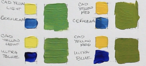
1 Comment
9/11/2023 09:14:08 am
I wanted to express my gratitude for your insightful and engaging article. Your writing is clear and easy to follow, and I appreciated the way you presented your ideas in a thoughtful and organized manner. Your analysis was both thought-provoking and well-researched, and I enjoyed the real-life examples you used to illustrate your points. Your article has provided me with a fresh perspective on the subject matter and has inspired me to think more deeply about this topic. Your comment will be posted after it is approved.
Leave a Reply. |
Shawna Lampi-LegareeShawna is capturing moments of beauty from the world around her. Archives
June 2023
Categories
All
Mailing List
To receive an update about new paintings, workshops and other art related news, subscribe to my mailing list below. You can unsubscribe at any time. 
|